It’s been a few years now since the major renovation of our first home, and it’s nearing the time that the major projects of house number two are set to begin. Architects have been consulted , and we are now just weeks away from determining whether we will start with a re-design of our first floor, or the moving of our kitchen from one side of the house to the other. But for today, I’m talking about the space which adjoins the two floors; the hallway, stairs and landing.
Typically, it’s last on the list for a renovation (or should be to avoid it becoming destroyed by inevitable dirt carried through the house). In our first home, this project many months, tackled slowly, and we even tried two separate colour schemes in an effort to experiment and determine our style. Amongst the trial and error, here are the lessons that we will be taking into our next hallway makeover when the times comes, with thanks to today’s sponsor, Kersaint Cobb.
1. Maximise every opportunity for light
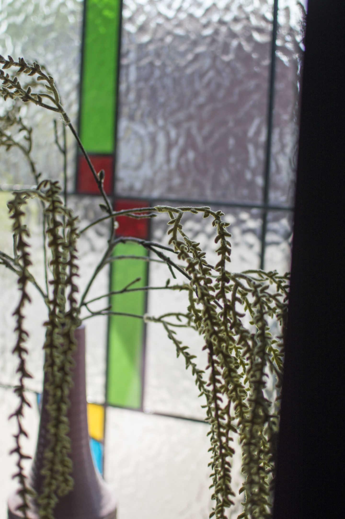
Unless you’re lucky enough to live in a house with an abudance of square footage as well as windows, then it’s likely that your hallway space is definitely going to feel a little on the dull side, lacking in the light it deserves. Our current entryway leads directly up a staircase with only a front door as the natural light source – pretty common in Victorian terraces. Where you can, switch up your door to include glass panels, and if you can, open up the staircase to include spindles rather than solid banisters. If suitable, a transparent glass banister could add the illusion of space you need, and never forget to add a mirror in your hallway – on all floors – not just to check your appearance before you leave for the day, but to help bounce that precious light all the way through.
2. Treat each level as one unified space
One of my biggest errors in the first house was dealing with the stairs and landing as separate areas, when there should be a feeling of continuity. Colour-blocking and quirky mismatches are what makes our home unique to us, but try to keep a level of cohesion between your hallway, stairs and landing. It sounds obviously but as those elements are typically on different levels, it’s not always executed, and can lack a sense of cohesion.
3. Understand how to dress for your room width
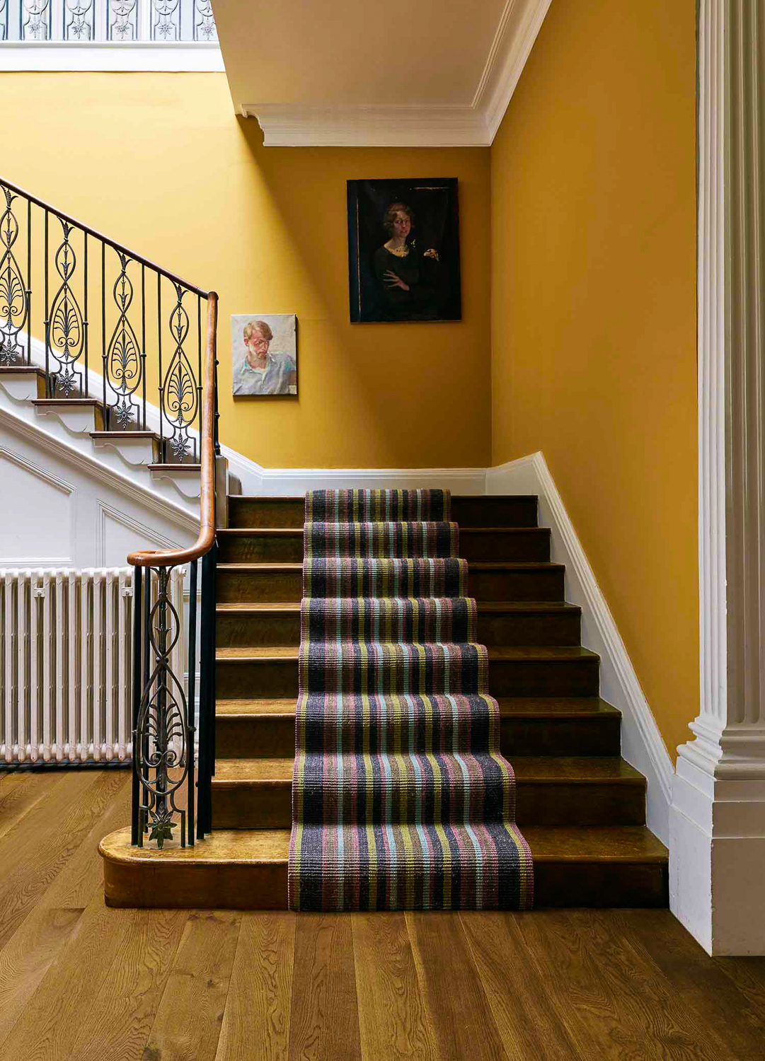
Original wooden stairs or fluffy carpet underfoot? It’s a common dilemma, but it’s an easier decision if you consider the width of your room and your staircase. Assuming that your original stairs are in good condition, there is no reason that you can’t treat them with a lick of paint or varnish and let them shine, but often exposed stairs can lack warmth. Stair runners are a fantastic solution for this, but can also trick the eye into thinking that your stairs are narrower than they are. Therefore, if you already have a narrow staircase but don’t like the feeling of wooden floor, a fully carpeted stairway may best suit you. If you’re in an old house like mine where the stairs are steeper and narrower than average, a stair runner may just exacerbate that.
[Image: Look how gorgeous and wide that stair set is! This is why I love to visit stately homes at the weekend.
This Morocco runner goes beautifully with the wall colour.
4. Soften the harsh angles
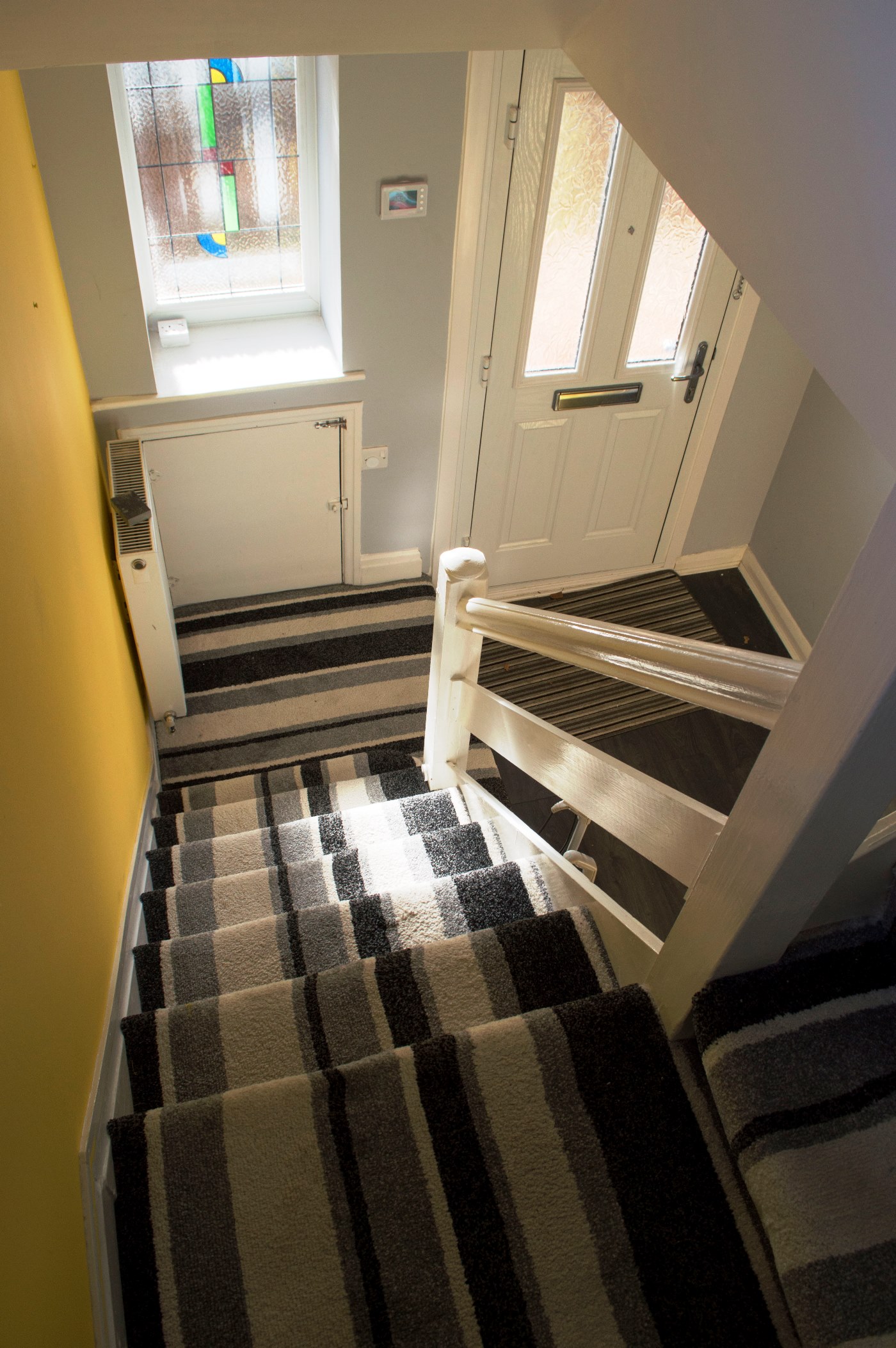
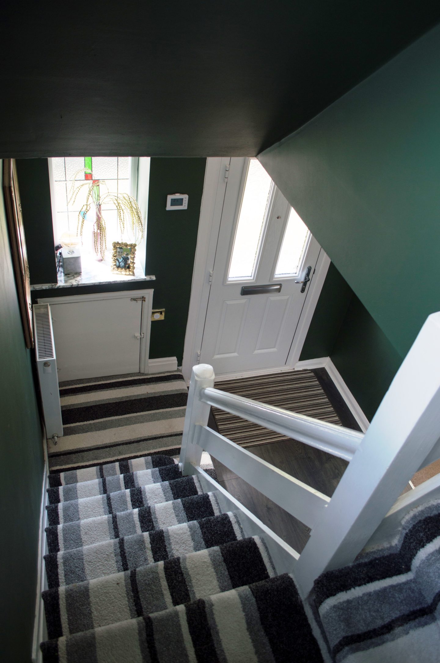
By nature, many hallways are quite boxy and can look quite severe due to the sheer number of angles. The reason we painted our first hallway more than once is because the first choice (yellow feature way, grey walls and white ceiling) meant that we only accentuated the angles. Take two, and we chose a darker colour but went for all the walls, which helped to blur the barrier between wall joins and separate rooms. Even though we chose a darker shade the second time around, it made the space look more open by reducing focus from the stark white ceiling, instead choosing to paint that too. Other ways to reduce the boxed look include curved accessories to offset the angles – whether it be through a round mirror, half-circle entry mat, or patterned wallpaper.
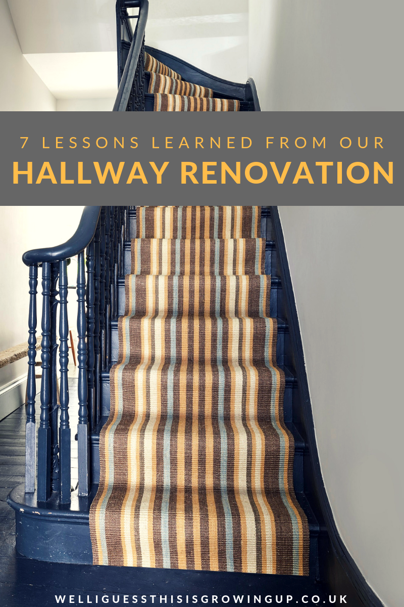
[Image featuring Kersaint Cobb’s wool stair runner in a Beach Hut Stripe.
I love the curved banister in this set, and how the plants have been made a feature!]

5. Paint everything!
Speaking of paint, even when we had found a colour we loved and slapped it on every wall, something still wasn’t right. I still didn’t like the room and couldn’t figure out why. Looking back on the images, it’s clear as day. I left the radiators, cupboard doors and general woodwork a gloss white and it did nothing but pull focus towards them. These weren’t features of the room, so why were we treating them like they were? On reflection, I wish we’d have commited to painting them the same as the walls as a form of camouflage. In a room which typically has no furniture due to lack of space, you have to pay closer attention to the details on the walls. Make a decision, are they something to be hidden or to be shown off. Paint accordingly.
[Image: These are the two colour choices from our first renovation!
The darker shade of green isn’t for everyone, but wow it added some much needed drama.]
6. Offer a sense of direction through the space
C’mon, we all know how to move through a hallway. Generally, it’s pretty clear how to go up and down stairs! Saying that, it’s also nice to visually mirror the obvious. Gallery walls are so popular up staircases as they do just this, guiding the eyes upwards or downwards, depending on your location. We never quite reached this stage in our first renovation and it stuck our like a sore thumb. To keep the eye line pushing to the end of each space, over multiple stories of a home, adding a floor runner can guide your vision to a further point, giving an illusion of both added space as well as direction, in addition to complimenting stair runners, if you’ve gone down this route.
7. Choose the correct pile
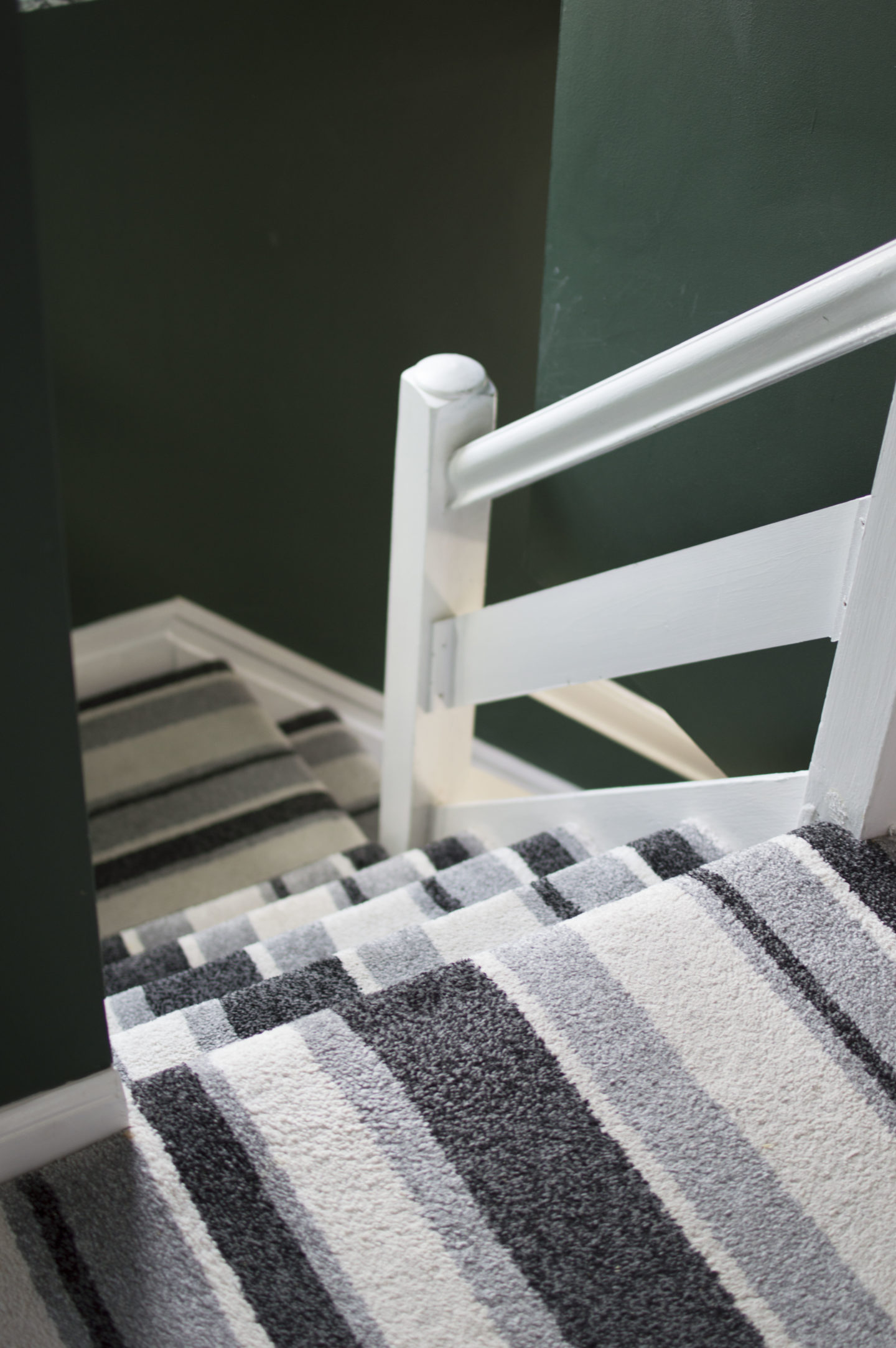
The absolute biggest mistake we made was a needless one really, and should have been advised against by the carpet fitters, as we are clearly not experts in this field. I loved this striped carpet the first time I spotted it in the store (shown below). It was incredibly thick and I thought nothing of it other than how snuggly my feet would feel underneath it. Alongside that, we planned to use our own underlay after bulk buying some cheaply earlier in our renovation project – also a “super” thickness. Combined, they made for a bit of a wedge of carpet and not really suitable for a stairway. They came away from the stairs on a few occasions and although felt lovely, just wasn’t a suitable long-term solution. Carpeted stairs should be an investment, and next time around we’ll be looking for something with a longer shelf life and more suitable for high-traffic areas, in both material and pile.
