Oh how I love children’s bedrooms. They’re so much fun to decorate! When we moved into this house, our daughter’s room was a priority to ensure she felt right at home. She chose the room in the converted loft, and it has become a wonderful little hideaway for her, and a way to develop independence.
I’ve written about what her room looked like when we moved in HERE, and you can also see it in our video home tour HERE. And whilst there are areas we are still going to change further down the line, which I’ll mention below, here is the makeover we’ve accomplished so far.
The Goal: To decorate in a way which would bring comfort and aid sleep.
To allow our daughter to grow into the space over time.
To offer practical storage without being boring. This is a kids room after all!
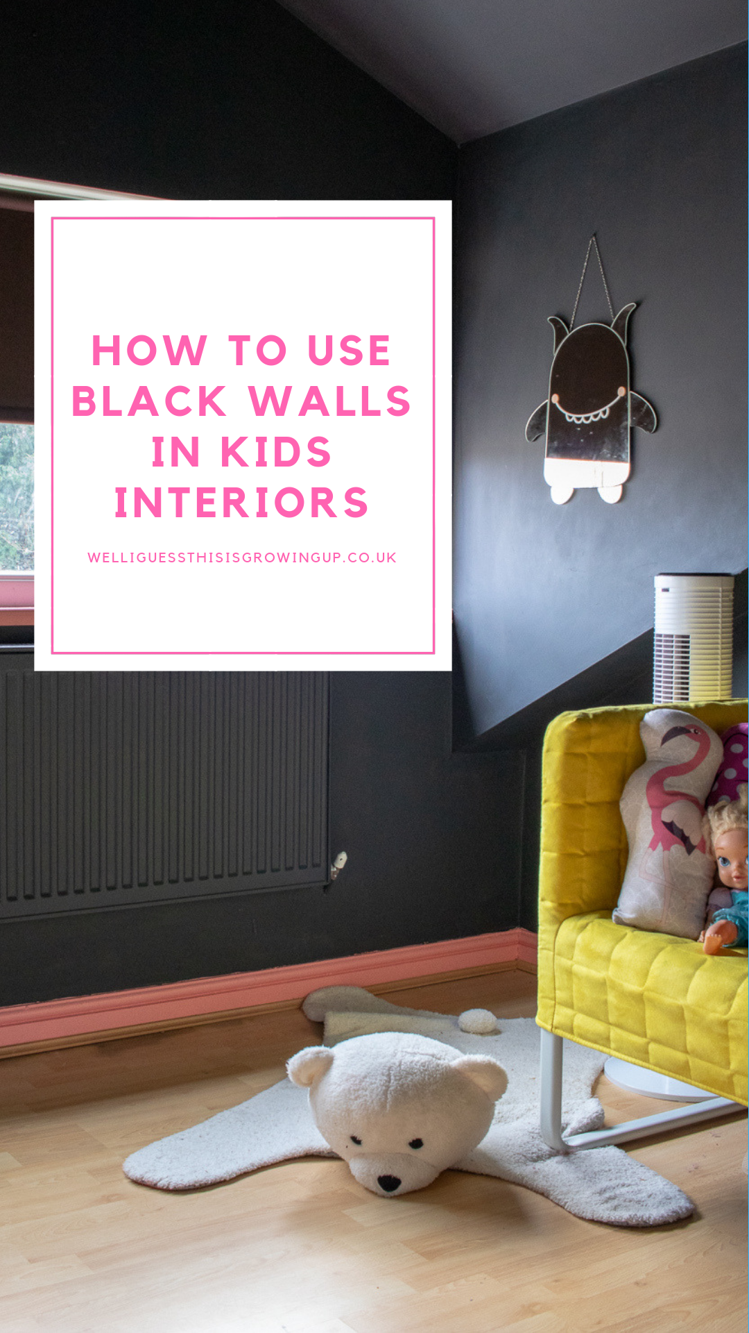
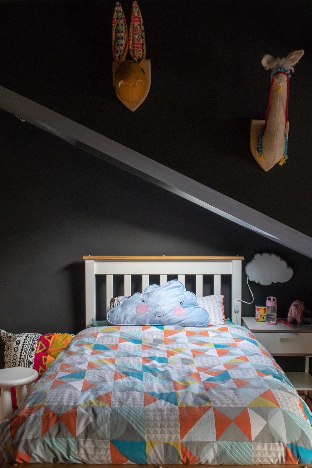
Colour Scheme: The Black Walls
To decorate in a way which would bring comfort and aid sleep. To allow our daughter to grow into the space over time. To offer practical storage without being boring. This is a kids room after all!
I talked about this at length in my “Should you consider black walls for kids interiors?” post but ultimately we chose to go dark in here for a number of reasons.
Firstly, colour blocking a room to include the ceiling can help disguise awkward shapes and angles. This room has a steep pitch and camouflaging this under a dark colour can help soften this.
Secondly, young children are notoriously poor sleepers. Choosing a deeper shade of your favourite colour (if you’re not a fan of black of course) can help to reduce stimulation and encourage calm and quiet. Our bodies produce sleep hormones in the dark and so it made sense for us to try and influence this through paint choice.
Thirdly, children don’t stick to themes. They collect trinkets, toys and artwork. Black walls felt like the perfect backdrop to let those personal touches shine.
Colour Scheme: The Painted Fixtures
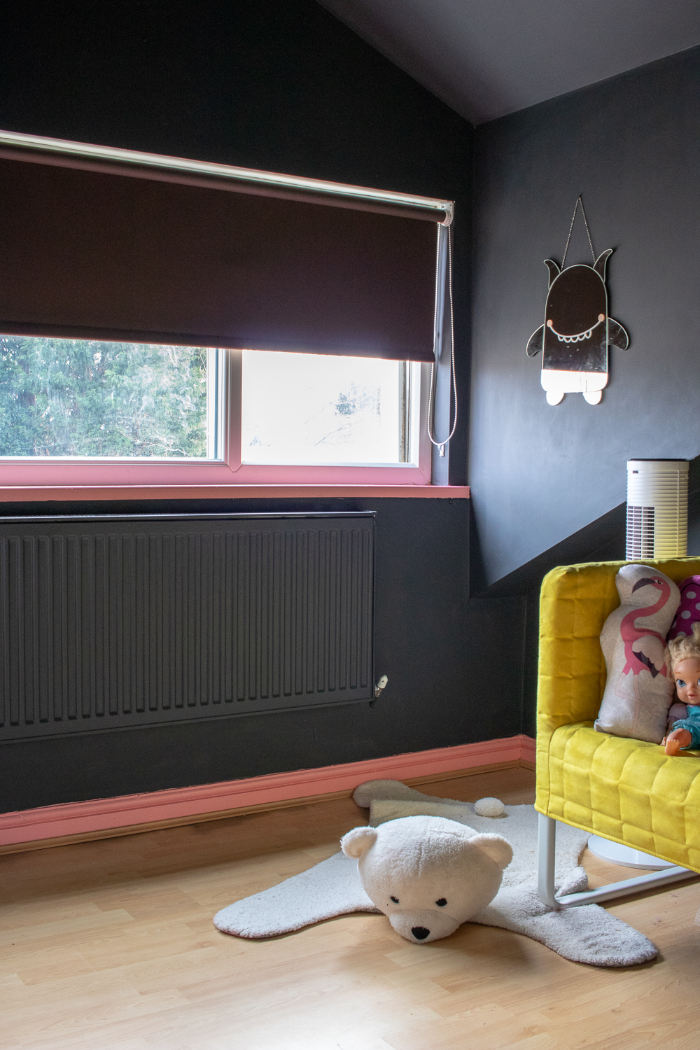
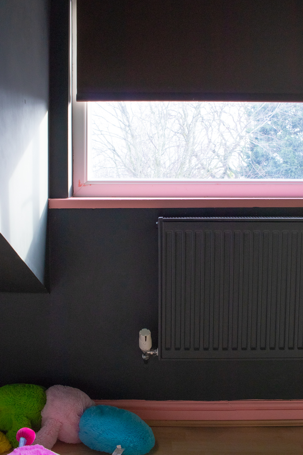
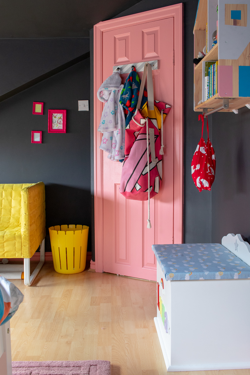
The woodwork in Luna’s room was painted a number of colours. Some areas such as the window sill and door were pastel blue, and the skirting boards were chocolatey brown. To give a refresh and contrast the black walls, we gave Luna the choice of a colour to paint the lot. She chose this lovely share of pink. It provides a great pop of colour against the dark charcoal walls.
One of the best things we did in this room was to paint the radiators black to match the walls. Radiators like this are not a feature and the stark default white of the metal meant that you couldn’t help but look at it against the black. Having continued the black paint from wall to radiators makes them practically disappear.
We haven’t chosen to paint the built-in wardrobes at this point, but one day we might.
The Bedroom Furniture
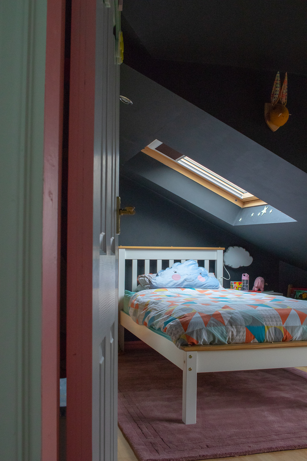
Our house move meant that Luna’s cot-bed was put into storage and she gained her very first single bed and single mattress. No sides to protect her, hence the enormous amount of pillows you see around the room to soften any potential falls. (Thank me later, parents). We toyed with the idea of a king size mattress, which, believe it or not is what the previous owner had in the alcove, but we felt this was excessive for her age.
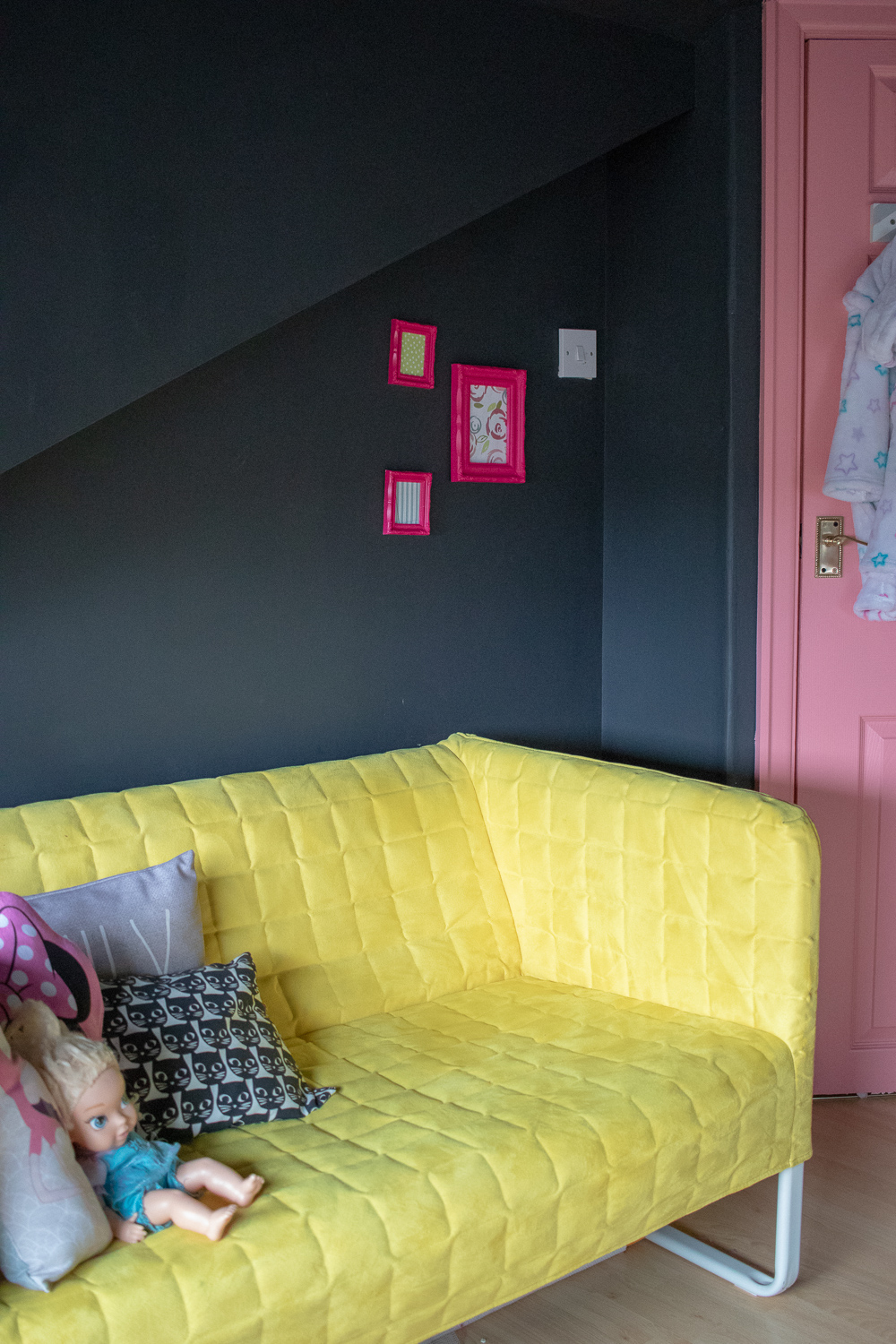
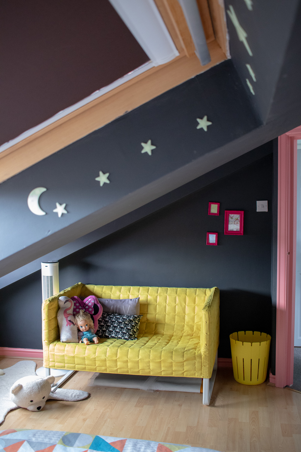
The yellow touch was an IKEA bargain from a few years ago (the colour was apparently unpopular so it was reduced to less than £30 – it’s still around in other colourways but not at this price). It’s a brilliant couch for playrooms, or in the case here, storytime and cuddles.
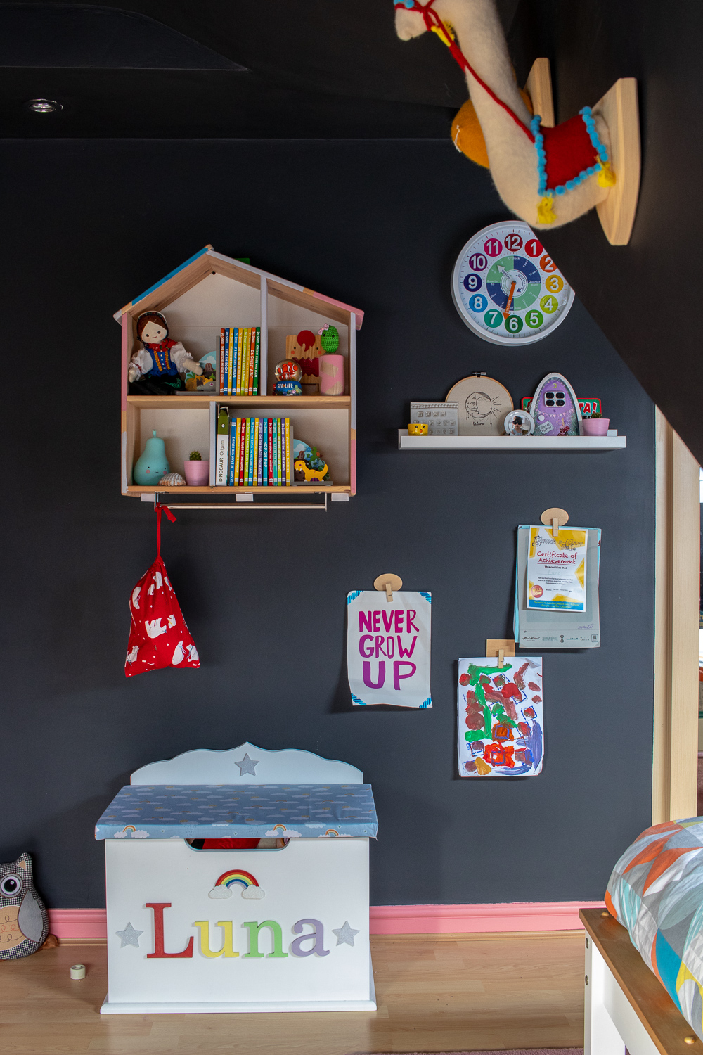
The toy box was handmade and customised just for Luna with rainbow fabric and lettering – very welcome gift from Dreambox. Every nursery, children’s room or playroom needs extra storage, and a toy box can help give a home to all the teddies, dolls or action figures accumulated whilst teaching children about tidying.
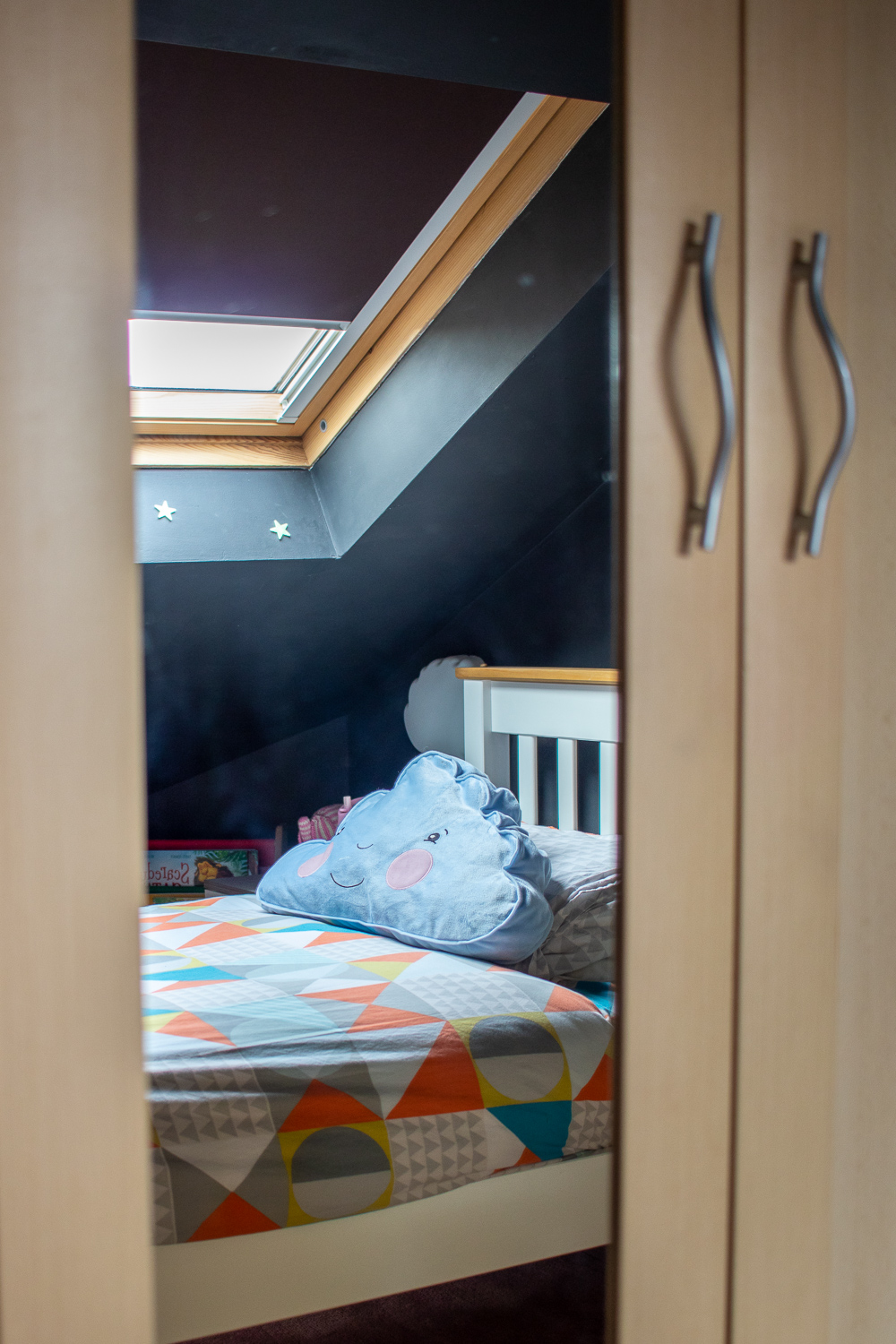
As for the rest of Luna’s things? The wardrobes are built-in (thank you to the previous owners!) For children’s rooms, built-in furniture can help to ease the worry of any falling furniture and can often achieve more storage space than traditional room sets. Adding mirrors to the doors can be another great space-saver.
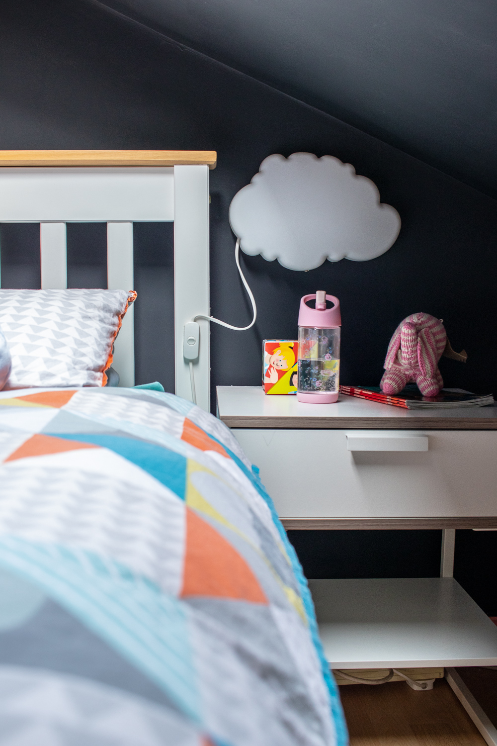
We struggled to find a good height bedside table, but this one has a lovely large surface, a shelf underneath and a drawer. It’s perfect for stashing books, and a nighttime drink. We encourage Luna to put all of her “special” bits and bobs in the drawer because one, there needs to be somewhere dedicated to the fidgety tiny toys, and two, to take responsibility of her special items. The light was an IKEA bargain too, and we have used double sided tape to stick the switch to her bed frame. It means she can access it quickly even in the dark, and reduces the danger of dangling wires.
Adding Personal Touches To a Child’s Bedroom
The Stars – Luna loves the stars, and is lucky that if she wants, she could look right up to the sky thanks to her skylight window. Obviously as a parent we don’t want to keep that open every night, so instead we (read: Santa) put some glow in the dark stars in her Christmas stocking. Every kids room should have an element of magic so we’ve positioned them around the window in a way that means that you can only see them glowing, if you’re lay down in bed. It means, there is nothing too cluttered on the walls when you walk in the room. It’s Luna’s little secret star show.
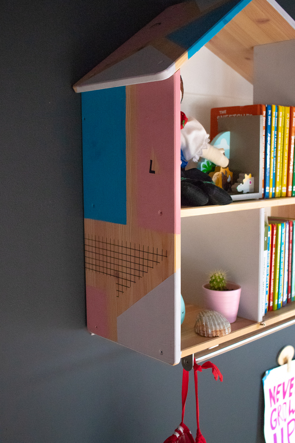
The doll house – This IKEA staple may be used as an actual dollhouse for many other kids around the world, and it is indeed available with accompanying toys, but we use it as a source of shelving in a room which doesn’t have much. It houses a Dr. Seuss collection which were a bit too special for the main book-rack, as well as family photos and sentimental toys. We’ve added a clothes rail underneath for outfits to be hung ready for the next day, to encourage self-dressing. I painted this in our last house with some leftover tester pots. The eagle-eyes will notice that I’d added Luna’s initials into the design.
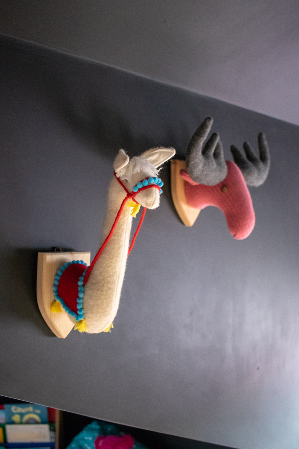
The animal wall – These are handmade by a local maker named Libby Bower who we discovered at a nearby market. I’d bought the felt Rabbit when Luna was very young, but after our daughter recognised Libby’s creations at a later date, we thought it would be nice for her to pick her own for the collection. We’ve since added the Llama design and Moose. Who knows if we’ll see her again and add more!
The Rugs – We have a collection of rugs in here. One is from the Spridd collection which isn’t shown but matches the oversized cushion by the bed. Another is a polar bear, and we switch between the two for fun. But the constant is the wonderful pink rug under the bed. It is such a lovely addition to the room, and warms up what is quite a cold floor. Having it aurrond the entire bed means its cosy underfoot when Luna gets out of bed. Notice, the bed isn’t actual central to the rug, as we’ve adjusted to fit the table on it as well. As you enter the room from an angle, it tricks he eye into thinking its central.
The Artwork – Any parent will know that with kids comes artwork. You may hang it on the fridge but we have used stick-on pegs meaning that our daughter can change these as she pleases. I appreciate that framed images and stylised illustrations will always be popular amongst children’s bedrooms, but for us, it doesn’t matter if the outside world doesn’t think this bedroom has a coherent theme. It’s about letting Luna create a space she loves.
The Before & After (& Future Plans)
You will get a feel for how things have changed from the before & after image below, but generally we are really happy with this space. It’s still punchy but in a way that feels more ‘us’. We have a dedicated playroom downstairs meaning that we’ve set clear boundaries for this room to be a wind-down zone. No games up here. No Disney soundtracks. Calm, quality, family time.

Saying that, if our budget had been bottomless, these are the things I’d like to revisit:
- I’m not a huge fan of the floor but as most of it is disguised by furnishings, we aren’t splashing out on a replacement just yet.
- The blinds. They’re actually a deep brown and I don’t like the clash against the black walls. Saying that, they are blackout blinds and are almost new thanks to the previous owners, so it would be wasteful to bin them off just yet.
- The lighting. I am personally into wall-sunken lights in a bedroom as they’re a little too harsh. However, there are limitations in a room of this size and shape so they will stay for now. Some nice wall-lamps may feature in the future to overcome this.
- The built in wardrobes. I really want to paint these but simply haven’t yet made my mind up on a colour/finish.
Source List
I’ll try to provide sources for everything in the room, but please do comment below if I’ve missed anything
- Black Wall Paint – Valspar “Charcoal Sketch”
- Pink paint – Valspar’s Wood Paint in the colour “Flight of Fancy”
- Yellow Sofa – Knopparp range, IKEA
- Dollhouse shelving – Flisat range, IKEA
- Plain White Shelf – IKEA
- Hanging Storage Bag – Spridd Collection, IKEA
- Toy Box – Custom design, Dreambox
- Bed – Wayfair
- Bedding – Aldi
- Cloud Lamp – IKEA
- Bedside Table – Trysil Range, IKEA
- Wall Stars – Waterstones
- Polar Bear Rug – Vertbaudet
- Pink Rug – Lippa design from Fritha Rugs
- Animal Heads – Libby Bower Designs
- Wall hooks – IKEA
- Set of 3 Pink Frames – Dunelm
PIN FOR LATER
