Google images. Pinterest. Flickr. Whatever your image search of choice might be, chances are if you go hunting for Nordic design, you’ll be greeted with minimal monochrome, styled beautifully and brightly. But this is not the be all and end all when it comes to Scandi-style…
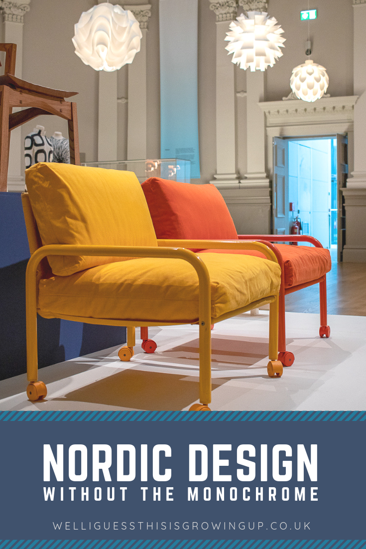
Nordic Design Through The Eyes Of A Colour-Lover
I’ve been incredibly lucky to have visited a number of Nordic homes over the past decade thanks to my step-dad being Norwegian and my mum having connections to Sweden. We even ventured out to Copenhagen for my daughter’s 3rd birthday in a bid to introduce her to some really cold Winter markets! So whilst the Nordic culture isn’t one of my specialist subjects, nor is it a stranger in my life. And yet, something which continues to surprise me is this:
Absolutely none of the homes I’ve visited have resembled our celebrated ideal of what we’re told Nordic design is.
I see a lot of white panelled walls, sure – especially in homes where bedrooms are underground and are key to making window-less rooms feel brighter. I see lots of raw materials and plenty of nods to nature. But in my experience, Norway in particular is a far more pattern-centric region than our screens may lead us to believe.
I’ve noted houses painted in rich reds with blue-shuttered windows in Stavanger. Deep dark wood-varnished floors layered in those same coloured rugs in many homes in Eastern Norway. And absolutely anyone who has visited Copenhagen will have snapped the rainbow facades of Nyhavn port. Those colours of the Nordic flags are displayed in a variety of ways and rarely grayscaled.
As I look at my holiday photos to Norway over the years, staying in family homes, the shade on the walls is mostly moss green, if not a natural pine. The fabric of the curtains is full of over-sized florals, if not classic-shutters.. The picture frames are a riot of colour, although mostly finished in brass. I appreciate that this is just one person’s account, but it has certainly make me question: Are the Nordic countries far more maximalist in their design than we’re shown on screen? Or am I looking for colour, because that’s what I want to see?
Nordic Craft And Design at Manchester Art Gallery

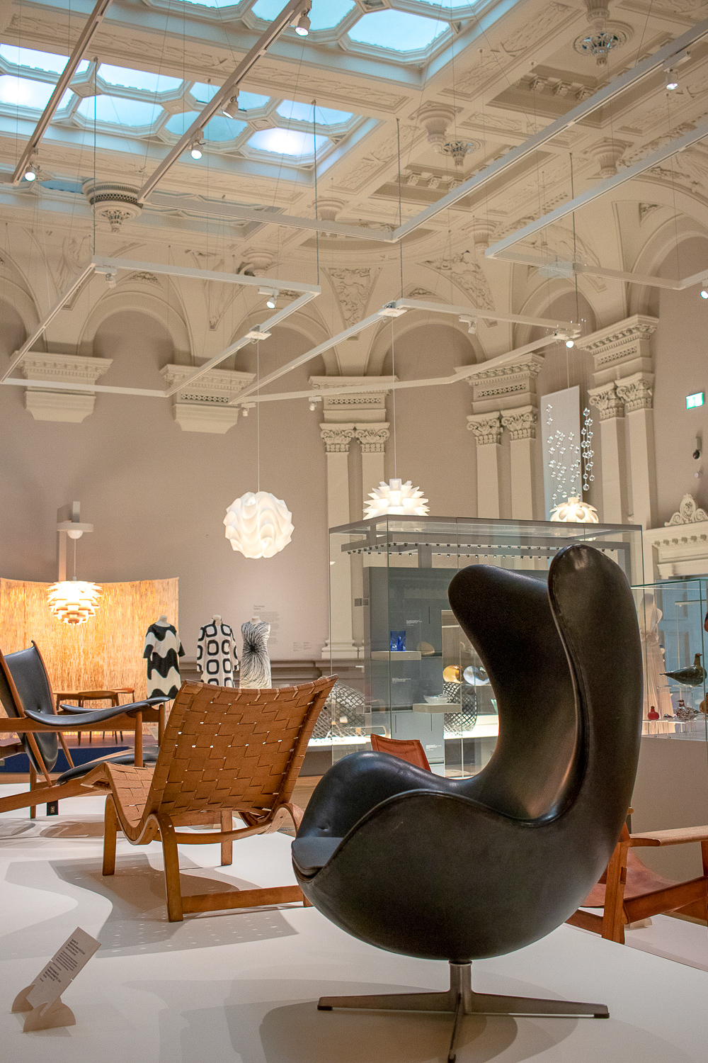
In July of this year, a new exhibit opened in Manchester Art Gallery – somewhere I frequent at lunchtimes due to working nearby – and to me it’s the closest representation to the version of Nordic design I’ve come to know and love. It’s such a versatile collection that there really is something for everyone in this collection alone – far removed from minimalist still-life photo sets we can so often see under the guise of Hygge.
The year-long exhibit does well to celebrate those simple displays that many idolise Scandinavia for, but with the boldness of mixed patterned textiles and rainbow backdrops to appease even those who want a bit more oomph in their colour palette.
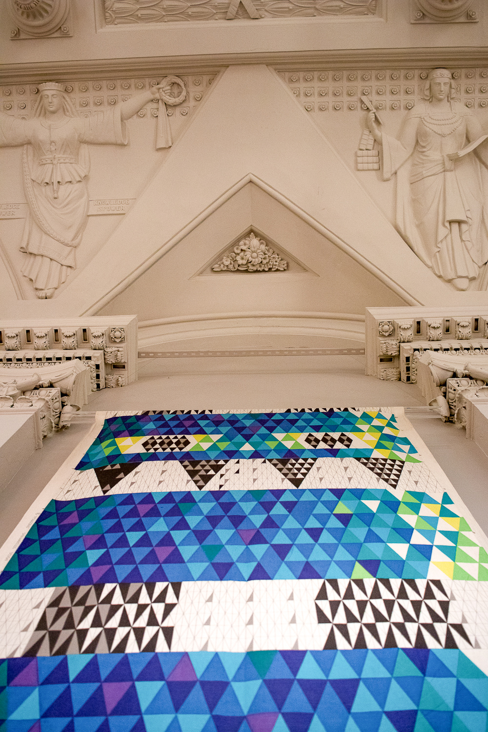
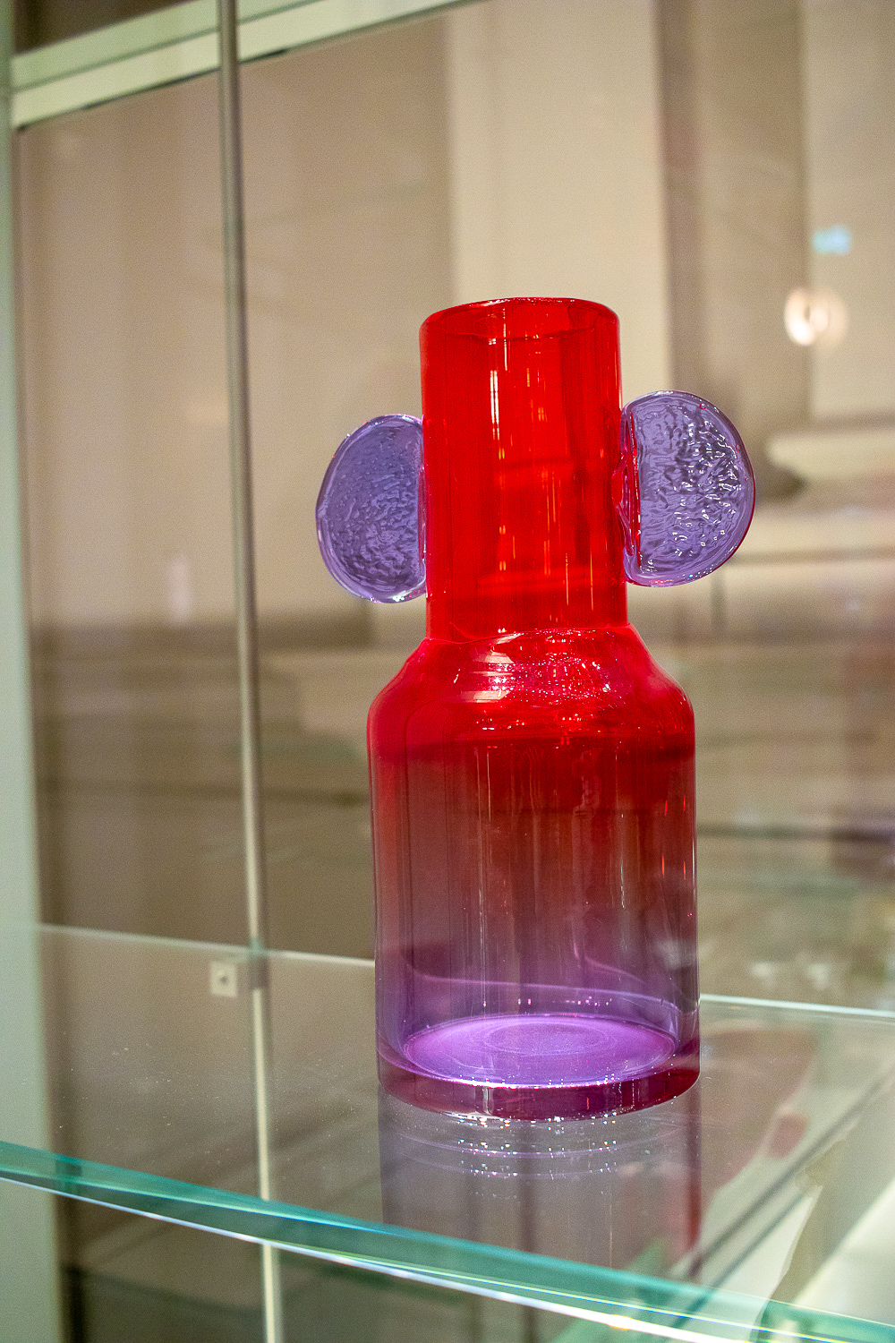
“The thematic approach will investigate similarities and differences in approaches across different media and countries, while highlighting the unifying philosophy of good design to enhance quality of life.”
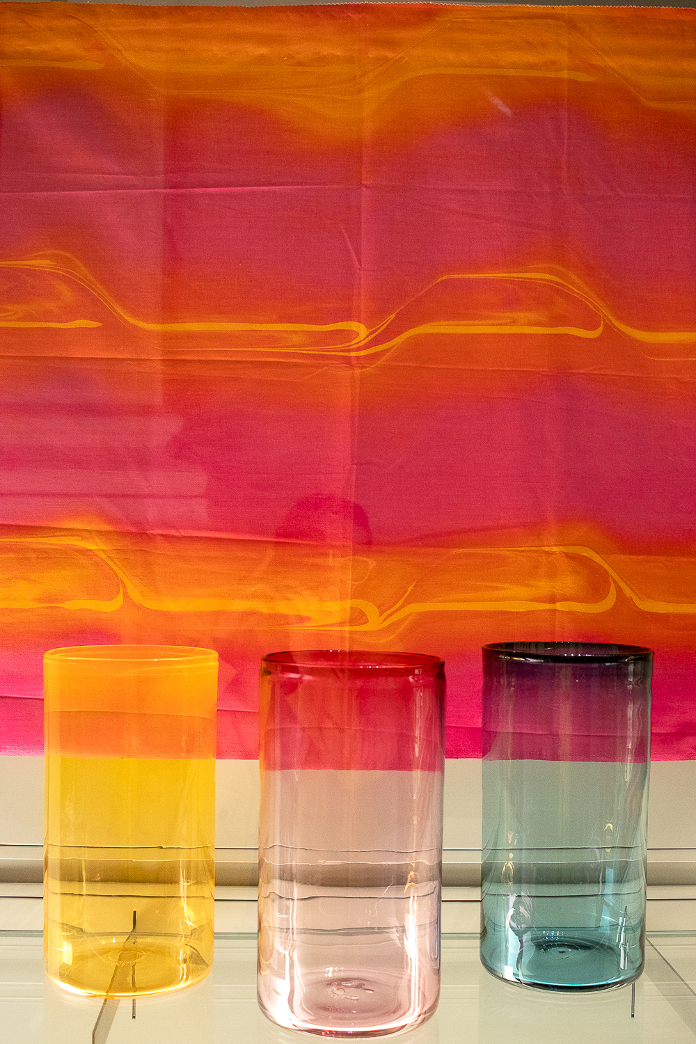
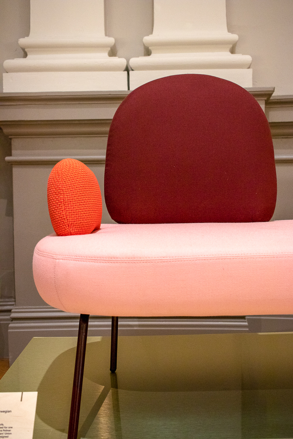
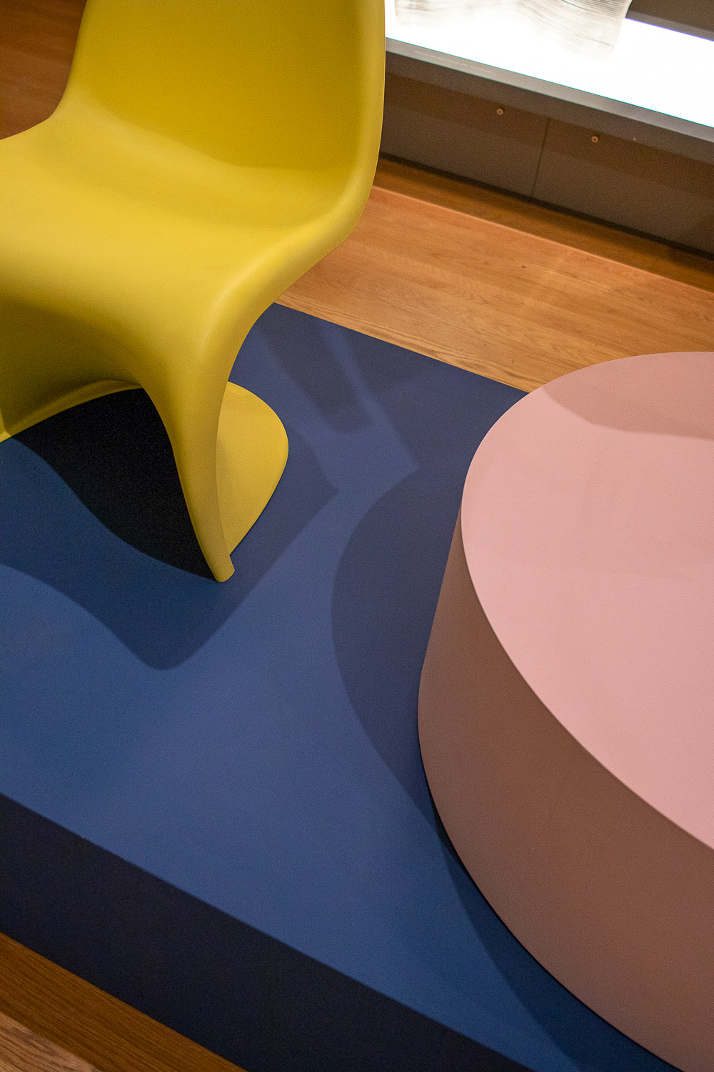
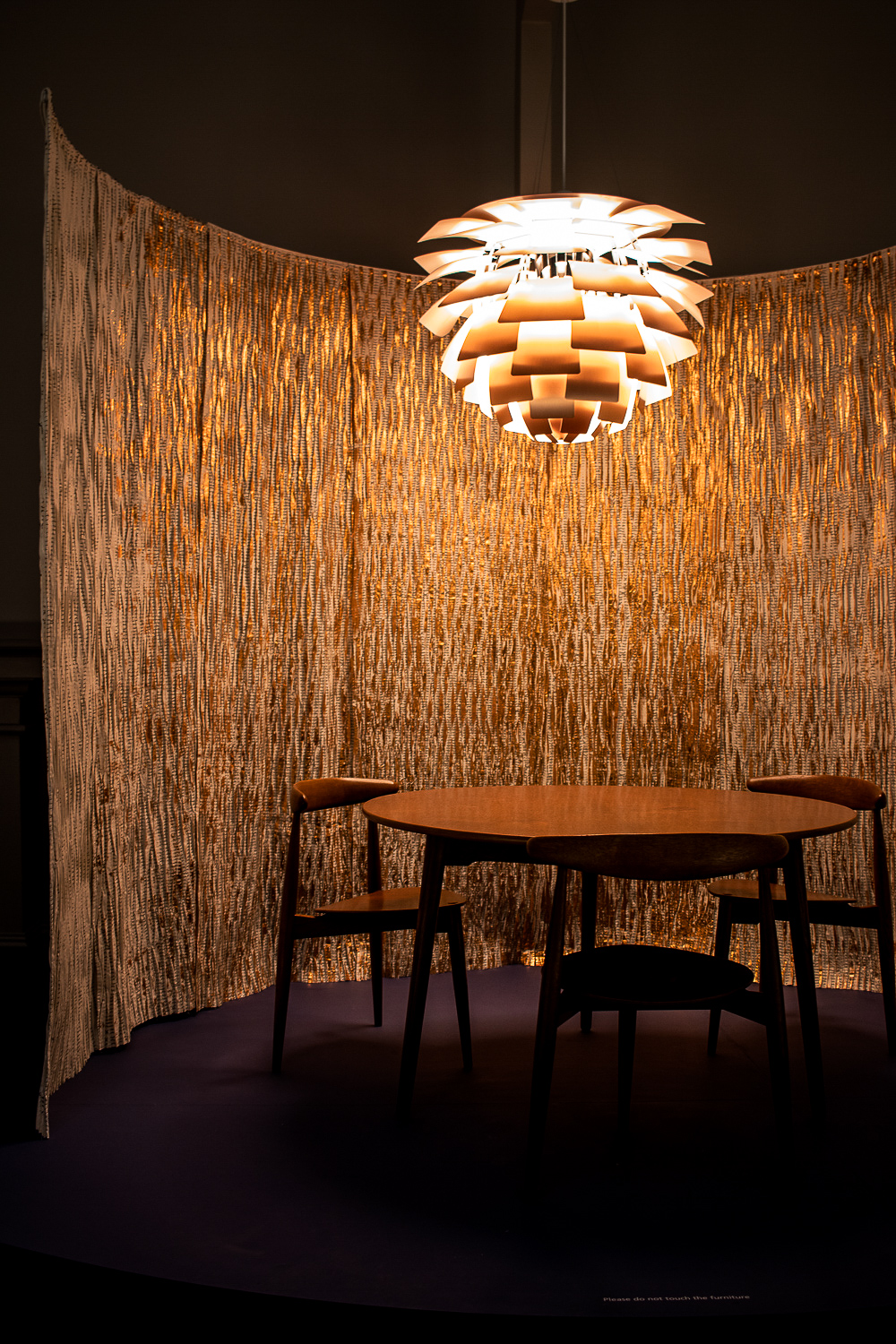
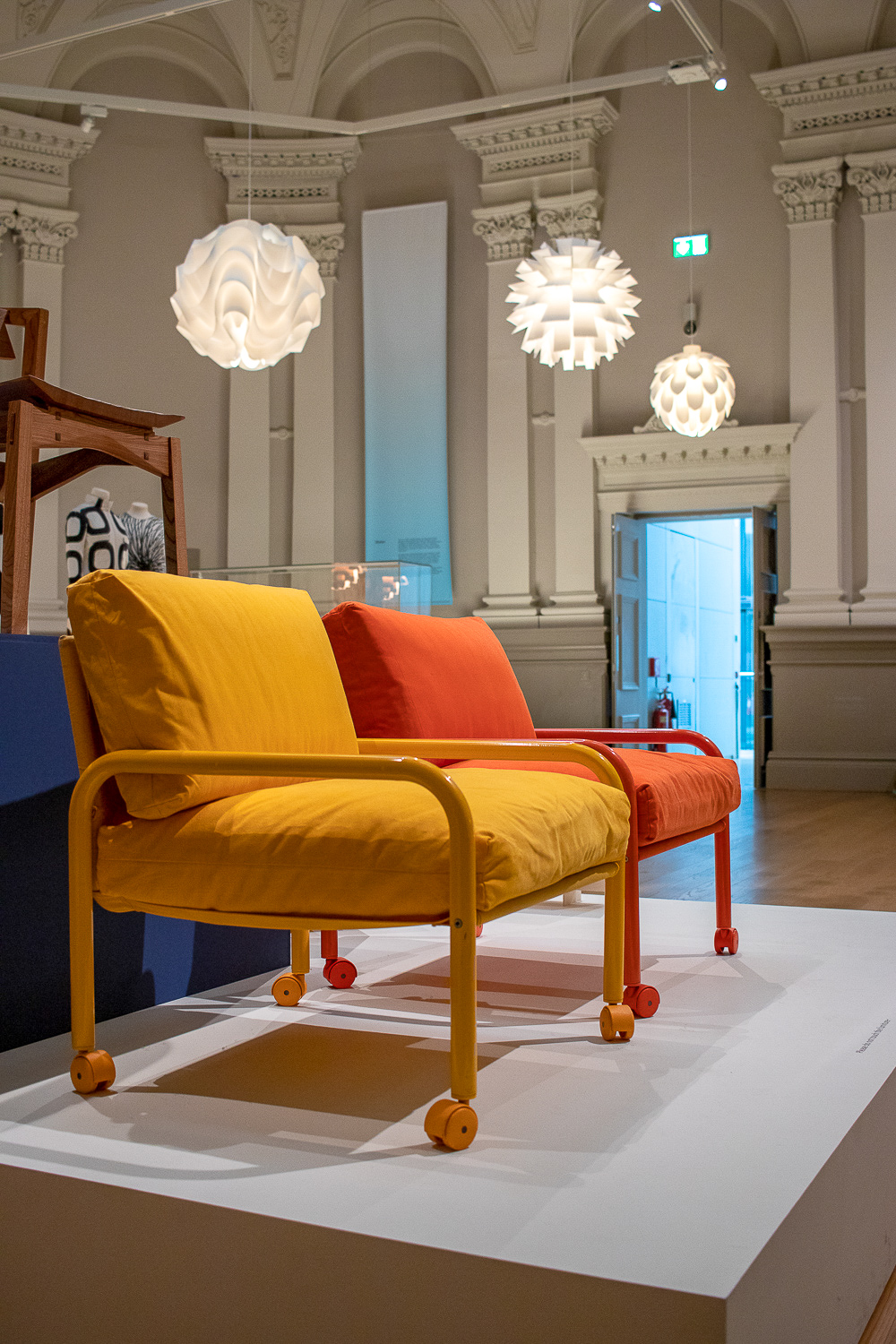
Me & my family will be celebrating a traditional Norwegian Christmas, like we do every year, with lashings of Ribbe, Sossiser, Kjottkaker, Sauerkraut, Akvavit and Gløgg before heading back to Norway in January to visit family and hit the ski slopes. But until then, I’ve always got my little slice of the Nordics here in Manchester, with my favourite pieces shown in this post.
I’ve probably visited the exhibit once a month since launch and shall continue to do so until it closes next summer. Design lovers everywhere, get yourself down to Manchester Art Gallery and challenge your ideas of what makes Nordic design so very fabulous.

