It’s been so long since I did any sort of decorating updates thanks to our big house move taking over the whole of 2017! So I’m absolutely itching to get back in the game and show off our big house project.
In case you missed it, I did a video house tour shortly after moving in, but I’ll also be showing progress of each room in the house with a dedicated Before, Progress, and After post – so you can really get a feel for the changes!
The first room to grace the blog is our 3 year old daughter’s bedroom.
The Room:
It was a funny decision to make: “which room should we put Luna in?” Mostly because we’ve never been in a situation to have that choice before. After a bit of thought, we’ve given her a bedroom in the loft conversion (the largest of the 2 bedrooms on this floor).
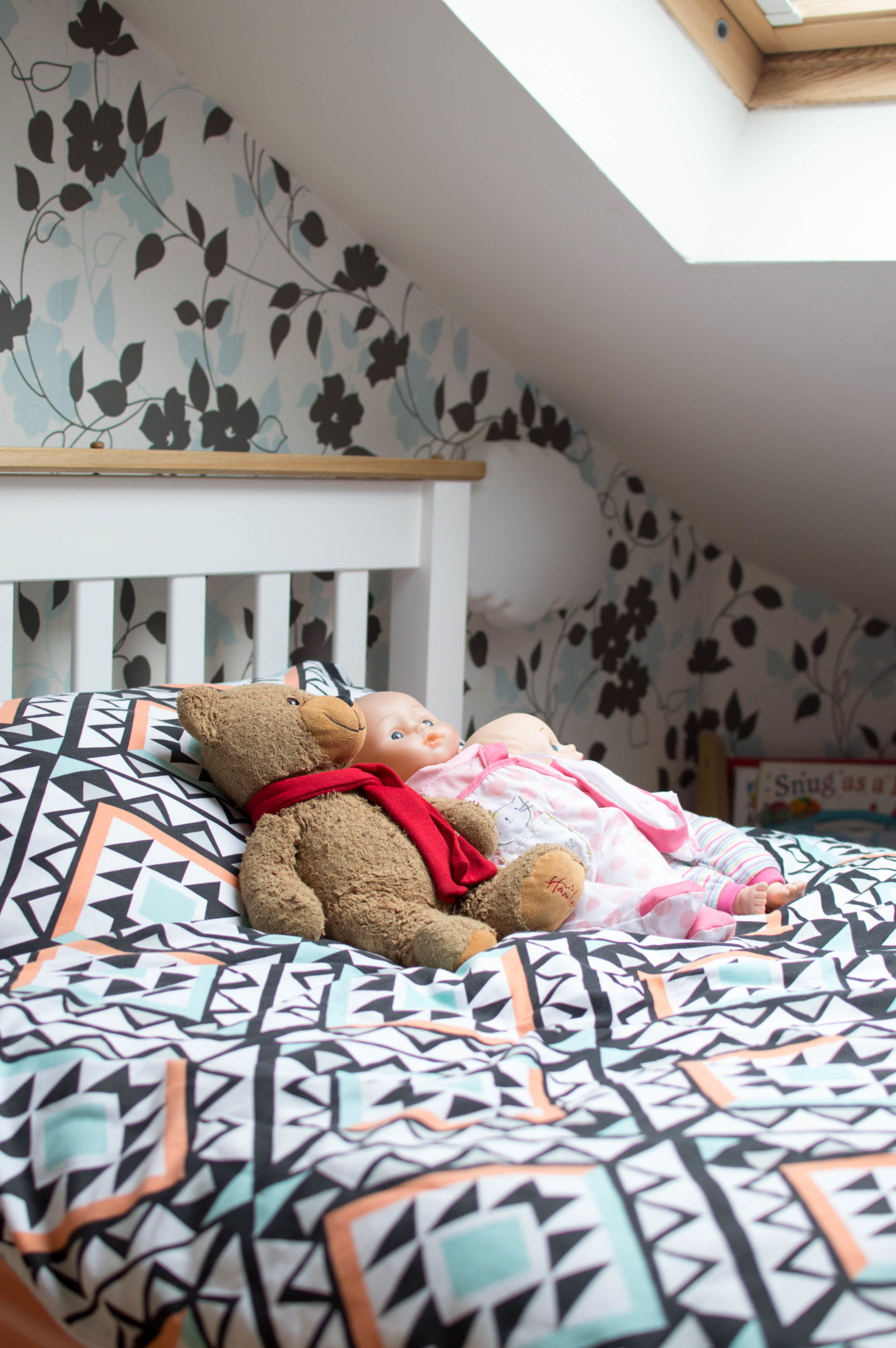
The roof pitching is incredibly steep for one half of the room, but this adds to a “den” feeling and is perfect for someone around 2 feet tall – spot on for a little hide-and-seeker. Not to mention the doors are narrower up here, as you can see below when viewed from the hallway. If we were to make use of the space at all, she would be the best one to enjoy it. We weren’t 100% sure at first if this was the right room for her, but thankfully she adores having the independence of sleeping on a different floor to our master bedroom.
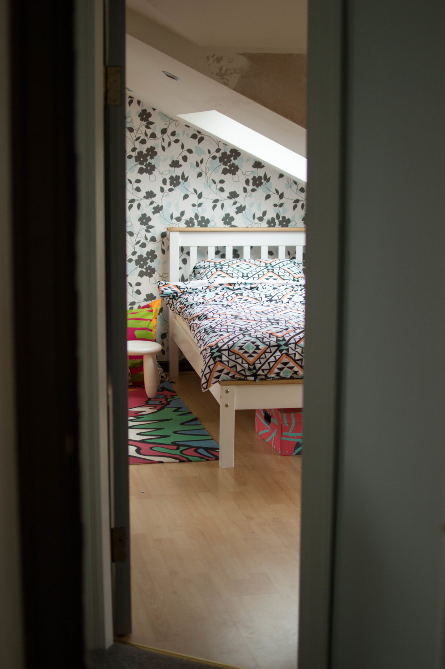
The Timing:
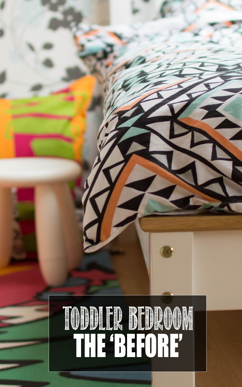
It’s been a conscious decision not to decorate Luna’s room immediately after moving – even though we’ve only been in a few months! She’d gone from her own lovely square room in a cot bed she’s had since birth (you can see her baby nursery tour here and the toddler bedroom here) with decor she had ‘helped’ (read: watched) put up. So when we moved, and decided to give her a grown up single bed, we felt a settling in period was only fair.
The Setup
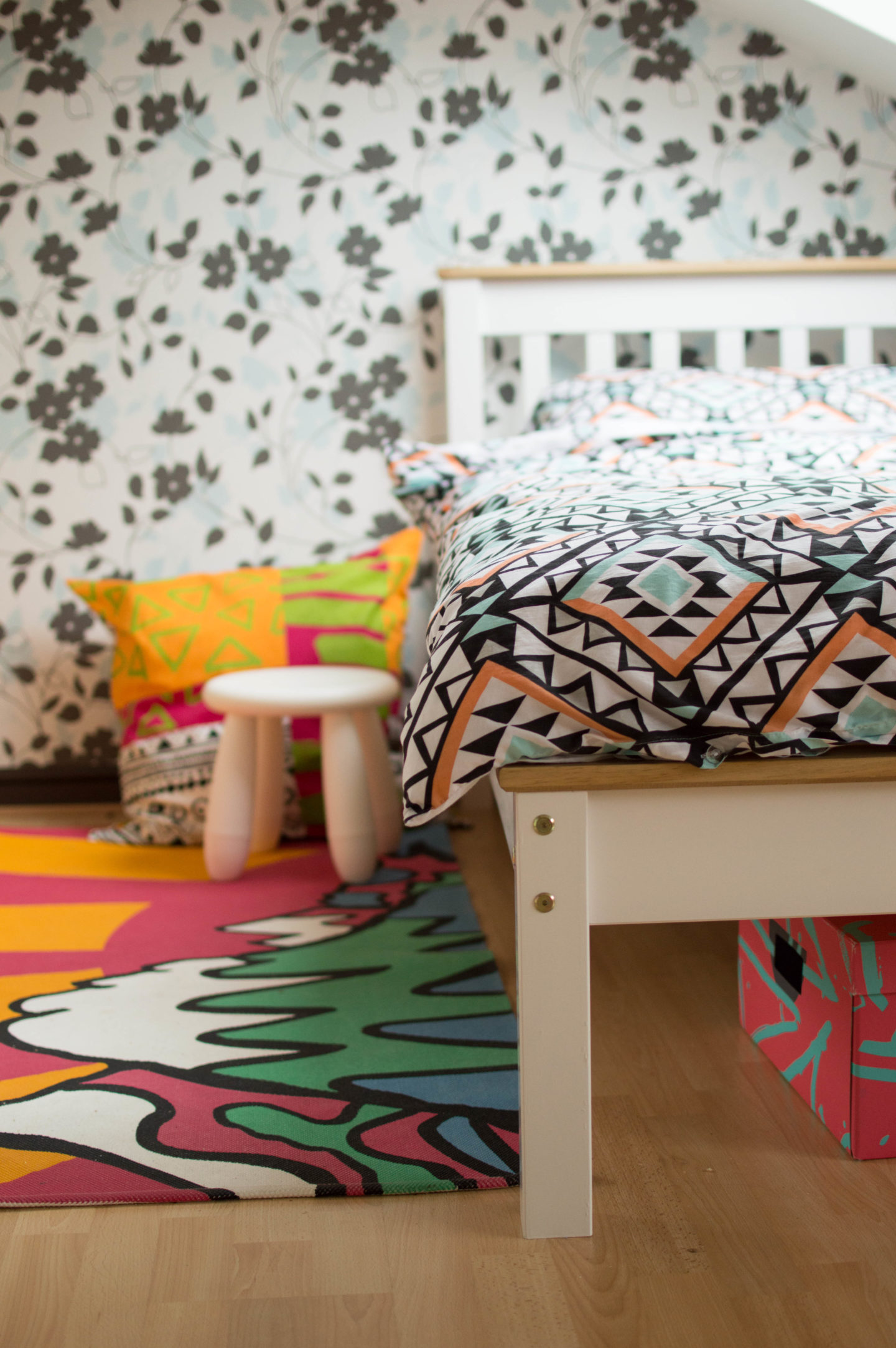
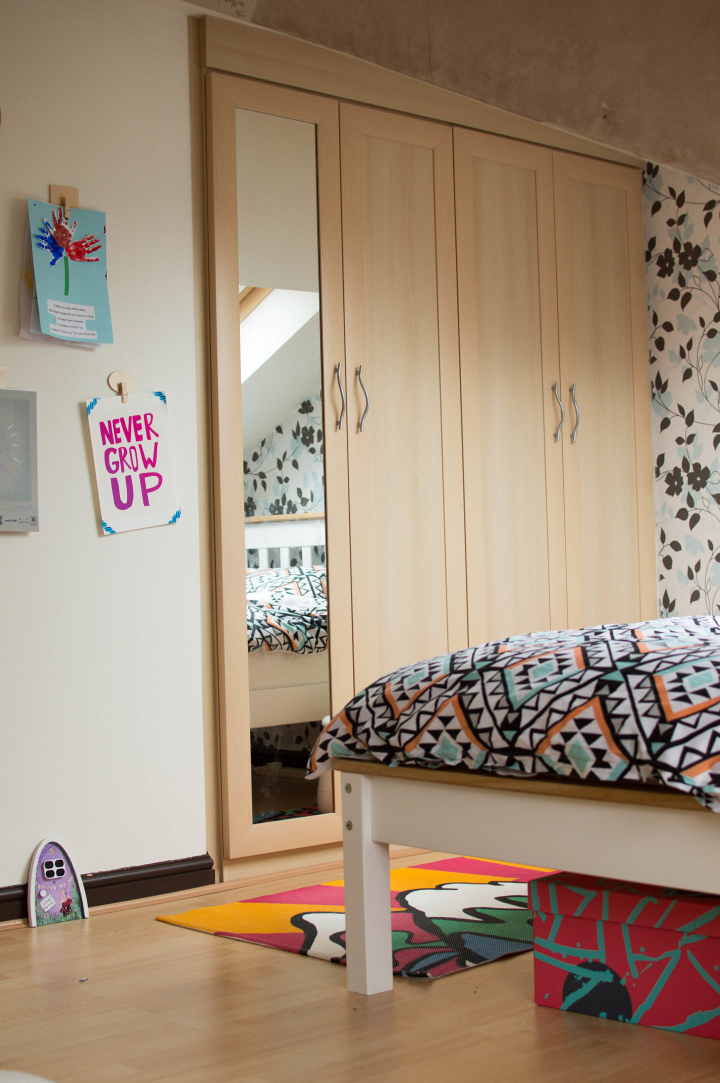
So what are we starting with before we decorate? Well, two beautiful windows bless this room with masses of light, and you can even see Manchester city centre from her bedroom as it’s pretty high up. (And the skylight above her bed means she can sleep under the stars if we haven’t closed the blinds) Wardrobes were built into the room as part of the conversion by the previous owners – plenty of space for her clothes, luggage, fancy-dress, the lot! It looks like a tight room due to the unconventional ceiling but there is plenty of space to grow into due to this clever storage.
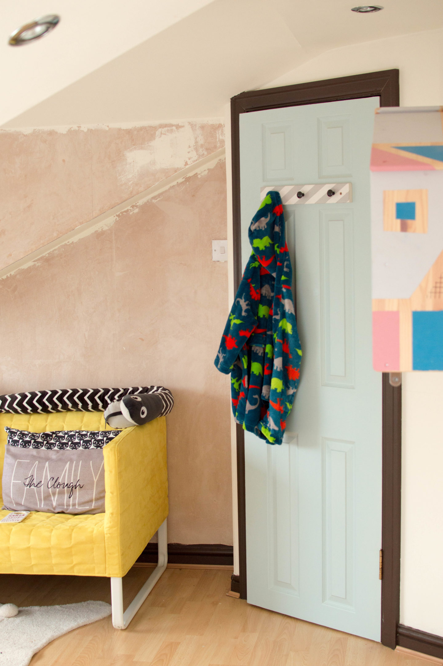
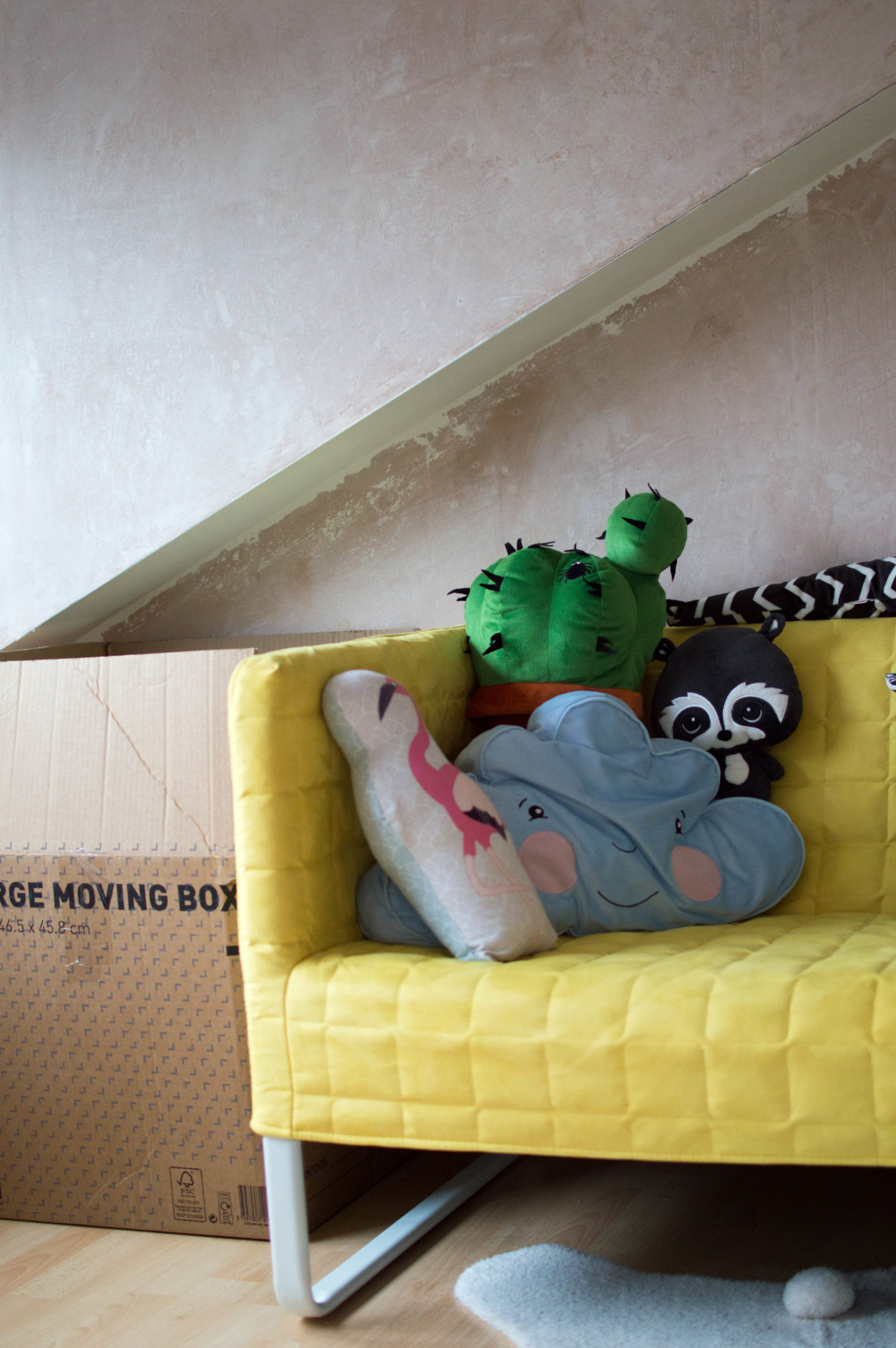
The walls are mostly white, with two of them featuring a floral wallpaper (which in some images you can see has already started to be removed). The skirting detailing has been painted brown and window sills and doors a duck egg blue! Interesting combo but one we’re going to change.
What We’ve Brought
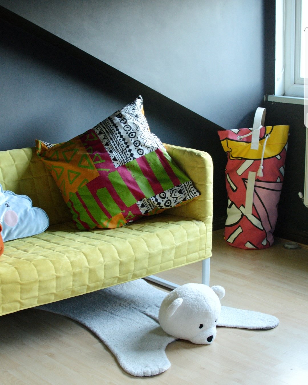
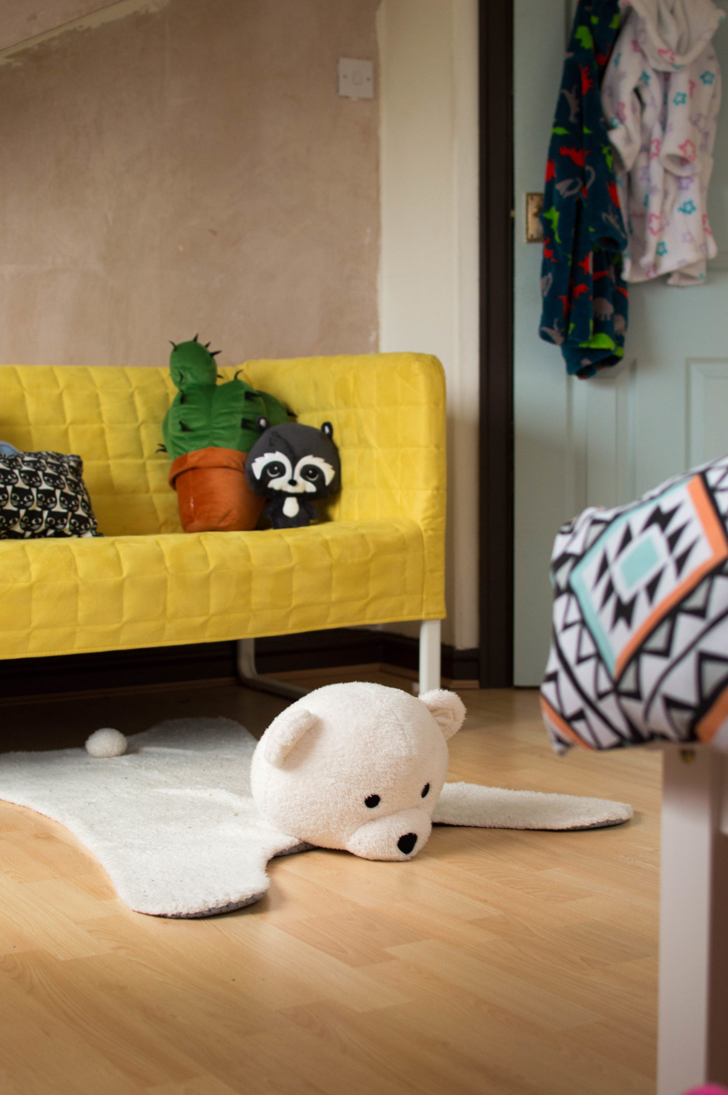
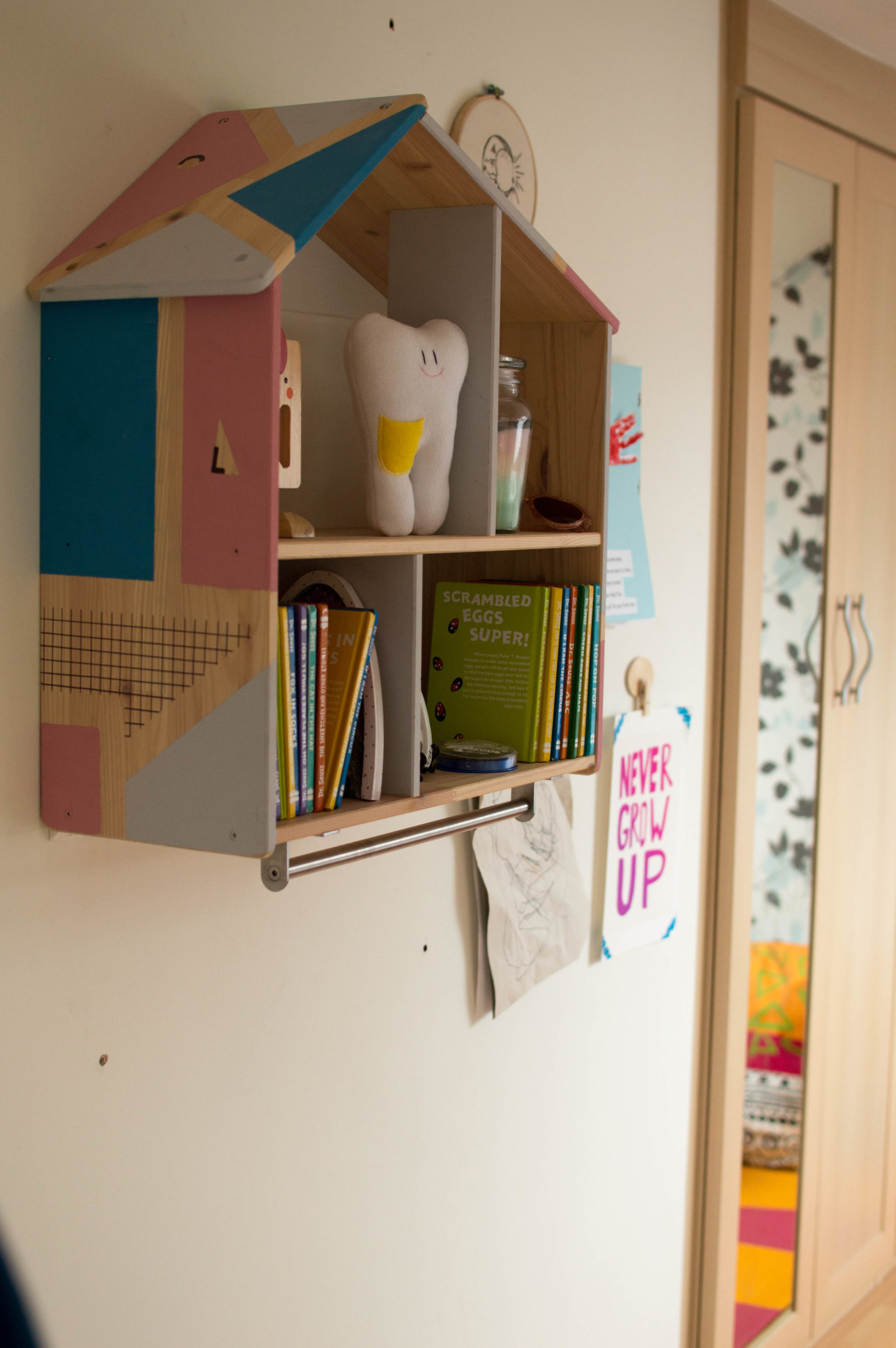
The bed is new (from Wayfair and an utter bargain at only £100 when we bought it) but everything else came from her last room. The Ikea yellow couch (Knopparp 2 seater sofa) remains her favourite, as well as the various rugs, enormous family of stuffed toys and plenty of reading books, shelves and bean bags. We’re lucky to have a dedicated playroom downstairs for any toys so we’re going to try and keep this bedroom space purely to winding down, chill time, and sleep.
We’ve just thrown it all in for now to help settle her and give a feeling of familiarity. The challenge will be finding cohesion with all of her stuff.

The Plans
Here is where the fun bit comes in. Let’s talk about what needs changing:
- This room is so incredibly angular, it will need softening. I want to paint the entire room in one blocked dark colour to help blur those sharp lines. I’m thinking of painting a curve around the door in a separate colour to add some much needed circular shapes to this space, but we’ll see how painting goes.
- The laminate floor isn’t my favourite but may be too much of a splurge to change right now. We’re not looking for a big budget project – just a way to make it feel like home.
- Natural light in here is in abundance but the other lights are in the ceiling and scream “sterile office” to me rather than cosy bedroom. If we can’t justify the cost of rewiring them, we’ll most certainly need another table lamp as an alternative.
- Even though the skylight and main window both have blackout blinds, I think some lush curtains across the main window would be lovely.
- The colour I’m thinking for the walls? Black. I’m going to write a post on this because the idea itself has sparked quite a heated debate. But, if we want a room to aid sleep for our overactive little girl, to not clash with her crazy colour combination of belongings, and to mimic the night-sky for which she’s named after? Well, it seems the perfect hue for me. Watch this space…
So this is the starting point!
I’ll be trying to get this room fully painted soon which should be quite a transformation in itself from the half shredded wallpaper/ exposed plaster look we’ve got going on currently. I don’t want to spend masses of money here, but rather use what Luna already sees as her prized possessions in a way that she can fully embrace them.
I’ll be back soon with a progress update before the final reveal. Keep up to date with me on Instragram

