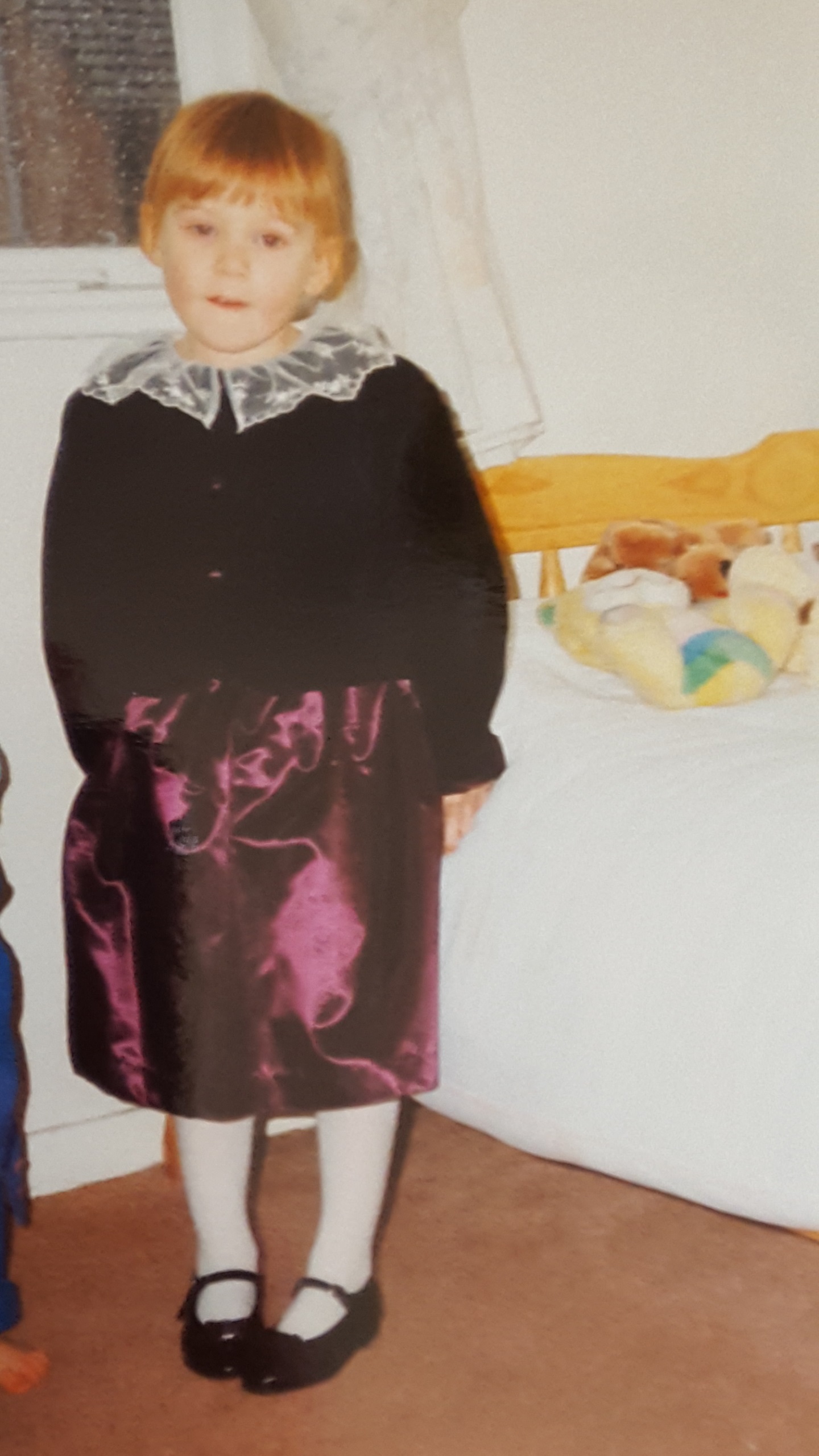
For those that know me well, you’ll probably know how much I truly believe I should have been hanging about in the 80s. Okay so technically I was, but I was just kicking it in my purple velvet dress (see exhibit A below). Well ahead of the curve you guys.
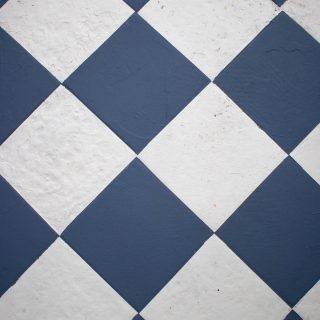
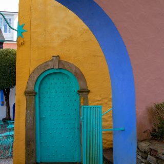
The Memphis movement is probably my favourite design movement of all time. It’s completely fearless, it’s colourful. it’s geometric. It’s abstract. Sure it won’t work in every home and is a bit in your face, but in terms of playfulness it’s right at the top for me.
This era has always been the one for me.
So when Dulux announced it’s Colour of the Year for 2018 as a heather-inspired mauve, I was actually OVER THE MOON. Because it inspired so much of that decade.
That might surprise some of you with it being quite a muted shade, but it reminds me so much of the completely monochromatic colour schemes that rocked the 80s. The lilac-laden walls complete with neon and emerald greens over brass. I feel like the generation above me would shudder at the thought of an entirely mauve interior, but not this gal. And let’s face it, all of these elements are making a comeback in a big way! But enough about my love affair with the year I was born. Let’s talk colour.
WHY HEART WOOD?
Heart Wood is a warm neutral which sits somewhere between a smoky taupe and a dusky mauve, according to ColourFutures™, Dulux’s trend-forecast team, now in their 15th year!
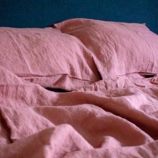
To me, it’s definitely a muddy colour but not to the point where it leans so far into brown that I’m bored. That pinky undertone really makes it. Esepecially when you consider how incredibly popular inky blues (thanks to last year’s colour choice, Denim Drift) and dusky pinks have been over the past 18 months, with no signs of slowing down – which would both pair beautifully with Heart Wood. It’s a complementary tone for what we’re already currently lusting over.
WHAT’S THE VERDICT?
“Dulux’s colour of the year for 2018, Heart Wood, is incredibly versatile, and connects beautifully with the accompanying trend palettes for the year ahead. Providing the comfort and reassurance we’re all seeking, it’s the perfect antidote to the mood of the moment – channeling a real sense of calm and warmth during such times of uncertainty. We can’t wait to see homes across the globe transformed into true sanctuaries.”
–Rebecca Williamson, Senior Colour and Design Expert, ColourFuturesTM
I’ve spoken to loads of people about this and the honest verdict? Mixed. To my interior chums, it’s a really bloody good choice. To my everyday mates, it’s just another shade of brownish taupe. Which makes me think, are us interior addicts more swayed by the why than the what? After all, the messaging of Heart Wood is all about creating a sanctuary in your home. Making it a place of stability and utter relaxation when the world outside seems to turbulent.
So perhaps all the general public need is some direction as to how it can be used. Thankfully, Dulux have done the hard work for us.
HOW CAN YOU USE IT?
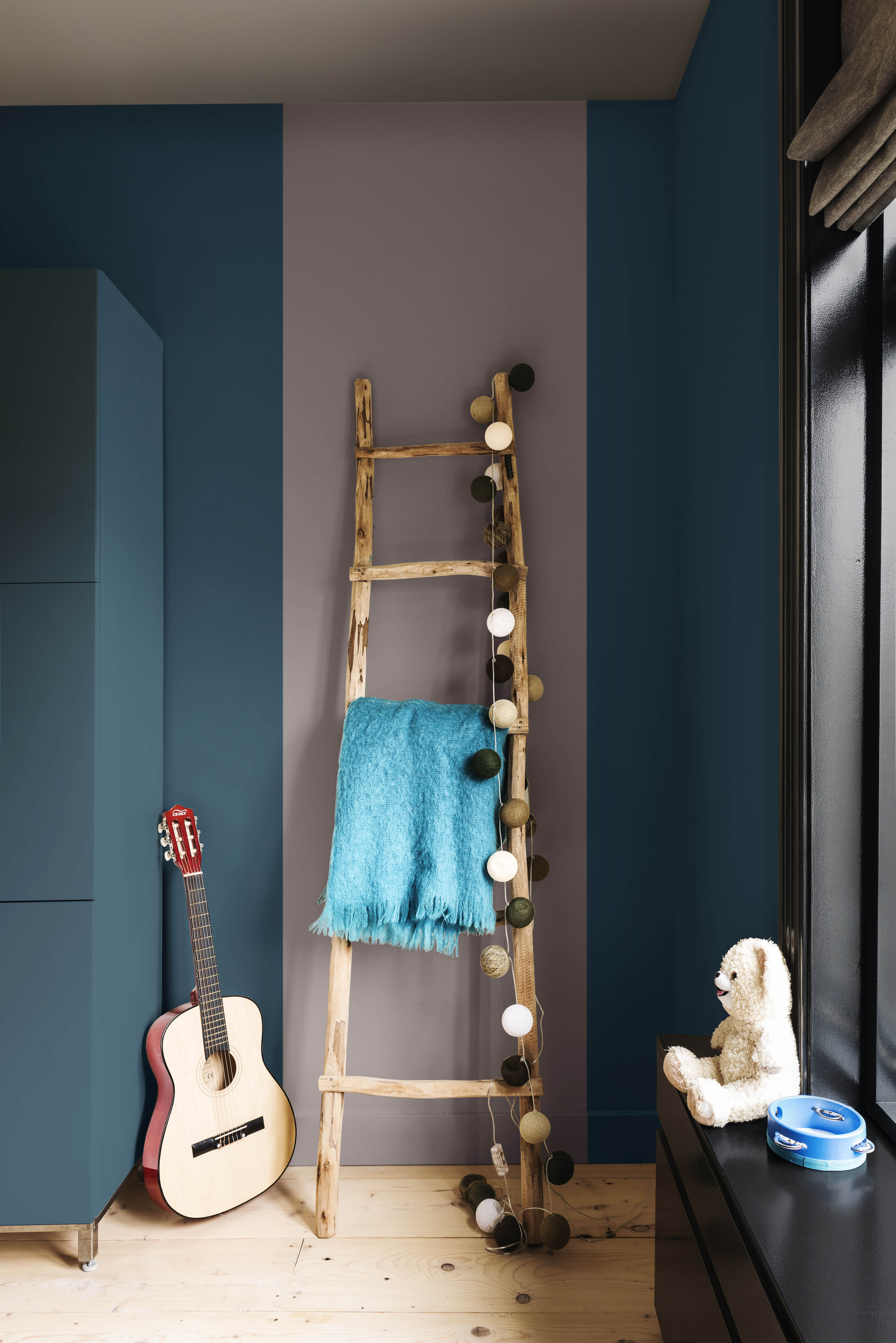
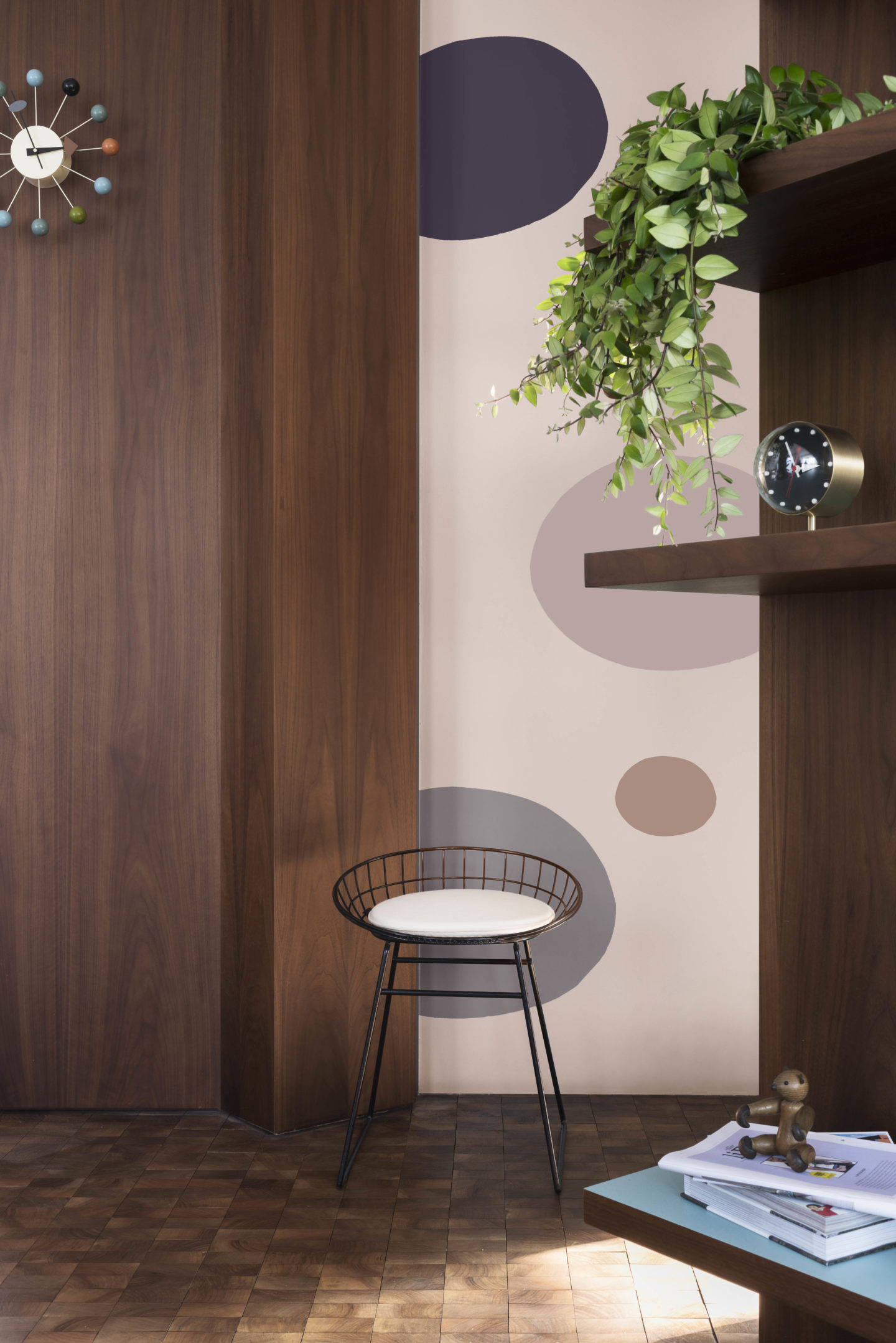
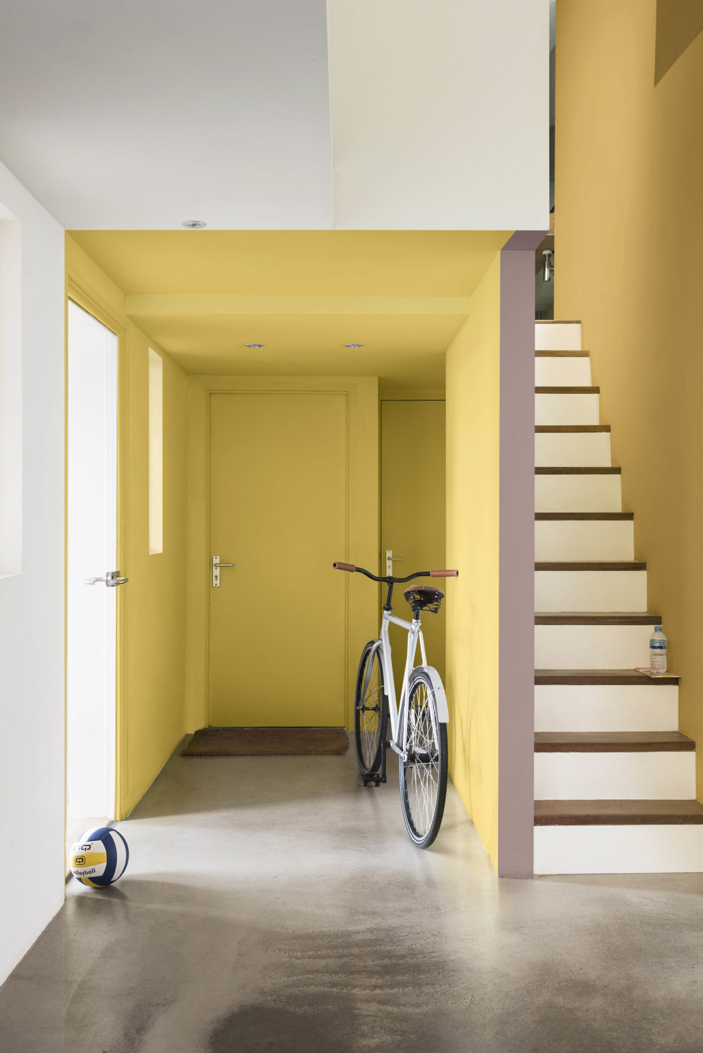
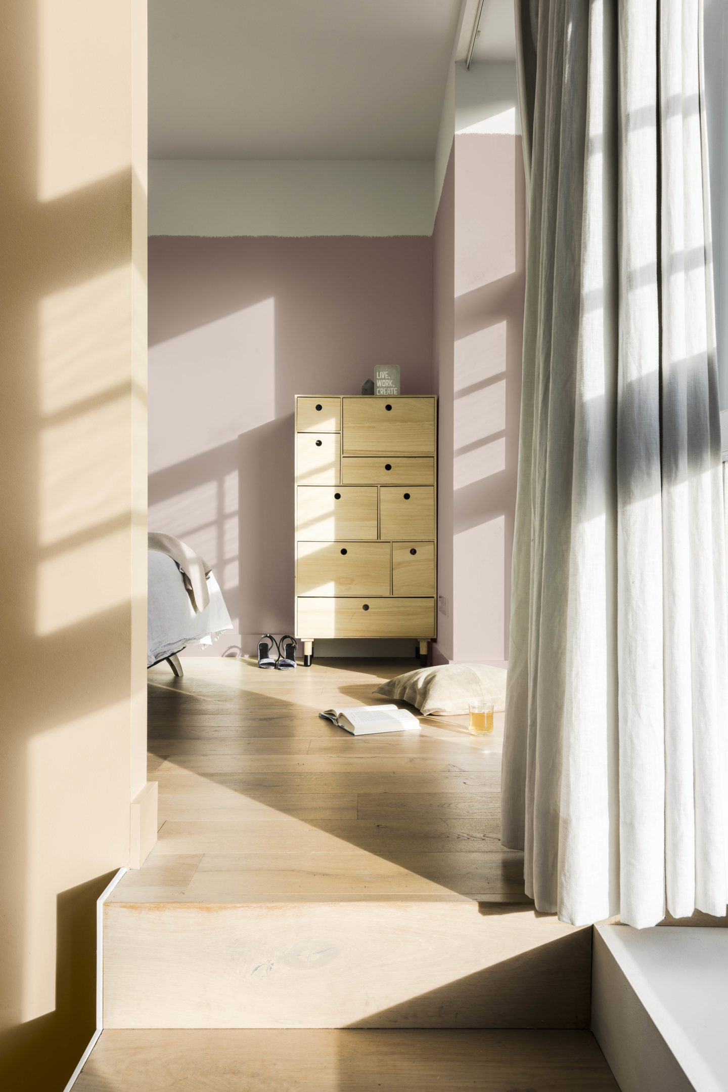
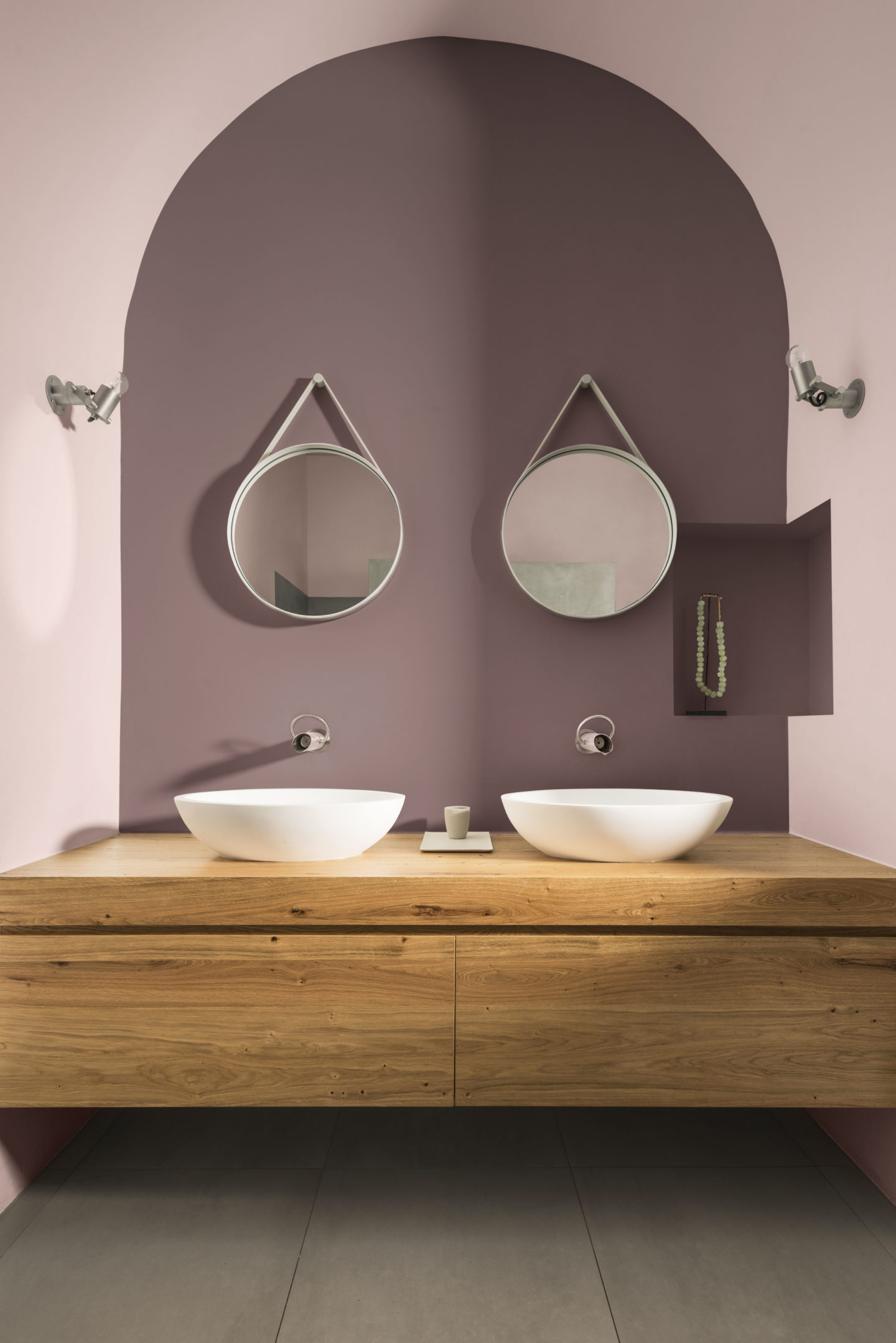
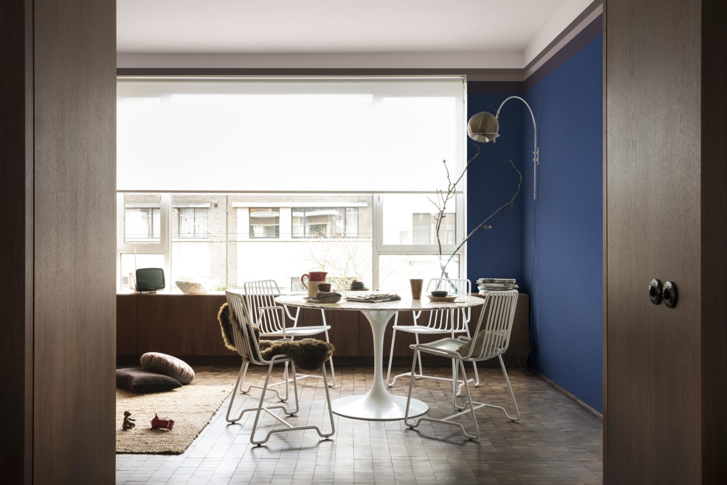
Dulux have separated their colour trends into 3 themes; the comforting home, the inviting home, the playful home. But above all it’s a welcoming home. Below are some of my utter favourites from their lookbook, showing that it’s versatile enough to stand alone as a feature colour, it can compliment original features should you choose it for skirting boards of cornicing, or it can be used to balance out brighter, bolder tones.
HOW WOULD I USE IT?
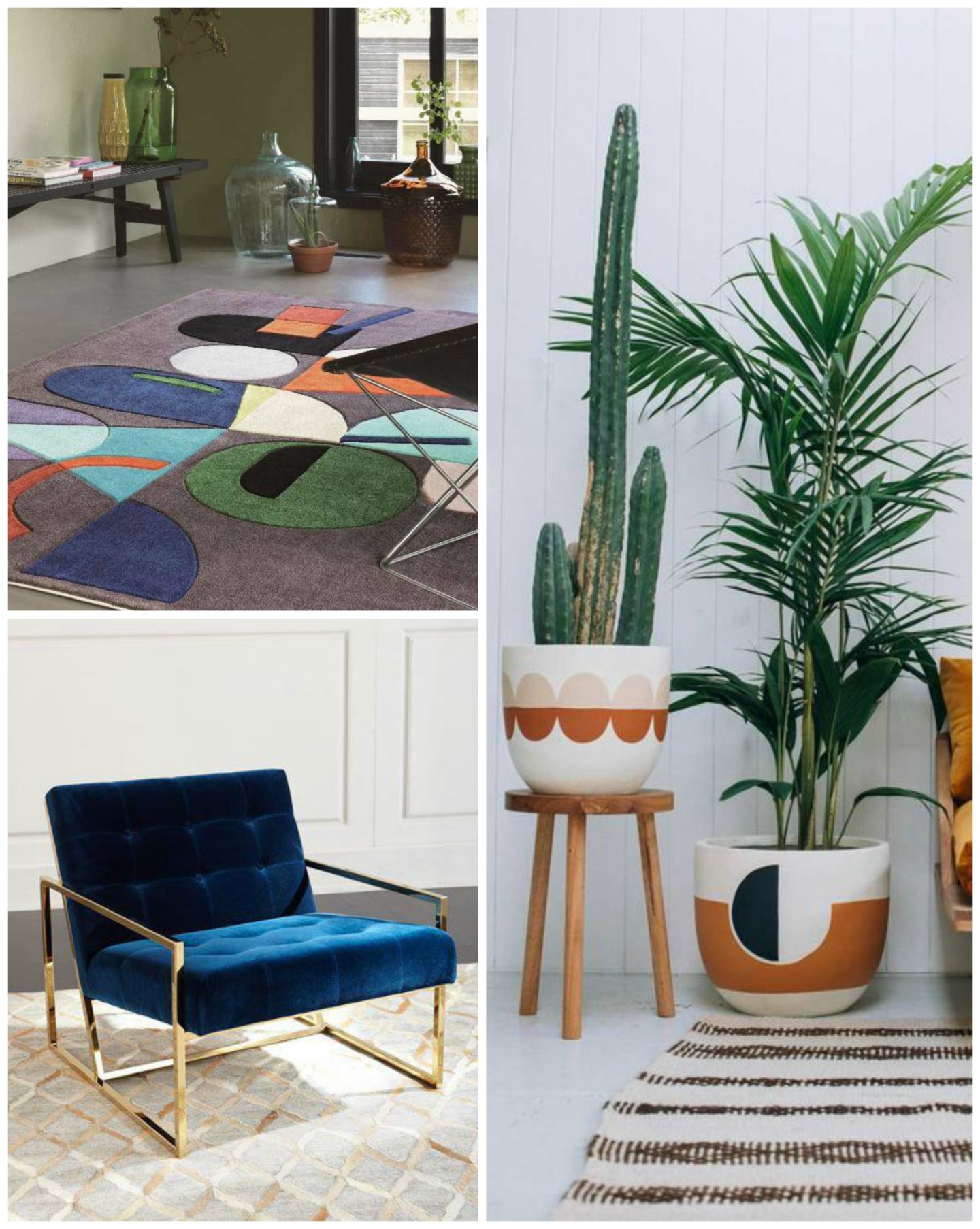
Hopefully you’ve got plenty of ideas from above. But for me, I would really love to see it against some orange tones. Take a look at this Moonlight rug below (from Modern Rugs – very seriously thinking of ordering this for our new lounge). It’s the perfect example how well that mauve colour marries with blues, green….and pops of orange. Paired with oversized plants (below examples from Pop and Scott) and brass accessories (can’t go wrong with the gorgeous blue used in the Jonathan Adler beauty down there – it’s his Golfinger lounger if you’re wondering), and you’ve got a winner in my eyes with all the right amount of nods to the decade I adore so much.
I’d really love to hear which one is your favourite, whether you’ll be using it in your home, and how you’d pair it together! Colour is a really subjective thing which everyone sees differently but Heart Wood is a neutral which everyone can get on board with. I’m sure of it.
