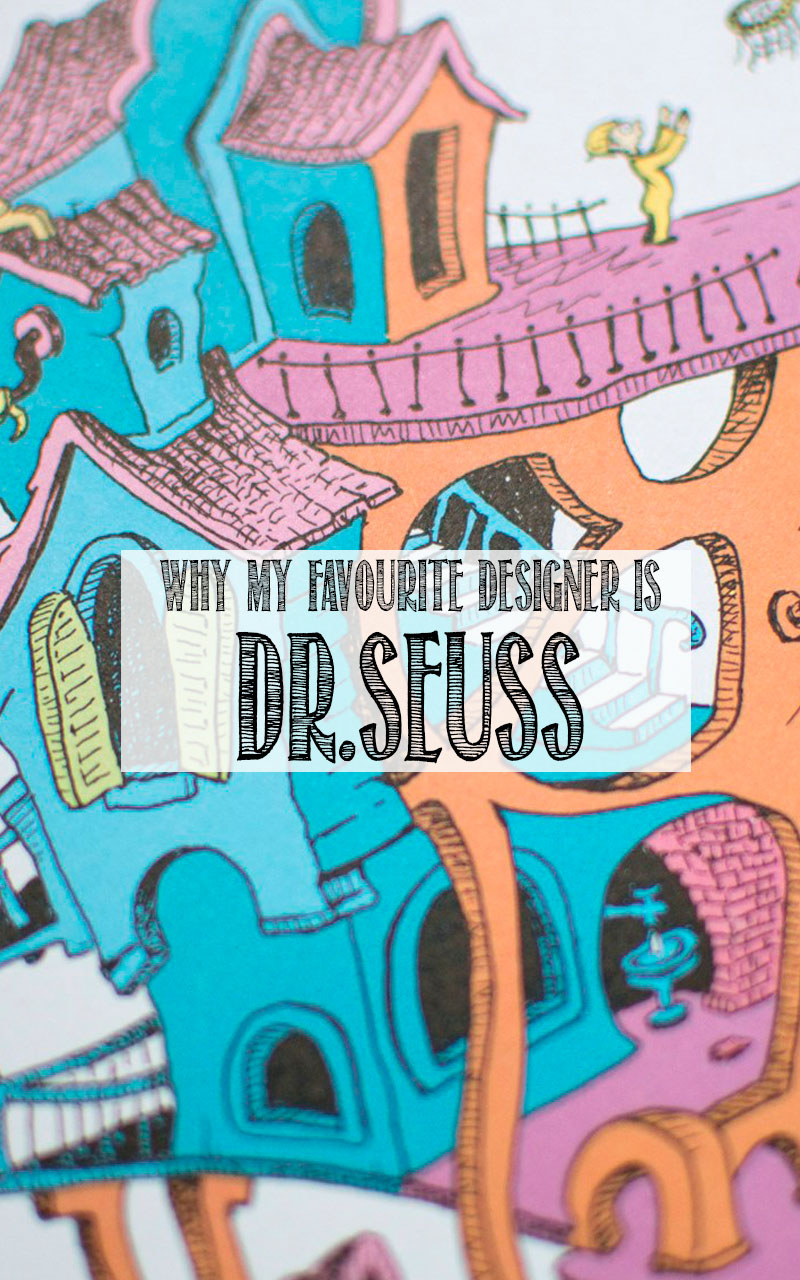
 It’s probably not much of a secret that I’m a big fan of Dr. Seuss.
I’ve long loved his illustrations and adored his books as a child. Myself and my sister, often mistaken for twins, acknowledge each other as Thing 1 and Thing 2, lovingly of course. As an adult I can appreciate Dr. Seuss for the philosopher he was (and if you’re not aware of him in this way I would encourage you to read Dr. Seuss and Philosophy: Oh, the Thinks You Can Think! because it will blow your mind.)
Now that I’m a mum, we’ve handed down a collection of the famous Dr. Seuss books to Luna and I am so chuffed that they’ve become a clear favourite at bedtime.
As we’re flicking through the pages and talking about what we can see, I’ve become more and more aware of how much of a KILLER designer he was too.
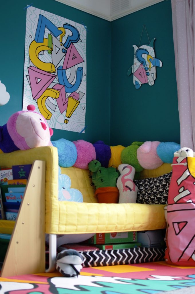
Following the reveal of Luna’s bedroom makeover, I realised the extent to the influence his stories and illustrations had on my decorating choices – and with that in mind here is exactly why I think Dr. Seuss is one of the greatest conceptual interior designers & architects of all time.
Mood
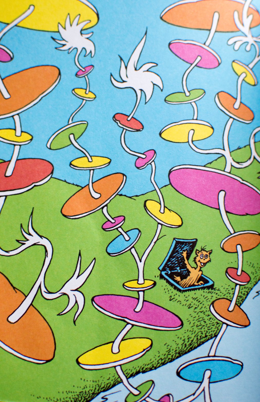
Toddlers don’t understand words on a page. They see colour and composition. They look at the whole image as a single entity and interpret the story through that picture. Seuss is so wonderful at using colour, and depth and white space as a way to nail on the head exactly how that story is unfolding. This is something we need to do more in our homes to make sure the rooms we spend time in, are fit for the reason we’re in there.

Texture
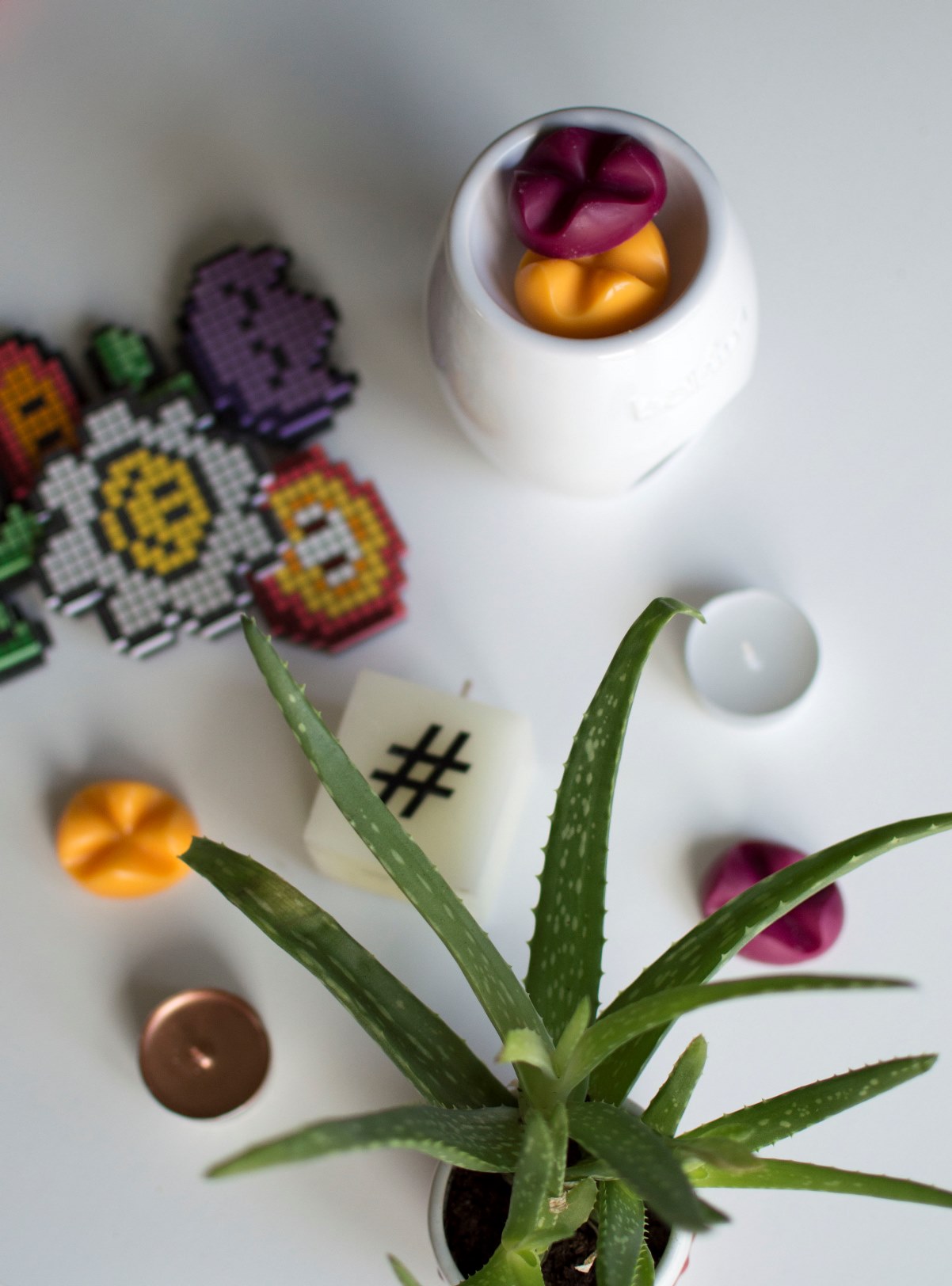
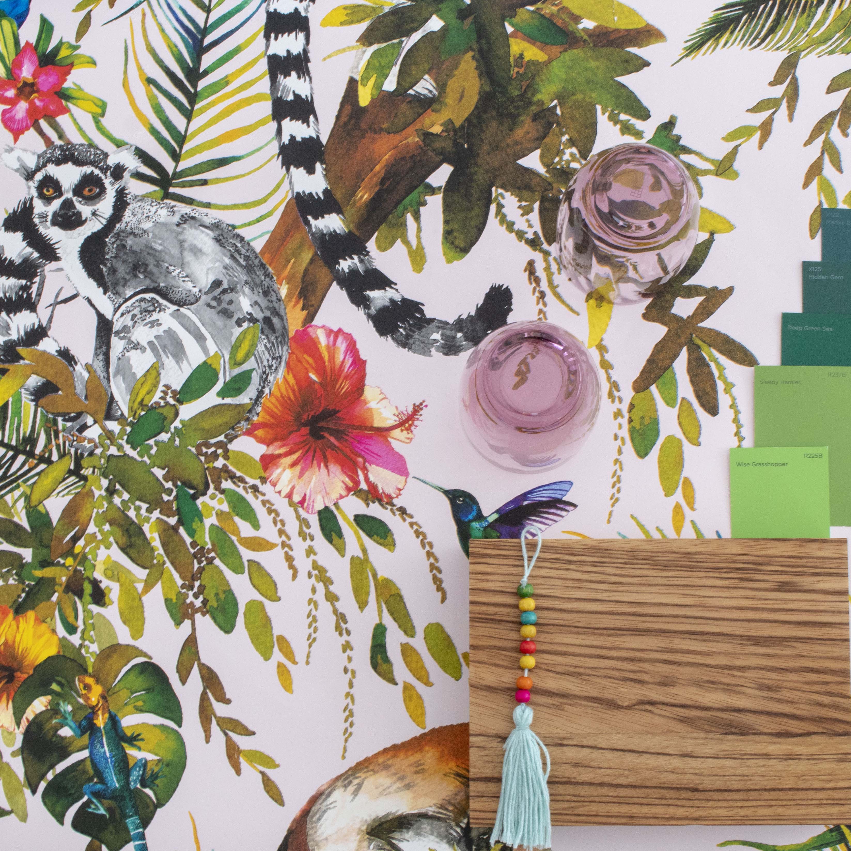
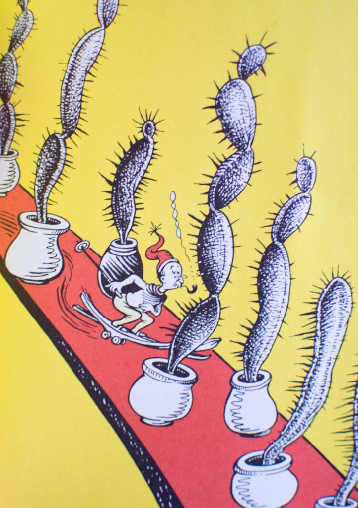
I read over and over again how important texture is in design. Not just in interiors, but for all creative measures. In Seuss’s world, trees can be furry, water can be fiery, and hands are pointy, sharp and rough. The unexpected gives us interest that we might not have seen in the mundane – and it forces you to look at everyday features in a new light.
Shape
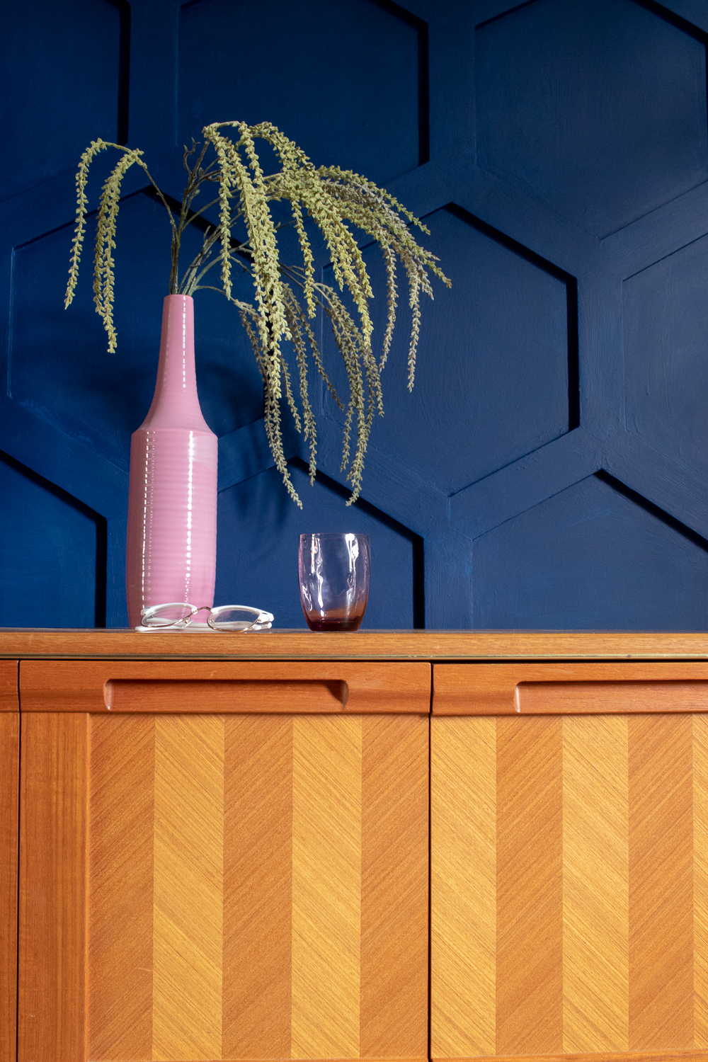
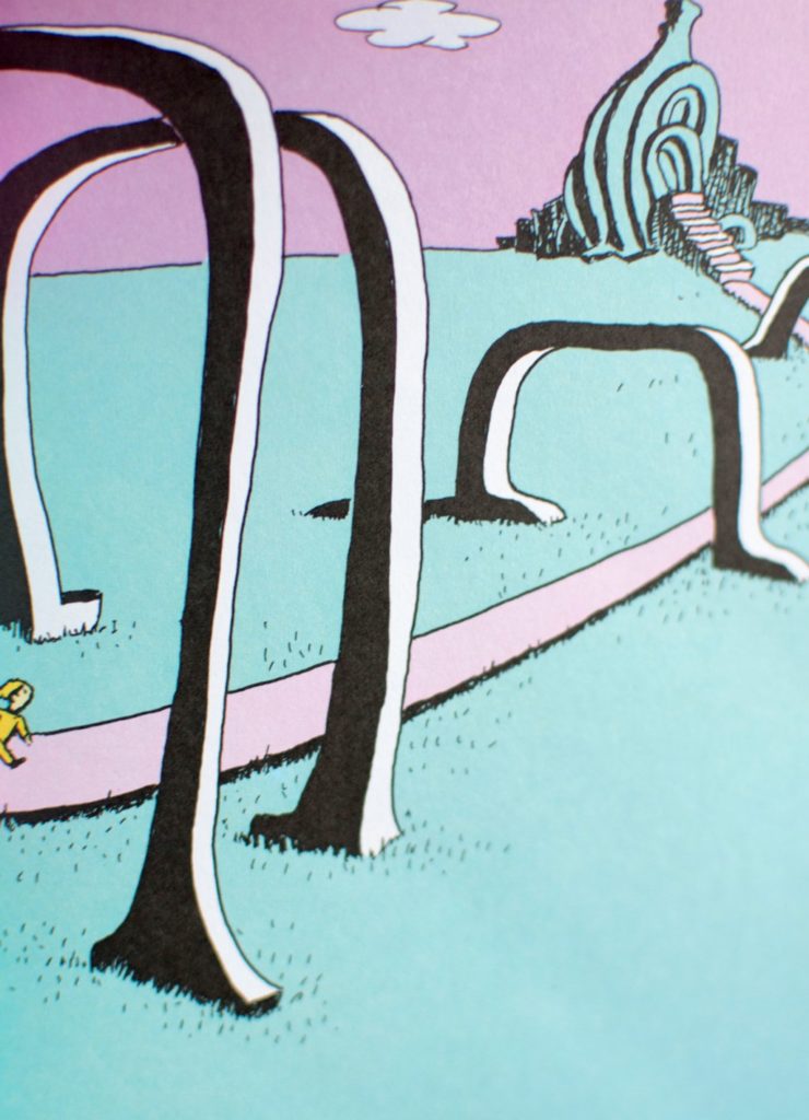
Who said door frames always have to be round? Why would your house be sat on the ground when it could have legs? Why not live on the top of an incredibly tall and pointy mountain to get the best view in town? He may not be a practical fellow in his designs but he’s sure not afraid of challenging the norm. Whilst I’m doing a bit of house hunting at the moment, if I’ve learnt anything so far, it’s that I don’t want to live in a box. A house is nothing without character.
Colour
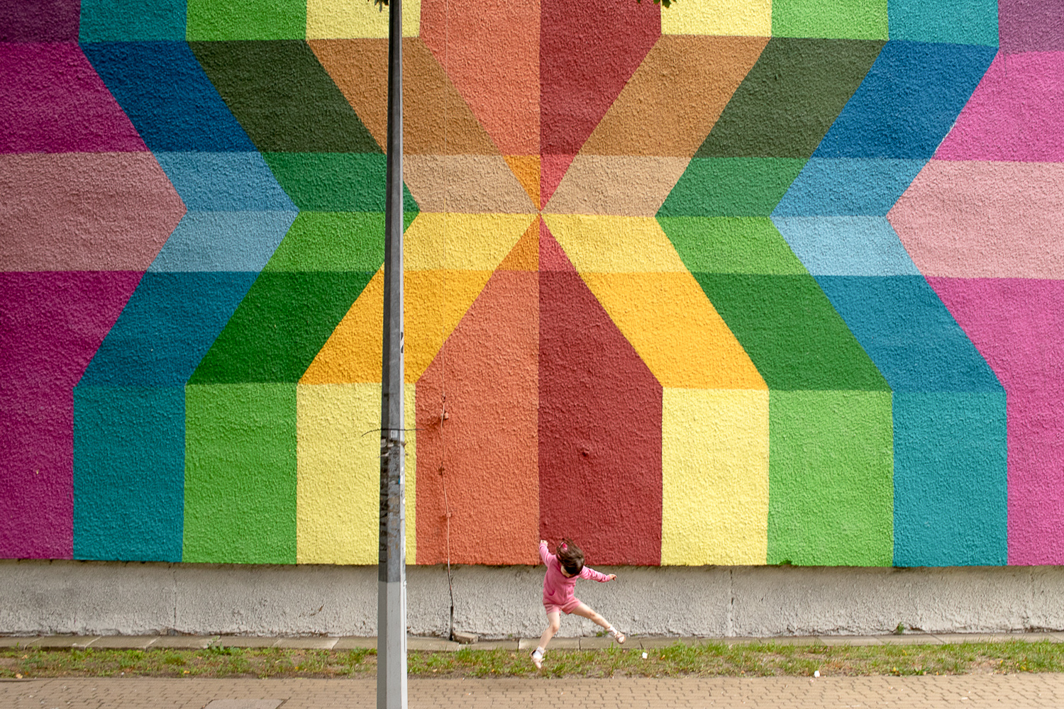
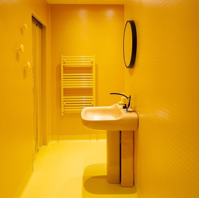
Probably one of Seuss’s most recognisable elements are his colour palettes – particularly that red, white and blue. I’m not suggesting you all go and paint your homes in primary colours so it feels like you’re living in a Mondrian painting. BUT. Don’t be scared of colour. Even if there is only one colour you like, monochrome the shiz out of it. Seuss can take a universe and make the whole thing green, but it doesn’t look out of place. He’s the King of clashing, and it works because he absolutely owns it.
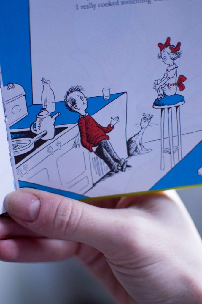
I think it’s worth bearing in mind at this point that I have absolutely no formal qualifications when it comes to design or interiors but hey, art is subjective – and I do consider both Seuss and interiors an artform. This is my interpretation and I’d absolutely love to hear what weird and wonderful aspects of life inspires you!
