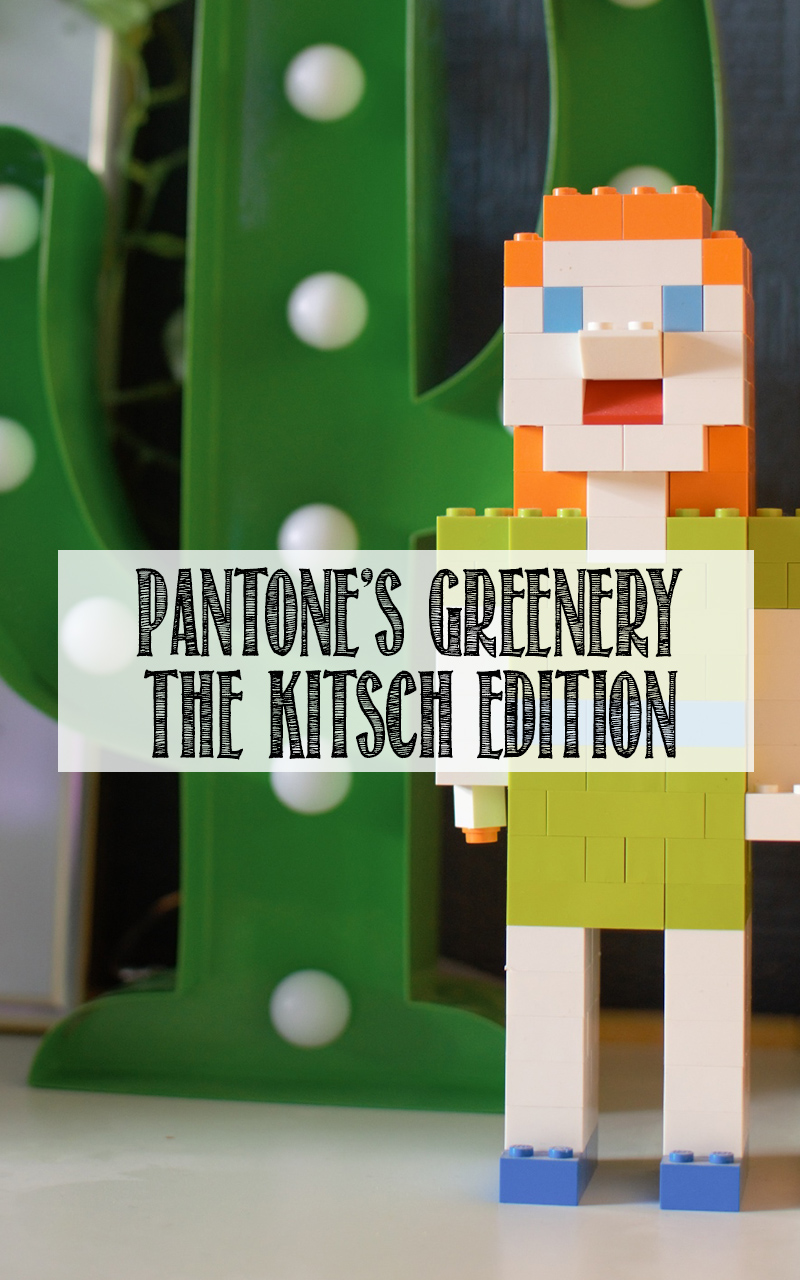
Greenery. Where to begin. After Pantone announced in December that it was to be its colour of the year 2017, like many others who write about interiors and design, there was a bit of pause for thought.
Do I like this colour? Why the heck did Pantone pick this lime green Kermit the frog monstrosity? Are we really expected to use it in our homes?
However, after letting it stew for a while, I think I’ve changed my tune. Y’see, it came to me that I’ve actually got loads of it already in my house despite being a really ‘IN YOUR FACE’ hue of green – in fact, it was even the colour scheme for my wedding!
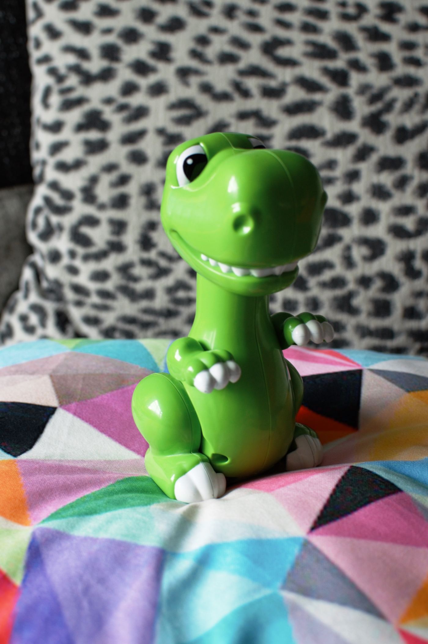
Can’t quite believe I forgot that for a second… We even kept most of the centrepieces and lime green dinosaur ornaments (yup, that was the theme) around the house so it’s always sort of lingered!
So I thought I’d ‘shop my home’ so to speak in order to showcase the colour, in a kitchy fashion s is the style around most of our living space. I’m using the citrusy tone of Greenery purely as a guide. It’s a really OTT, almost neon kind of shade and if you manage to pull this off plastered on the walls, then let’s see how you’ve done it! For me, the way to work it is with pops against dark walls, through added plants where ever you can, and embrace the madness of it. Take a look…
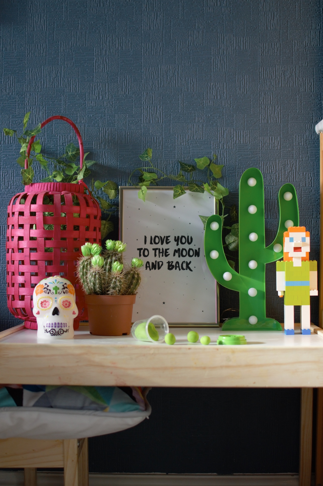
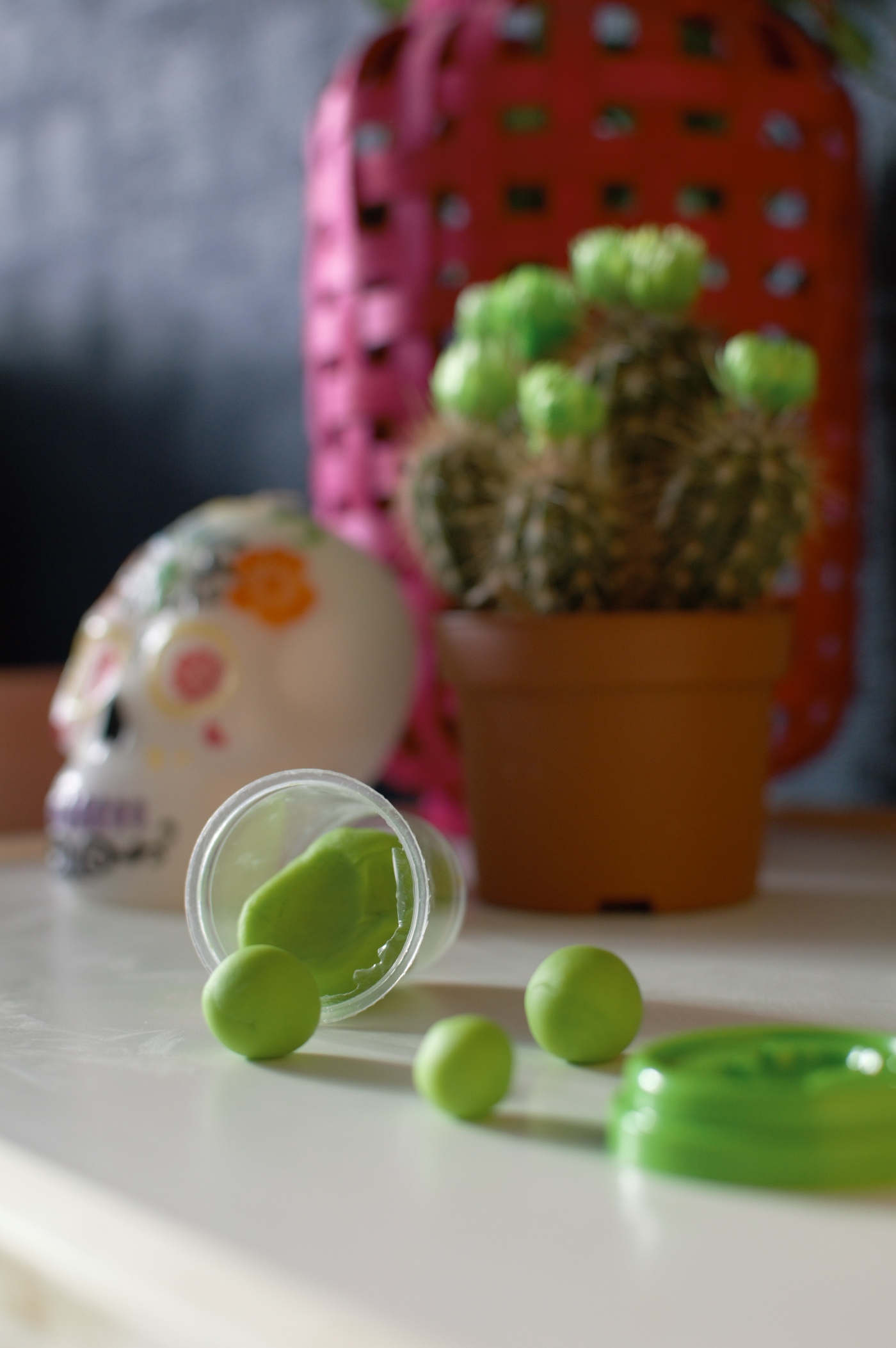
Now, if you’re a parent you’ll recognise this space. It’s that little Ikea table that we all know too well. Perpect for hosting tea parties, playing Play Doh and getting seriously creative with some jumbo crayons. But when it’s not getting all of the attention, we use it as a little area of display. What you can see above are all the Greenery pieces we have in our lounge alone!
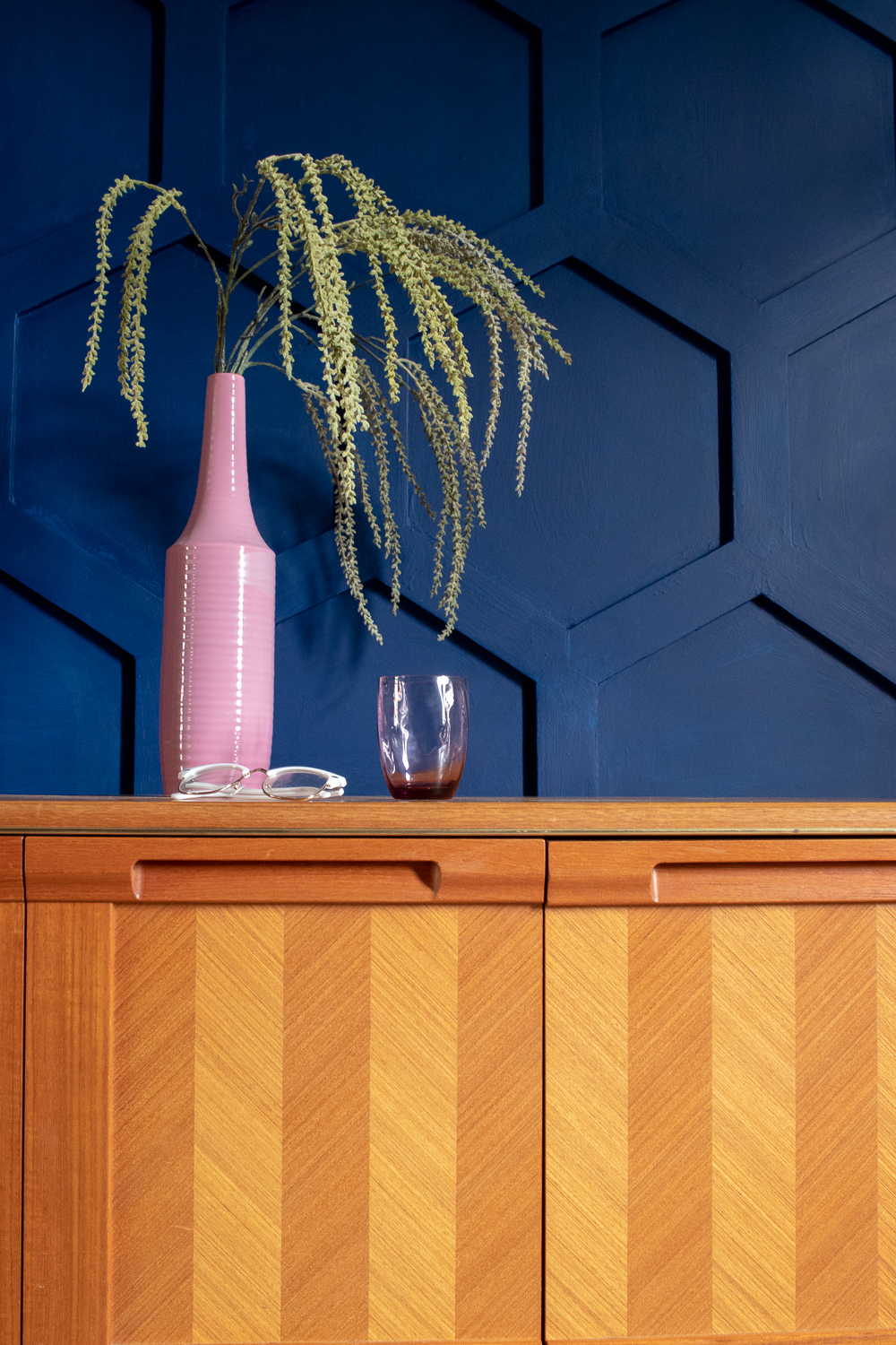
See how well they are complemented against the inky blue of our walls? And how much they pop when paired next to the vibrant pinks and oranges of our fun and flamboyant colour scheme.
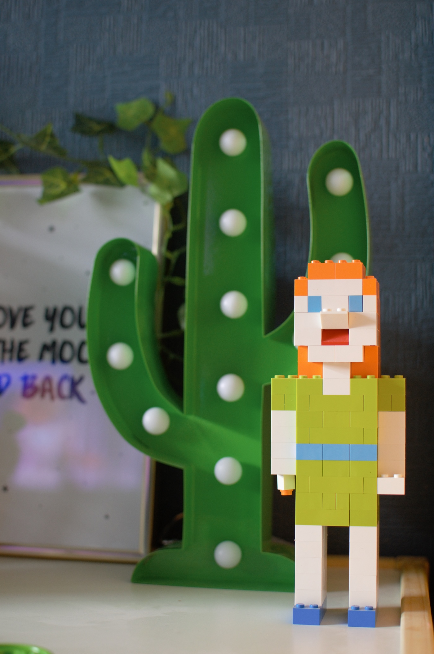
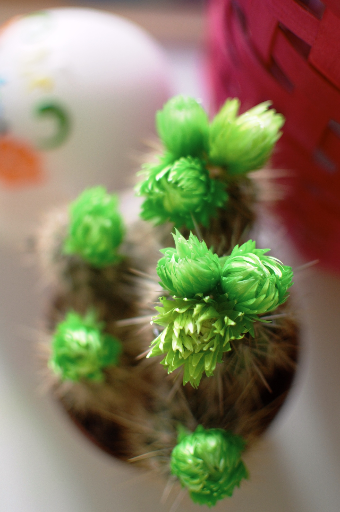
Check me out in Lego format in my Greenery top – this was a wedding present made by one of our best mates. And how about that cactus with neon green faux florals on the top. Lovely pop of colour if you’re that way inclined. Even Luna’s dinosaur collection has turned out to be just the right colour, and it reminds me so fondly of our wedding cake. Funny how things work out.

So it turns out, I’m a really big fan of Pantone’s colour of the year! Who’d have thunk it? I’m not going to be plastering it on all of the walls just yet but if you’re thinking about going to the dark side when it comes to your walls, perhaps Greenery is the accent colour you’ve been looking for even if it’s just in a few new plants.
If you’re not into the geeky and slightly bonkers way of decorating that I feel like I’m starting to crack, check out this Pinterest board which some of my fellow design bloggers and I have been pinning to – sharing how to use Greenery in a much more sophisticated manner!
So what do you think? Found anything in your home that could help to rock the Greenery trend?

This is my first collaborative post as a member of Wayfair’s ‘Home Experts’ panel. Stay tuned as I share more interiors loveliness from Wayfair over the next 12 months.

