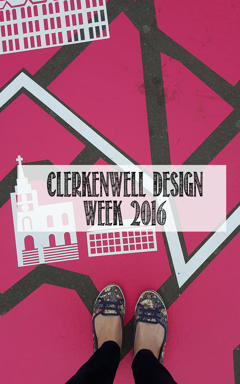
 I’ve been at it again! Out and about in London ready to get snap happy. This time, I visited Clerkenwell Design Week which ran in May. It’s home to more creatives and architects per square mile than anywhere else on the planet (according to the event) so as a bit of a design geek, I couldn’t well turn down a visit!
It’s odd. Many years ago when I was in an editorial job, I was given the chance to cover Clerkenwell Design Week from a facilities managment and office space angle. But it was so lovely to pop along, this time as my own self – just a plain old enthusiast looking to soak in what the design work is currently offering.
As usual with my photo diaries, it’s quite image-heavy so pop on the kettle! Below are my favourite bits of the day I visited covering the route, the location, and the highlights. Let’s go.
The Route
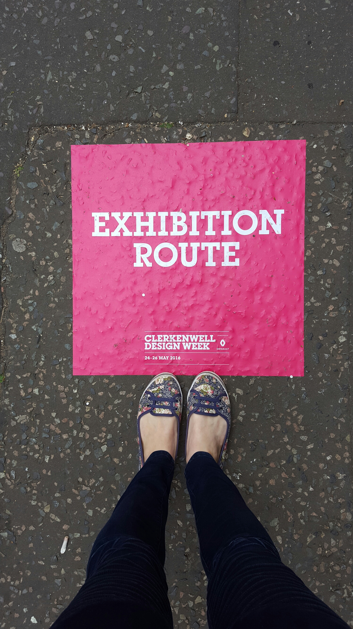
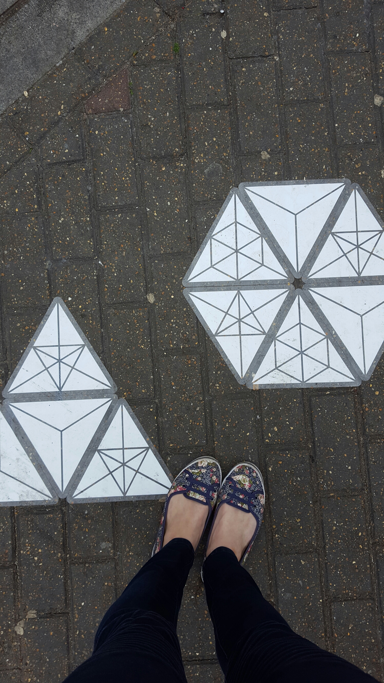
I emerged from Farringdon tube station to find that the floor was littered in pink. To directly quote the first message I found by my feet:
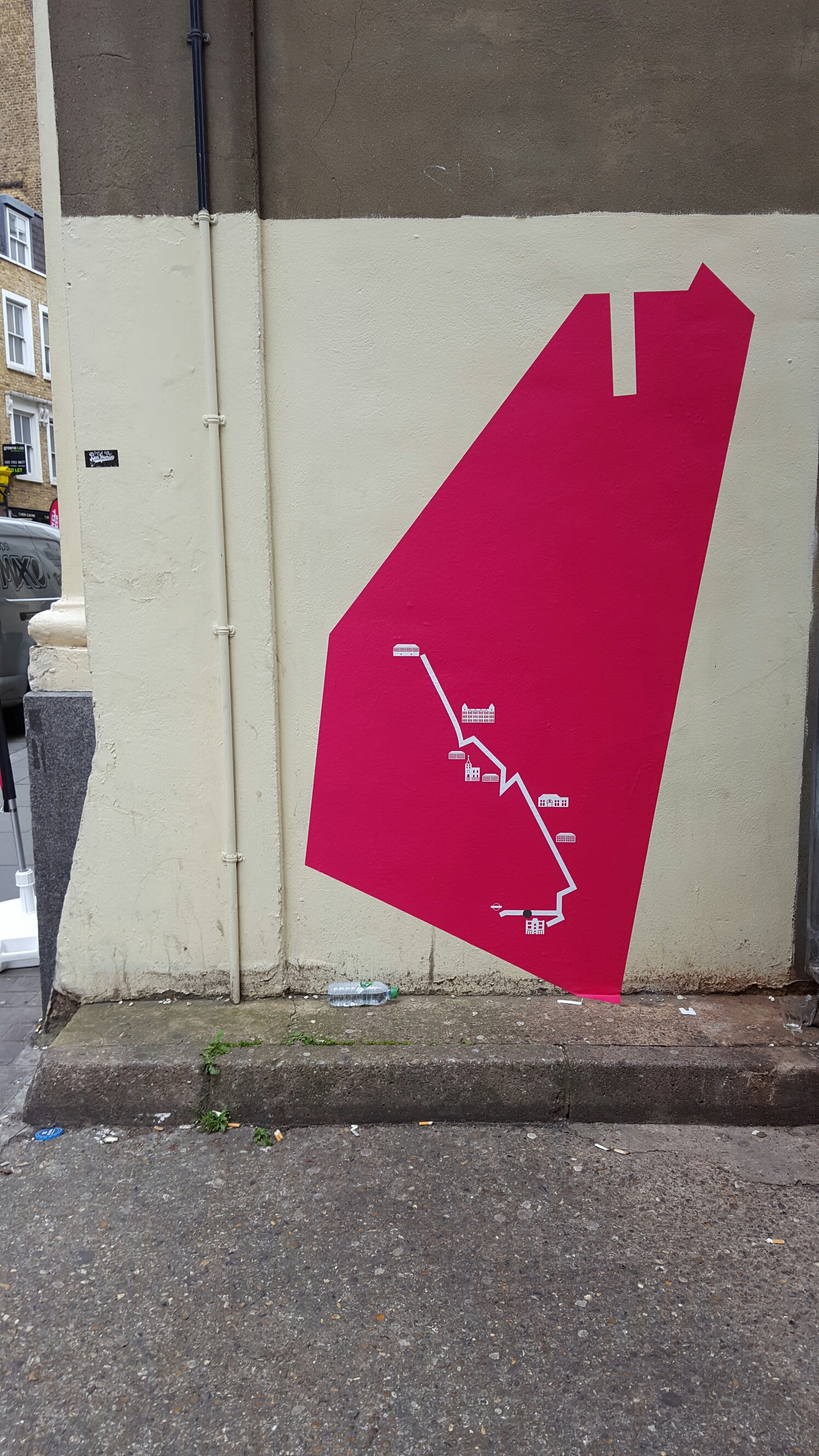
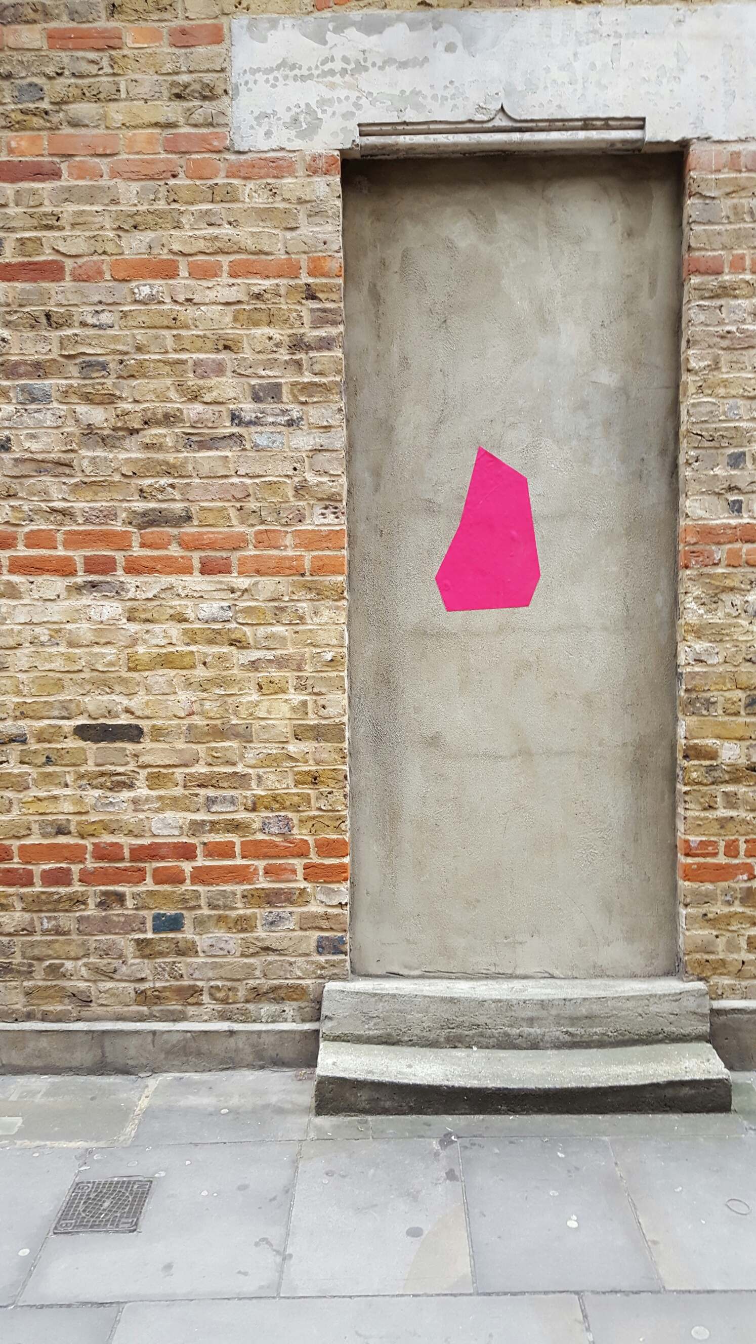
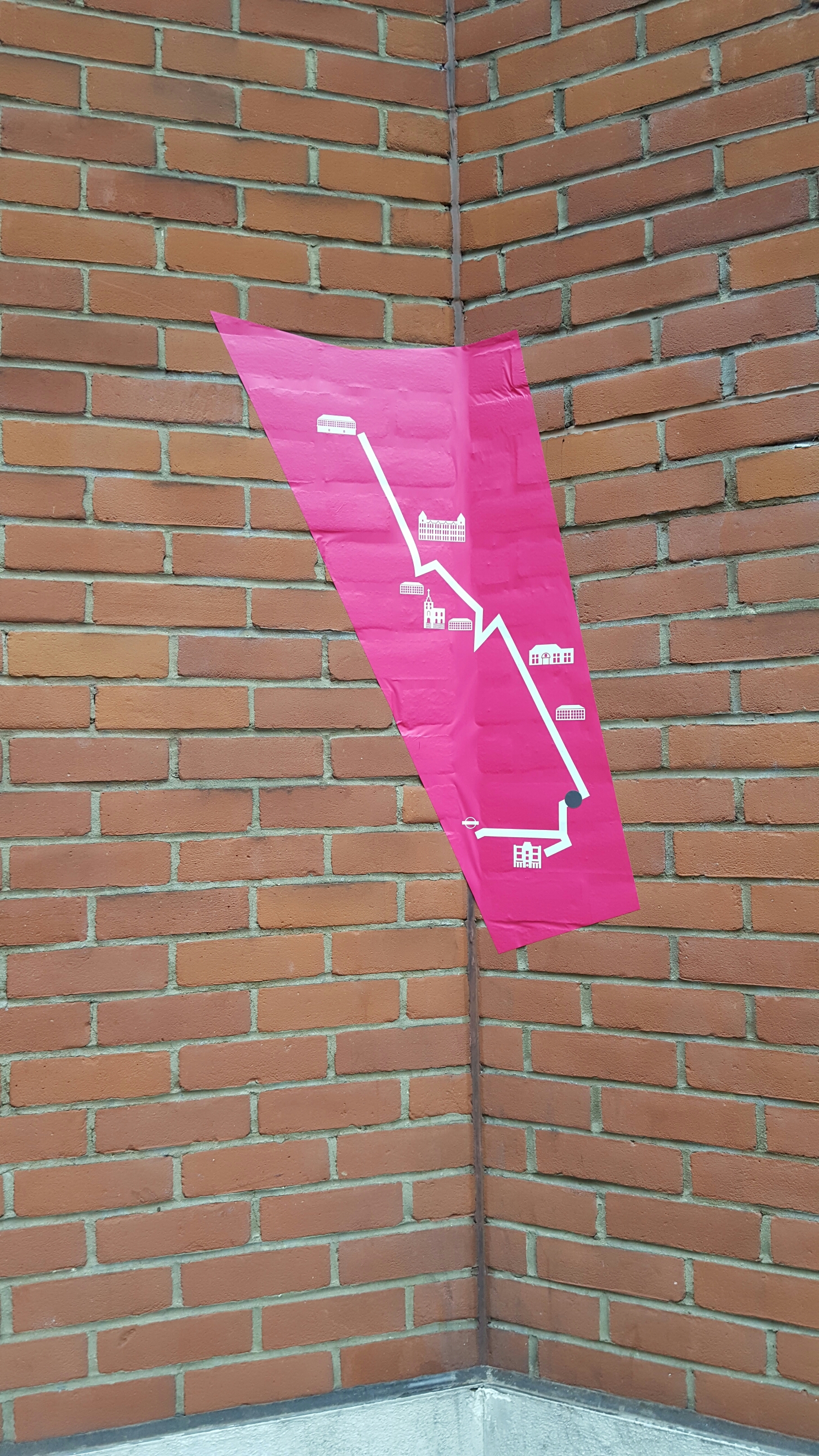
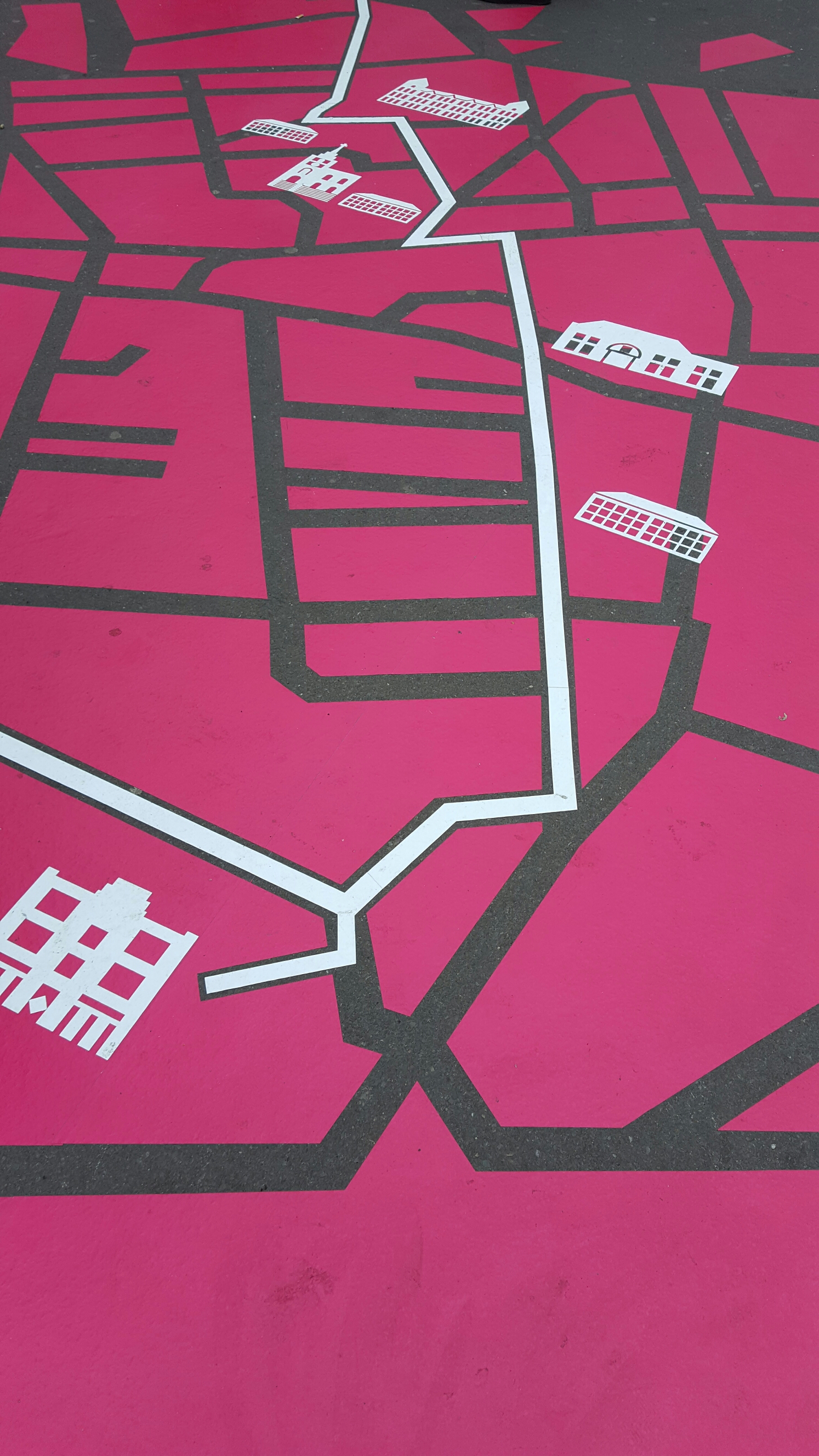
Beginning with the idea of a stone skimming its way along the streets of Clerkenwell, these shapes pop up and bounce their way across the new CDW route to guide you on your way. Inspired by the fractal forms that appear within the Clerkenwell Design Week map, the aim of the design is to echo this year’s covered theme, with shapes wrapping around bollards, covering floors and shrouding sectors of the street.
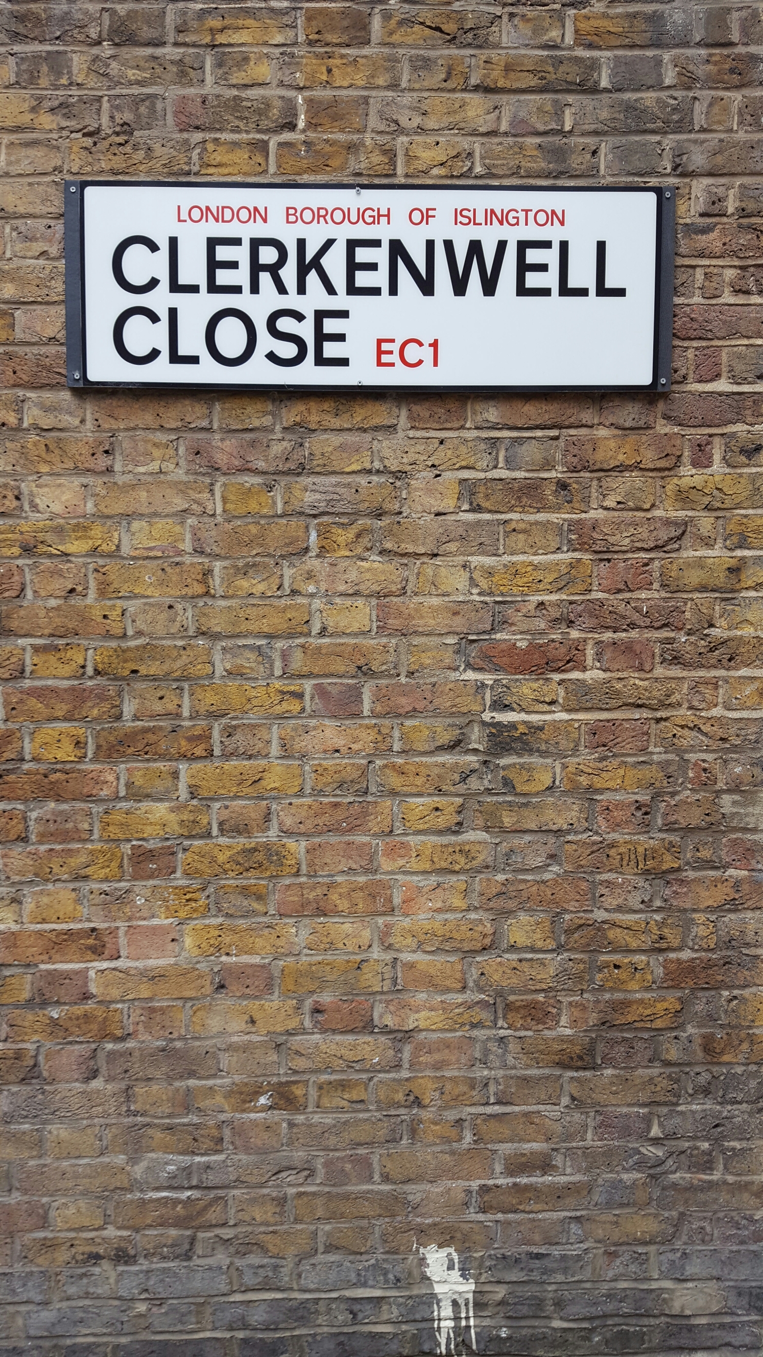
I adore this idea! And they weren’t wrong. Maps were used everyone – on traditional posters, to brick walls, to everyday traffic markers. What a well organised event which really took over a whole community! There was no way you could miss it.
The Location
As a Northerner who doesn’t really know our capital all that well (guilty, sorry guys) it’s easy to think London is all tourist attractions, old school telephone boxes and Royals out on a boozer.
I’d never been to this neck of the woods and I’ve got to say, it’s gorgeous!
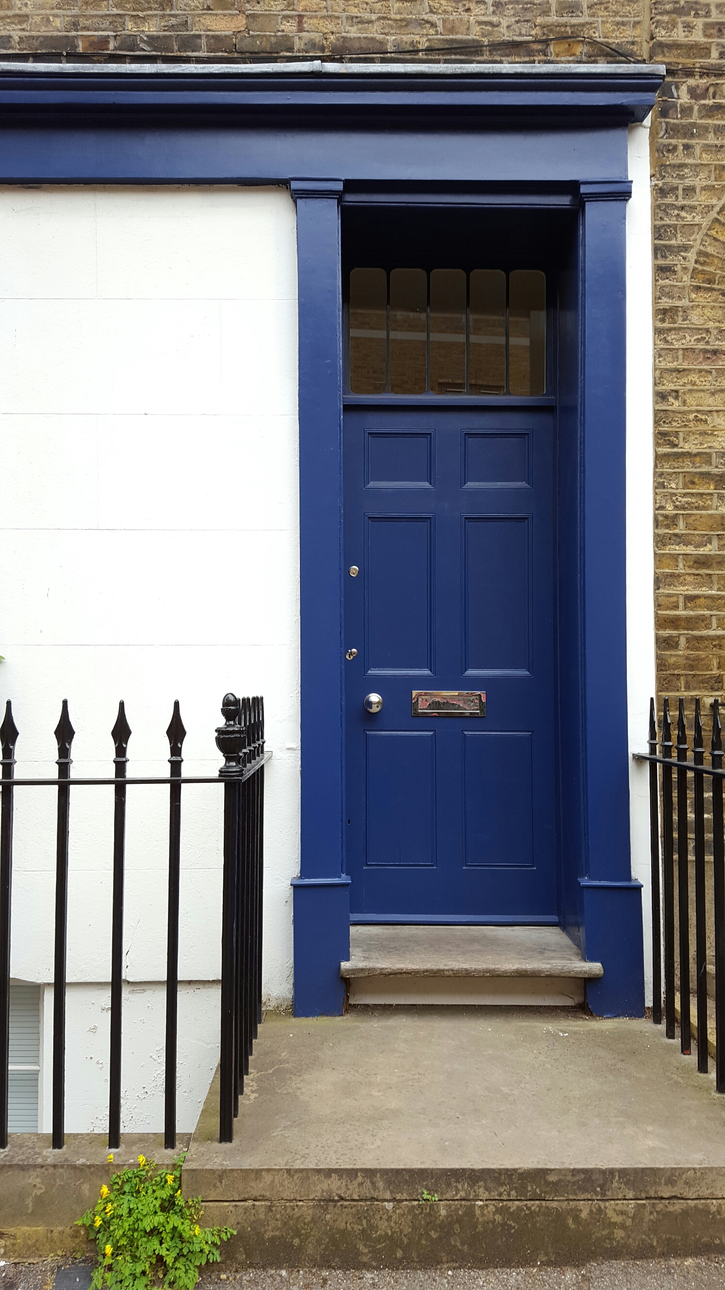
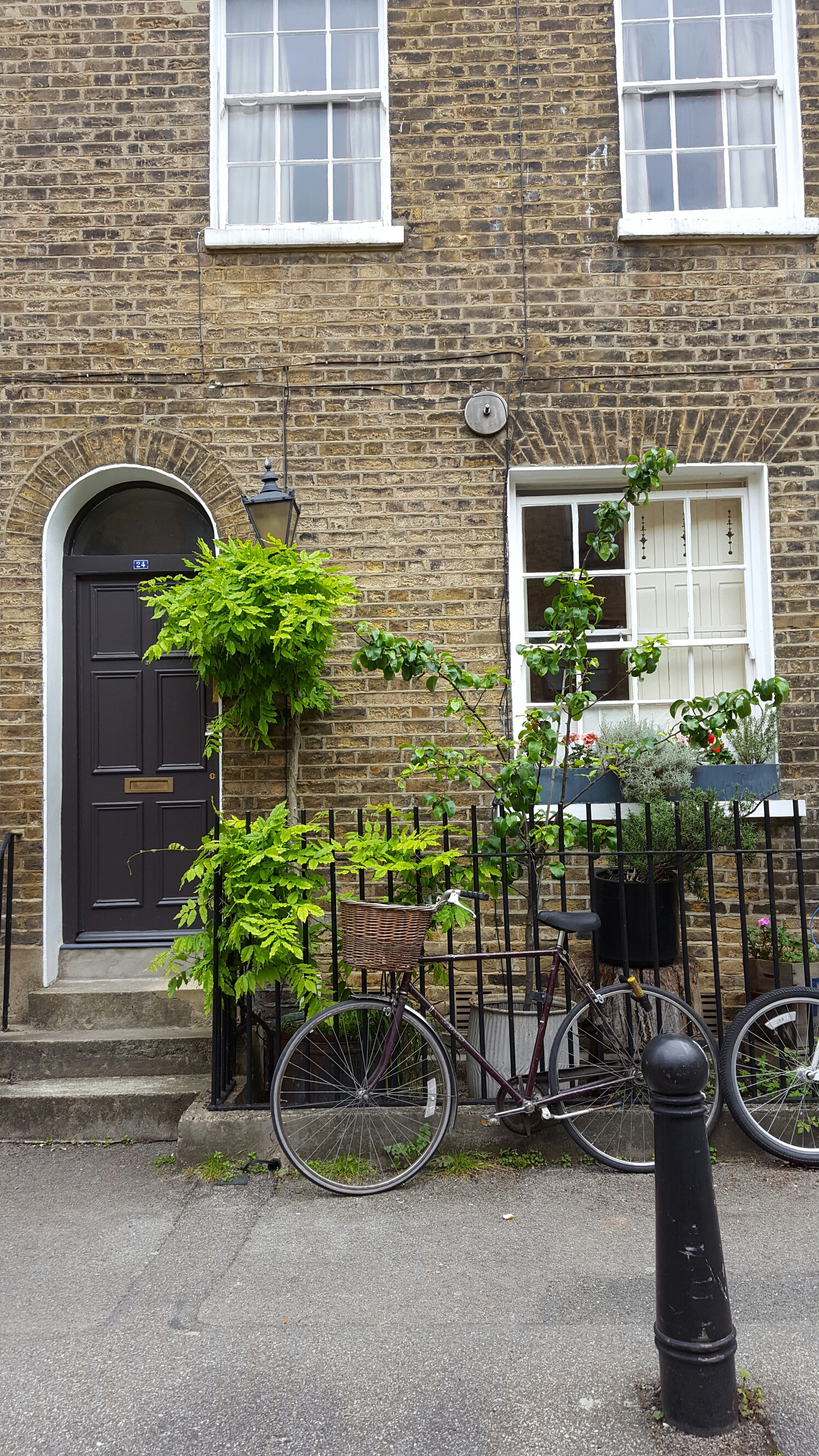
Quirky little houses which residents have clearly taken great pride in with flower pots on their doorstep and brightly painted doors. You can tell that it’s where creatives come to thrive.
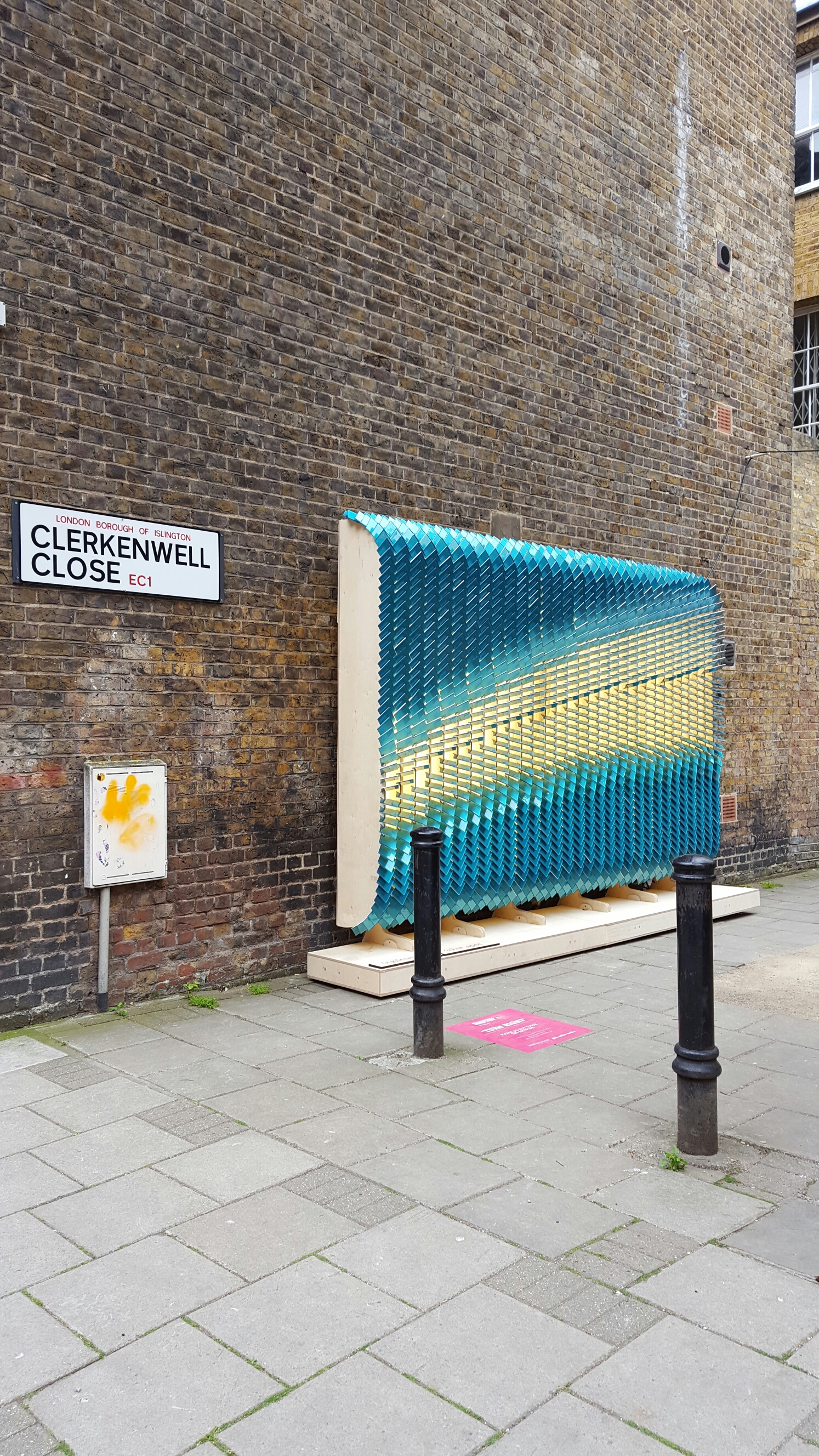
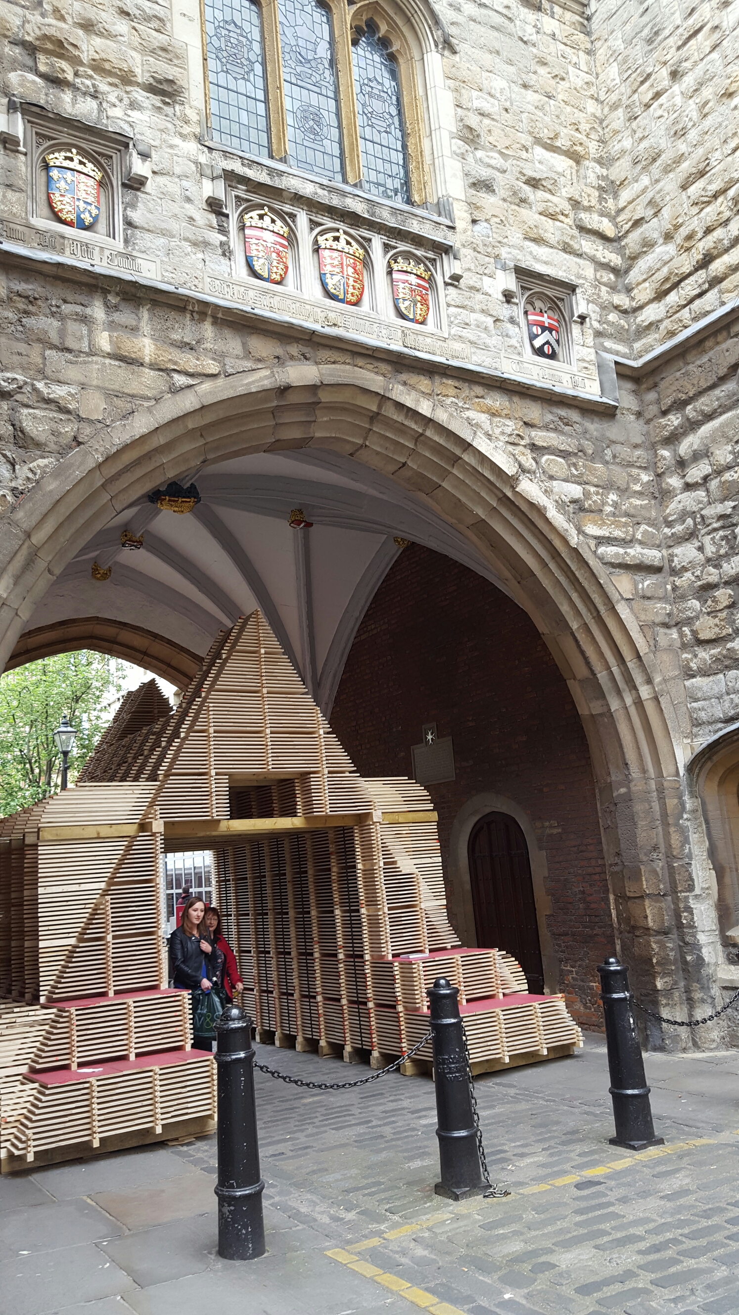
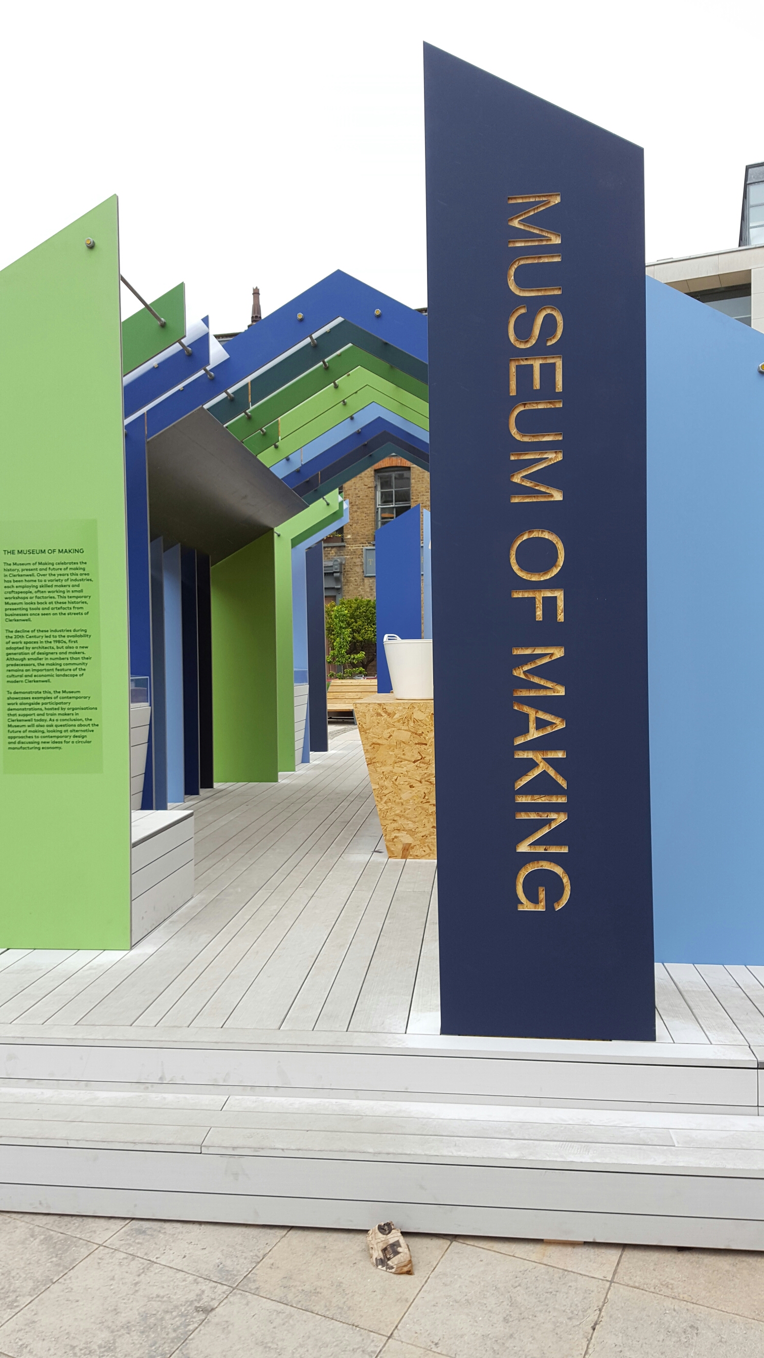
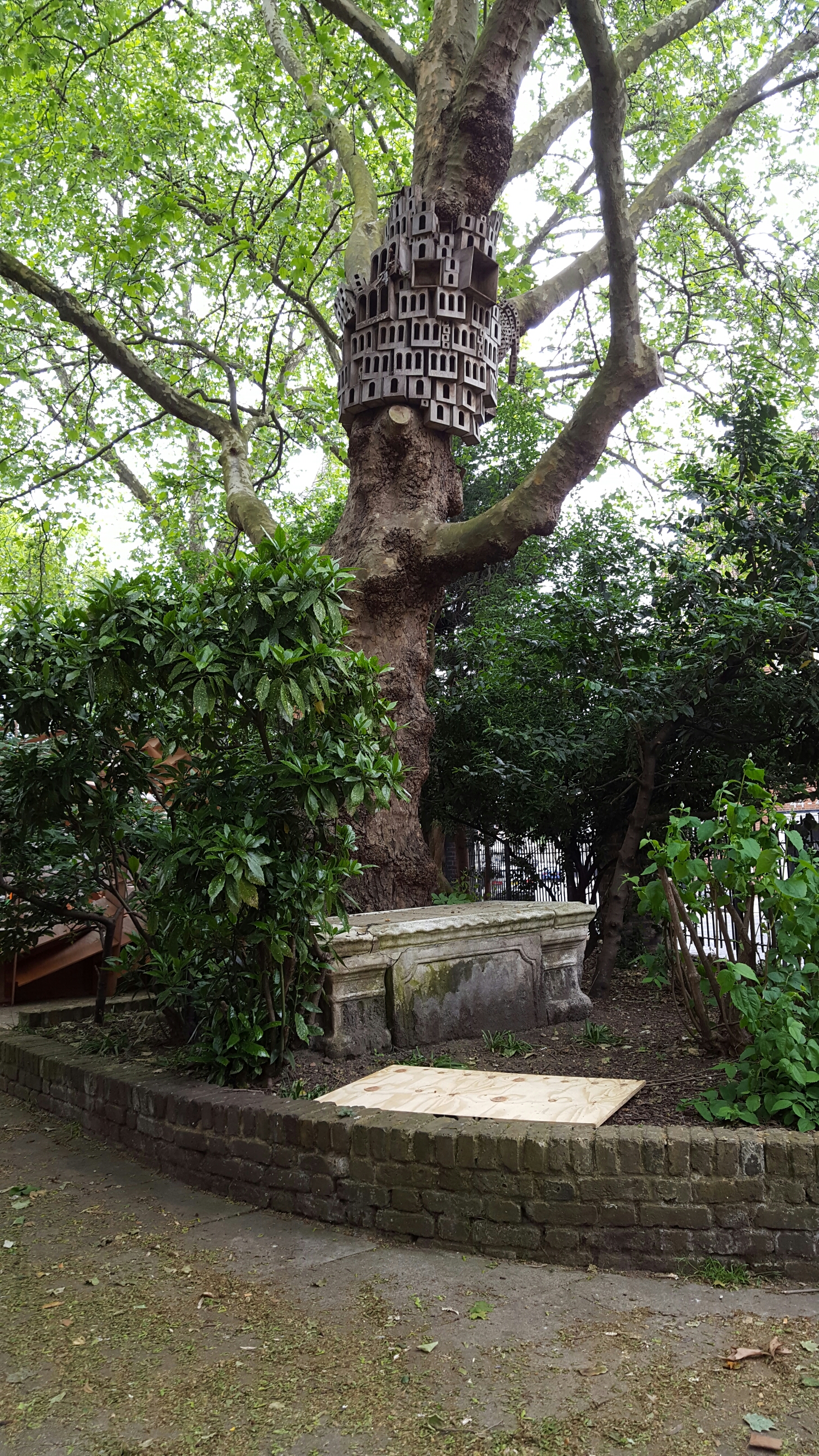
The exhibitions that ran throughout Clerkenwell were set amongst some really beautiful architecture, and I was stunned to find an old remaining Castle alongside some of them. There were temporary stands built aplenty too, with the Museum of Making a personal favourite through the colourful structure. Oh, and see that tree with all the bird boxes in? It’s at Crypt on the Green at St James Church. So cute, right? There may have been a super cute garden display right next to it, but this is what caught my attention.
The Highlights
Now, I think I could actually fill a couple of blog posts with all of the cool stuff I saw, but I don’t want to go on TOO much about it. So I’ll try and keep it to a few favourites.
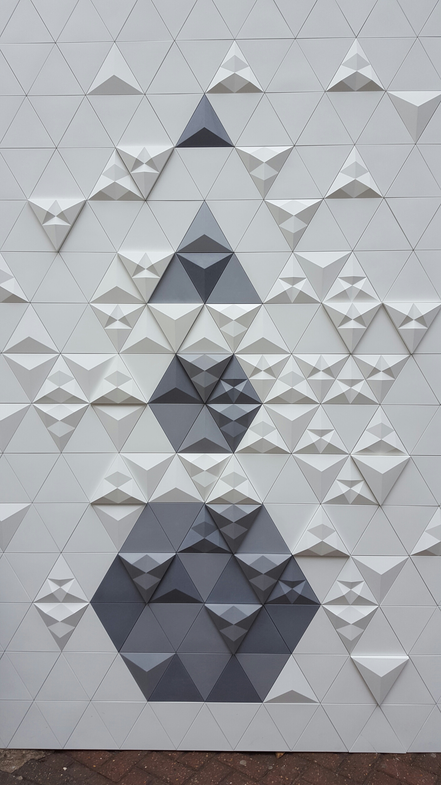
This is Kaza Tre. It’s a new modular concrete tile series that can be displayed independently or as modular elements in a larger geometric pattern. I adore the futuristic, almost clinical vibes it’s giving. Really lunar.
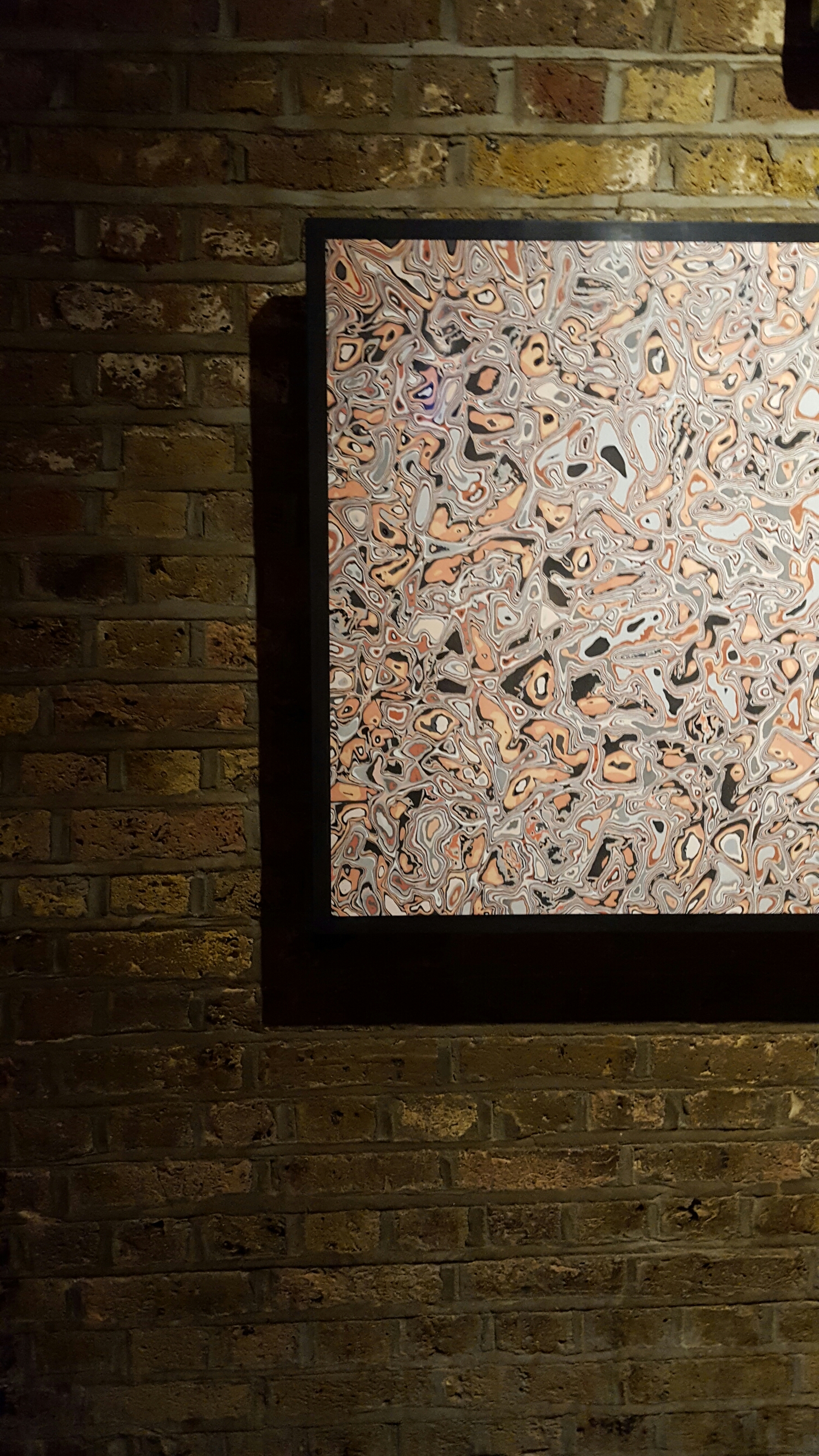
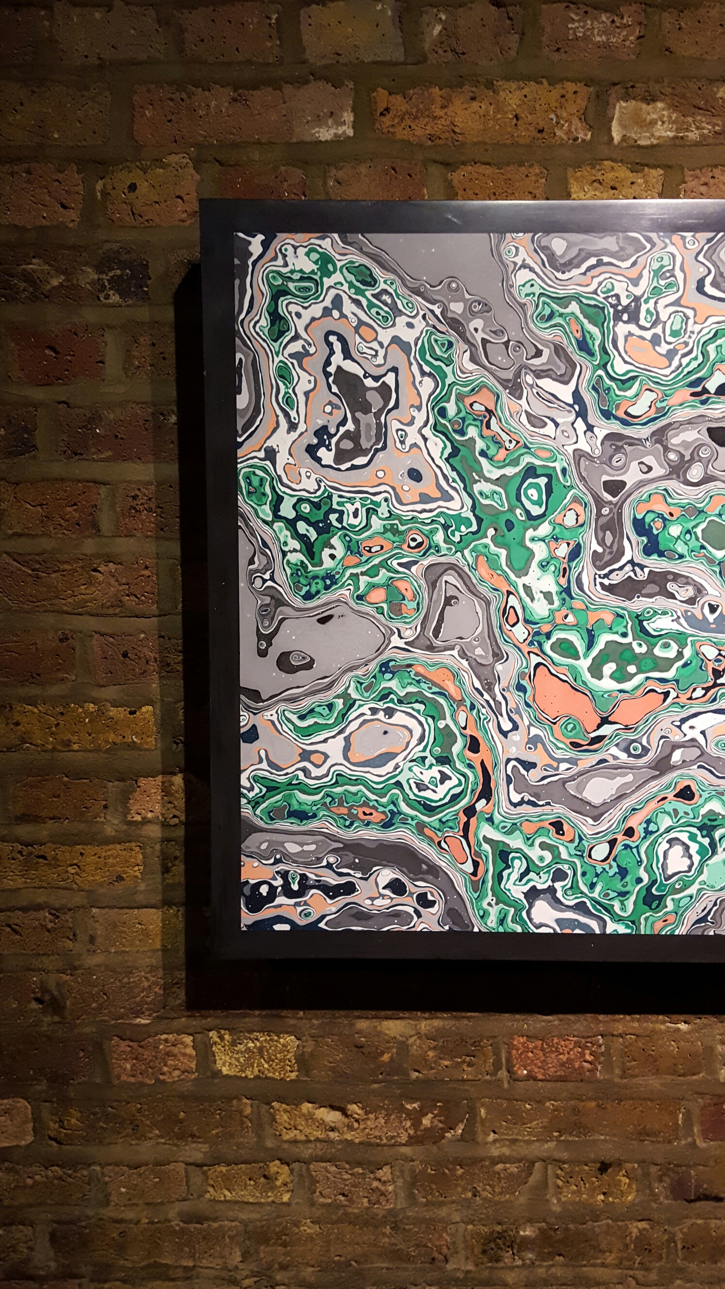
As part of the House of Culture exhibition, artwork was displayed on bricked walls with spotlights shining above it. This was to highlight just how important appropriate lights are, and how they can change how you perceive artwork. But, the images were pretty badass too, am I right?
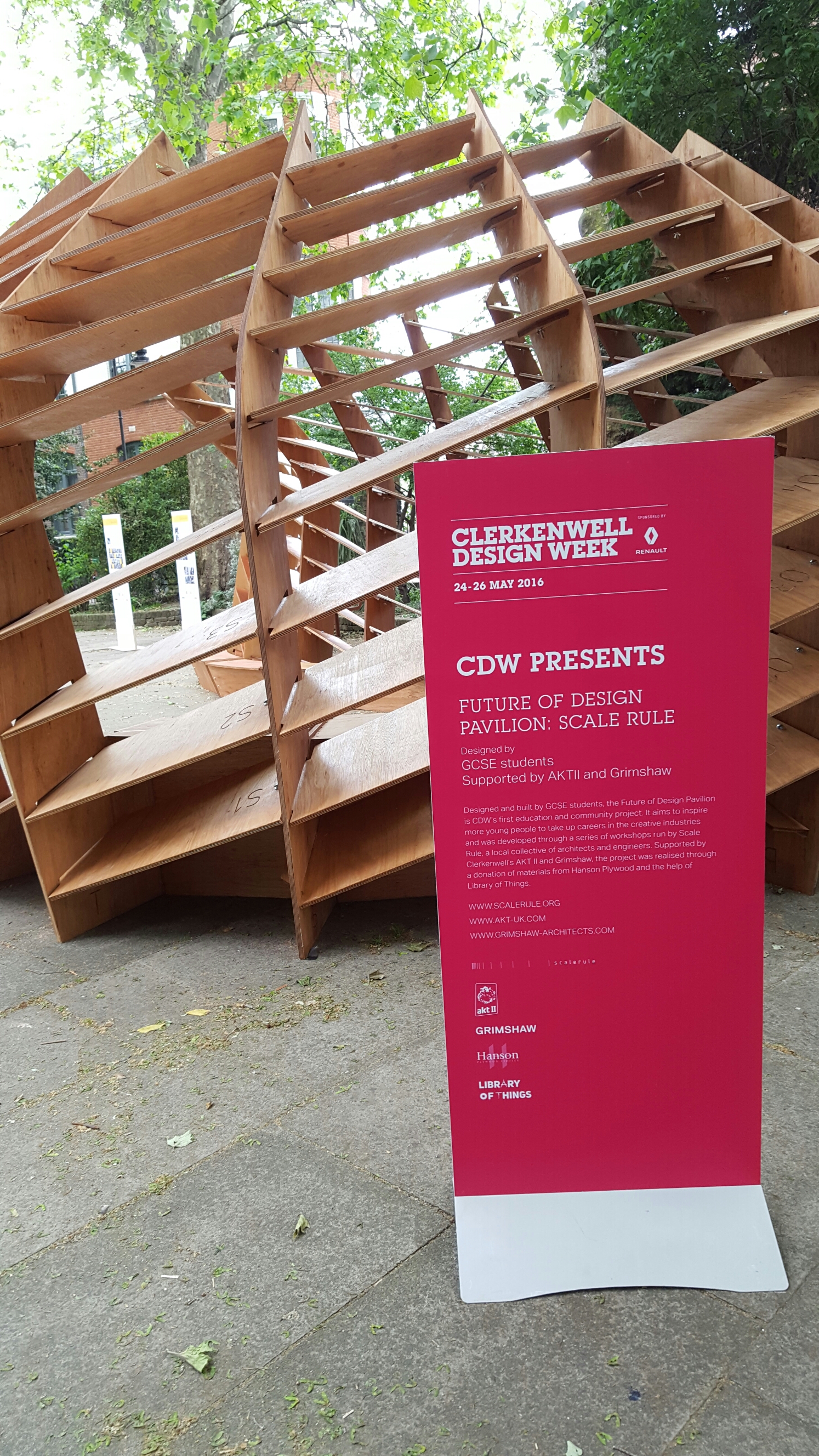
This structure was designed by GCSE students – how awesome is that? When you look closely, you can see where the wood has been marked so it can be arranged in the right order. Almost in a flat-pack fashion. Seriously cool vision from these teens. I know I would have be really proud to be a part of this project at that age.
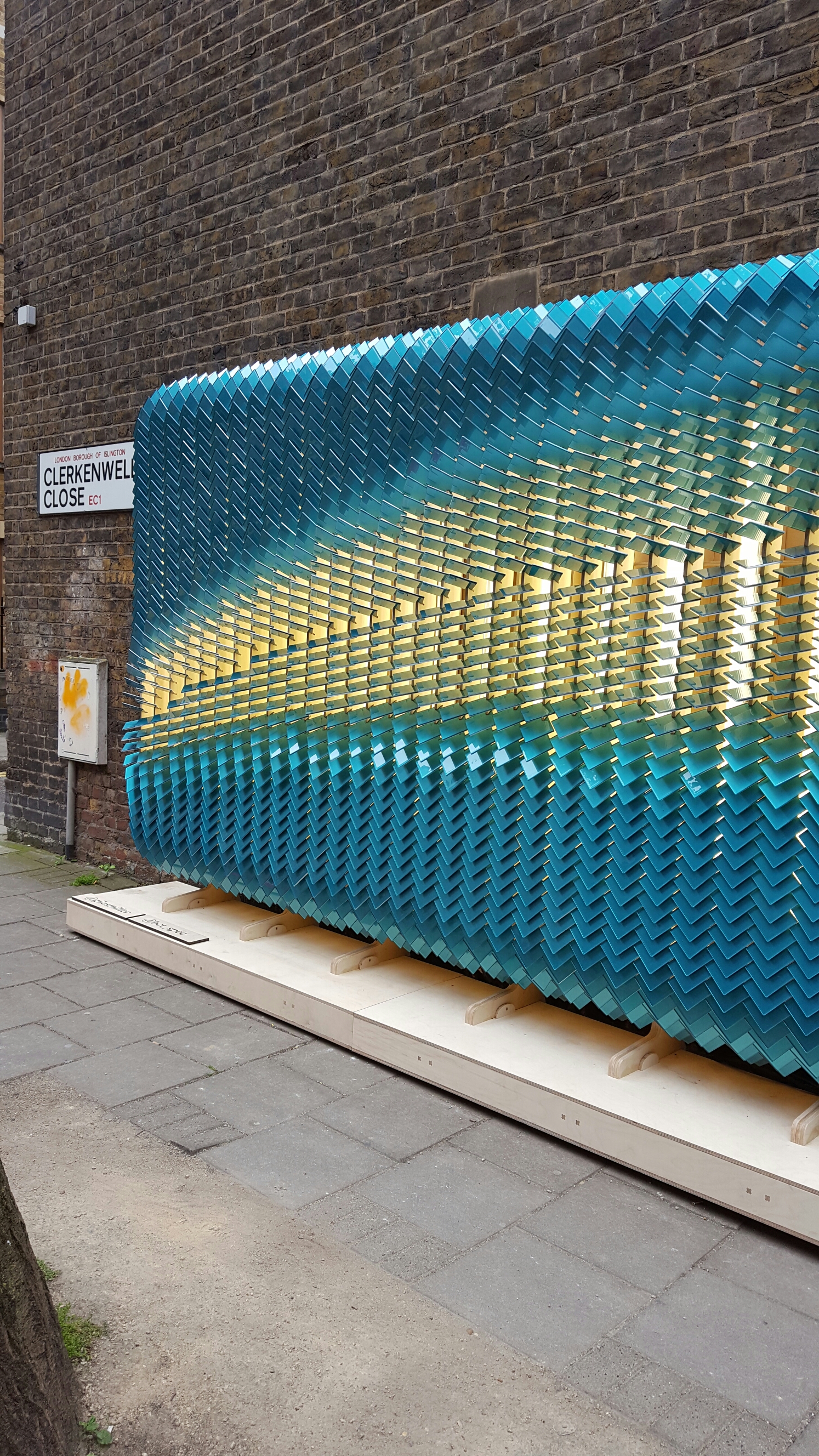
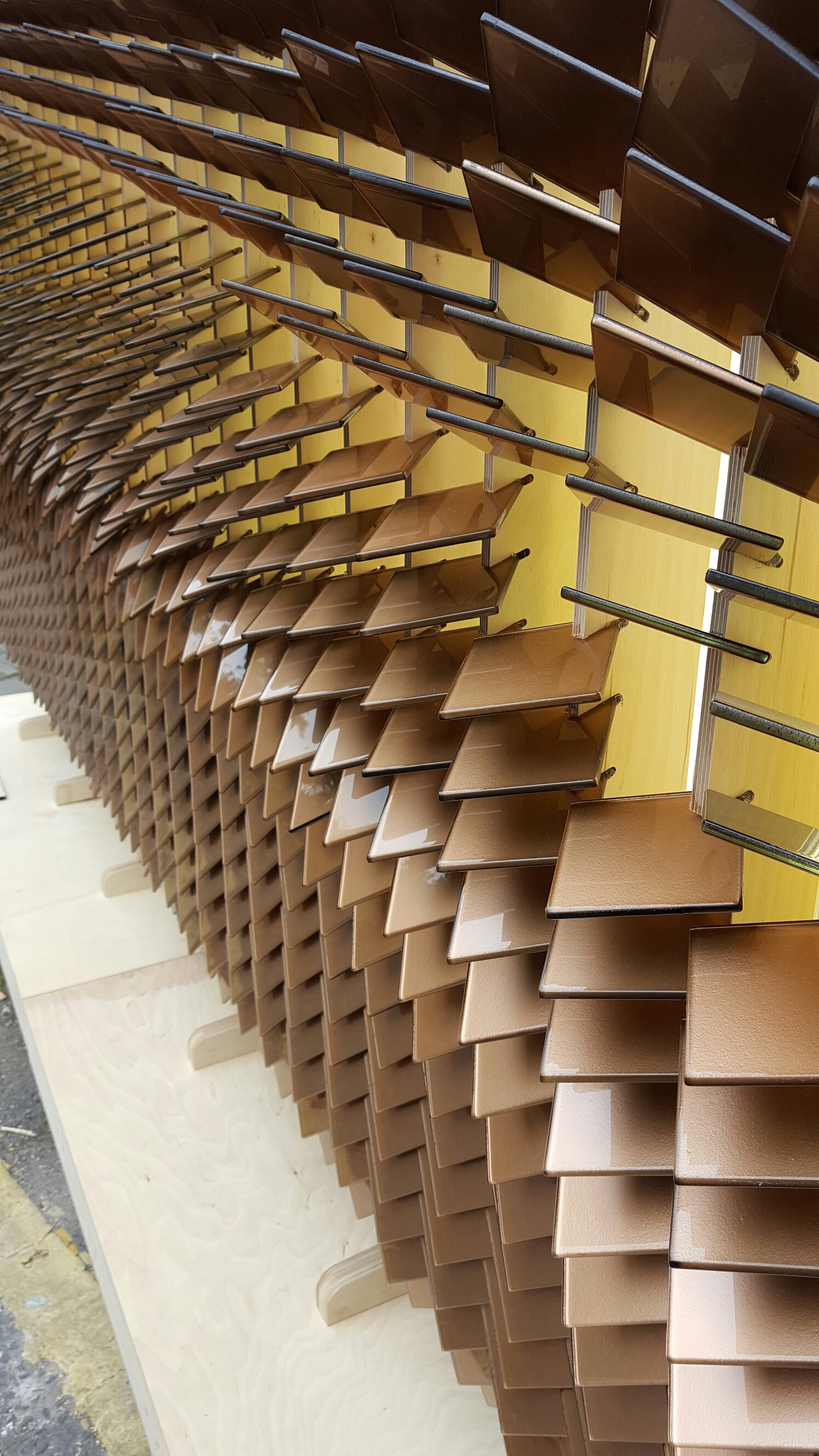
Giles Miller is a designer who develops surface and material sculpture artworks and these were darted around the Clerkenwell area, built to reflect light. They look different depending on where you stand. I think they’re stunning.
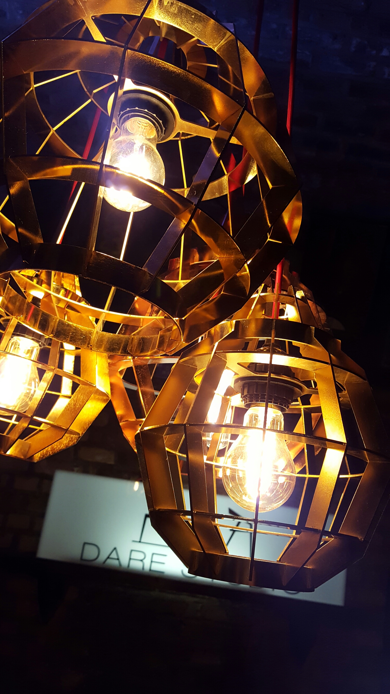
Dare Studios was a new brand to me, but one thing they are KILLING IT with is lighting. I honestly struggled to pick a favourite, but this one shall do. Really industrial and geometric which were the perfect pairing to the bricked arches of the House of Culture venue.
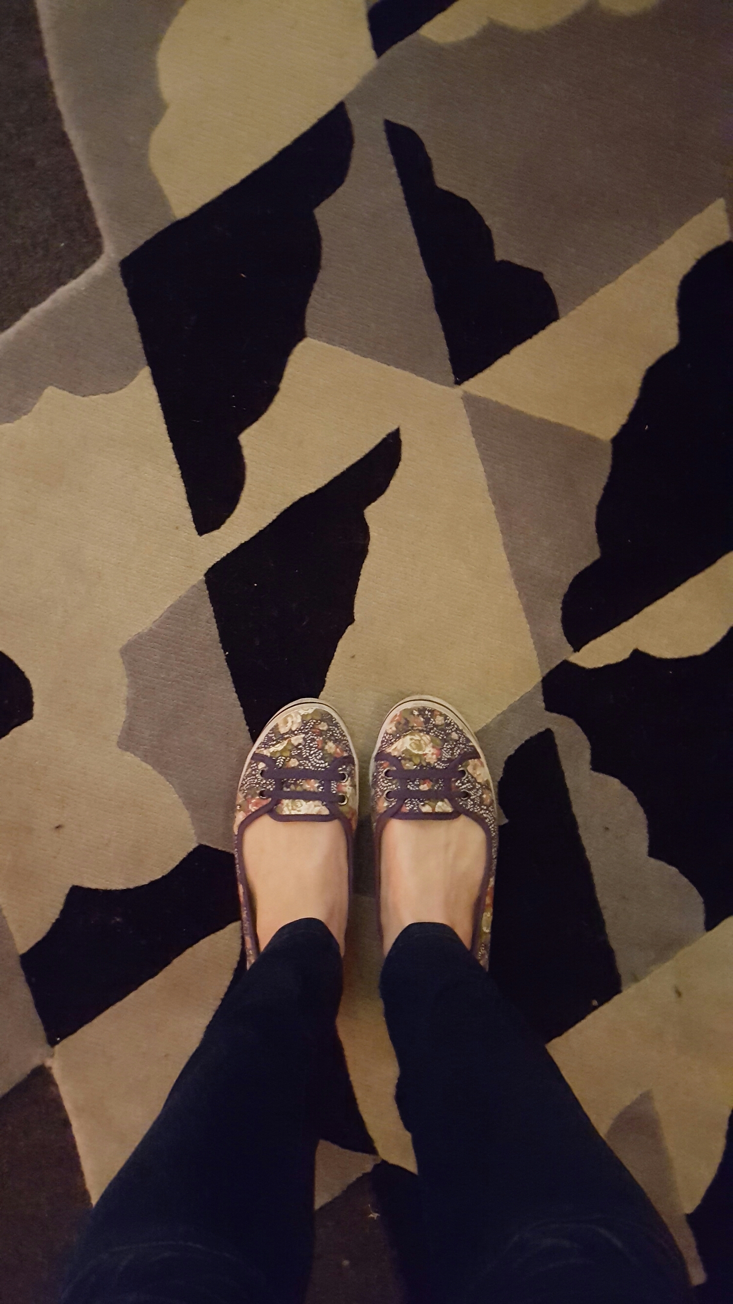
The most beautiful monochromatic rug at the Tom Dixon display, if not incredibly dirty.
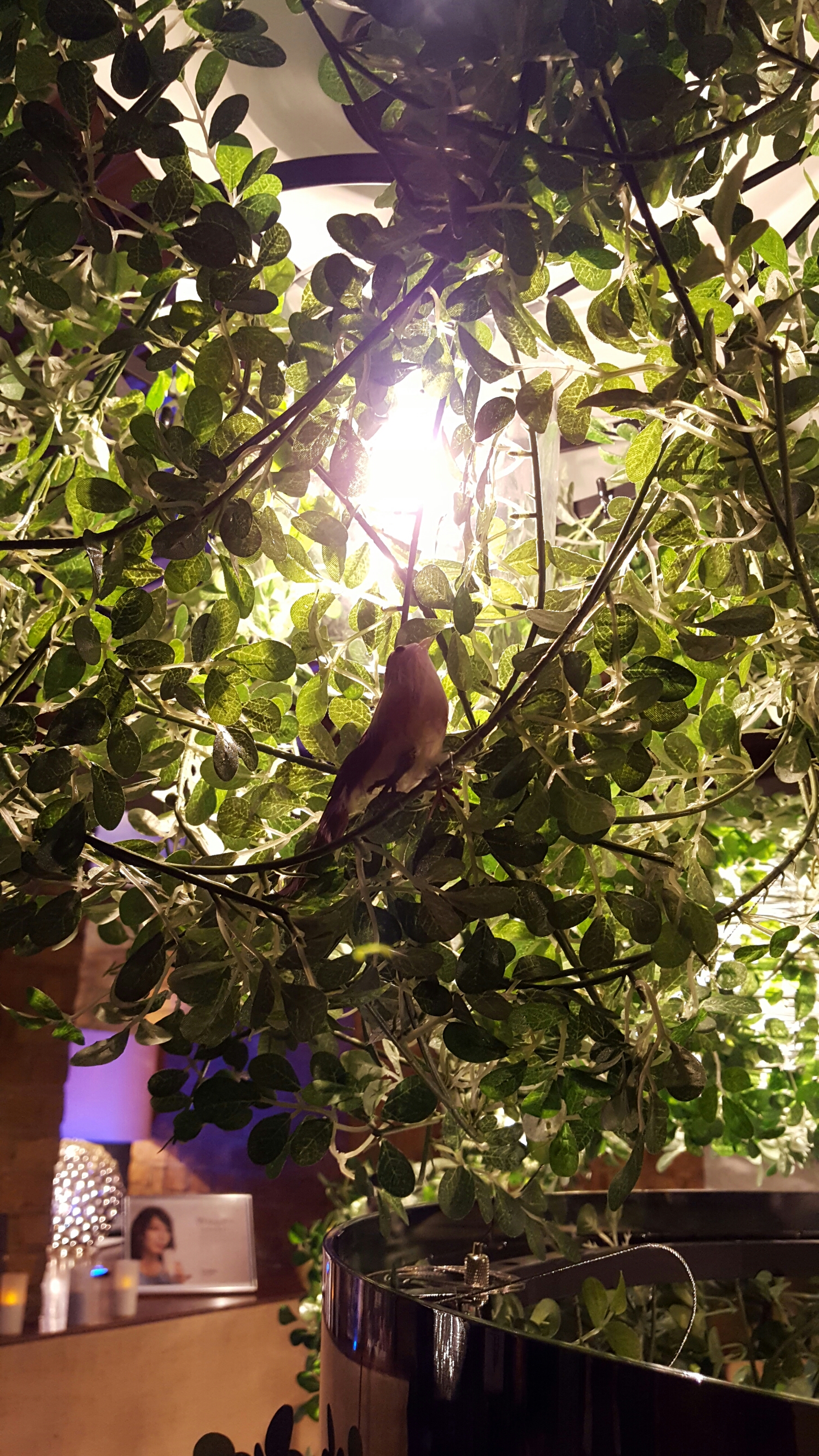
Dudes. Dudettes. This is a CHANDELIER. Created with artificial leaves and even featuring tiny little birds, I couldn’t get over how creative these were, and were a really welcome addition of greenery that wasn’t a tropical palm.
And that’s it from me!
I would 100% go again. You can see why it spans a few days, because with all the seminars and workshops, you could completely engulf yourself in it. Sadly, I just got to pass through some of the exhibits but I left feeling inspired for sure. Which are your faves? Link up your highlights in the comments if you were at the show!
