It’s finally happened. We’ve made enough progress on our lounge this year that I’m happy to share it with the outside world. In fact, we actually gave it a dramatic change over the Summer – all those months ago! – so you might say we’re fashionably late with this one.
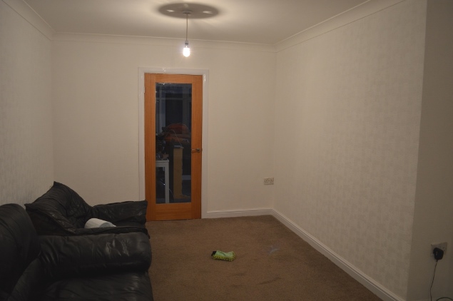
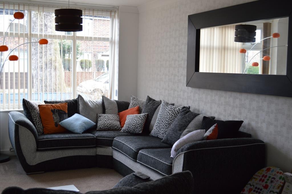
The update started a year ago when we were preparing for Luna to be born. The skirting board and coving were replaced. New furniture was bought. We added wallpaper. Deep cleaned the carpets. It was liveable enough for the baby, but I just didn’t feel like it had any personality or character. And so we waited.
Want to see what it looked like before?
A Living Room Update – Part 1
A Living Room Update – Part 2
A Living Room Update – Part 3
Summer came, and one day Joe suggested that we paint the living room a deep inky blue colour. I don’t know where his idea came from, but within minutes we’d made our way to B&Q for colour samples. Blue is my favourite colour and I wasn’t going to pass on this spontaneous opportunity, even if we do already have an insane amount of blue in the house now.
We toyed between two Valspar shades which were incredibly similar: Down In The Nile, and Passageway. In fact, I Instagrammed the two and you can barely tell it’s two different colours. In the end, we picked Down In The Nile. And it’s beautiful.
Let’s do this. #homebloggger #darkwalls #downinthenile #valspar3dchallenge #interiors #decorating A photo posted by Karen Clough (@karenanita) on
The paint went on an absolute dream. You may remember, we chose this textured wallpaper because unfortunately our walls, whilst strong and only recently plastered, show up a lot of hairline cracks so using paint alone, or even painted lining paper was just showing too many visible imperfections in the wall. This wallpaper is thick stuff and actually alters the dimensions of the room, even more so when painted.
And that’s exactly what the richness of the blue does to the room. It gives it depth that the plain white just couldn’t offer. It gives character which I’ve been trying to find for so long in this good-sized but narrow living room.
I think some of our family thought we were bonkers when we picked such a dark colour in case it closed in the room, but it doesn’t. Quite the opposite actually.
It’s an odd-shaped lounge really, and whilst we have one enormous window and 2 glass-panelled internal doors, it’s naturally quite a shadowy space. We were fighting it when the white walls were there, and in the end, the best decision ever was to just accept it, but make it the best damn dark room we could! In time, we’ll need a few more light sources. Most likely some table lamps when we eventually buy some side tables, and possibly some uplighting on the walls. I know, fancy right?
But that’s an update for another day! For now, let’s see the pictures in this mini tour.
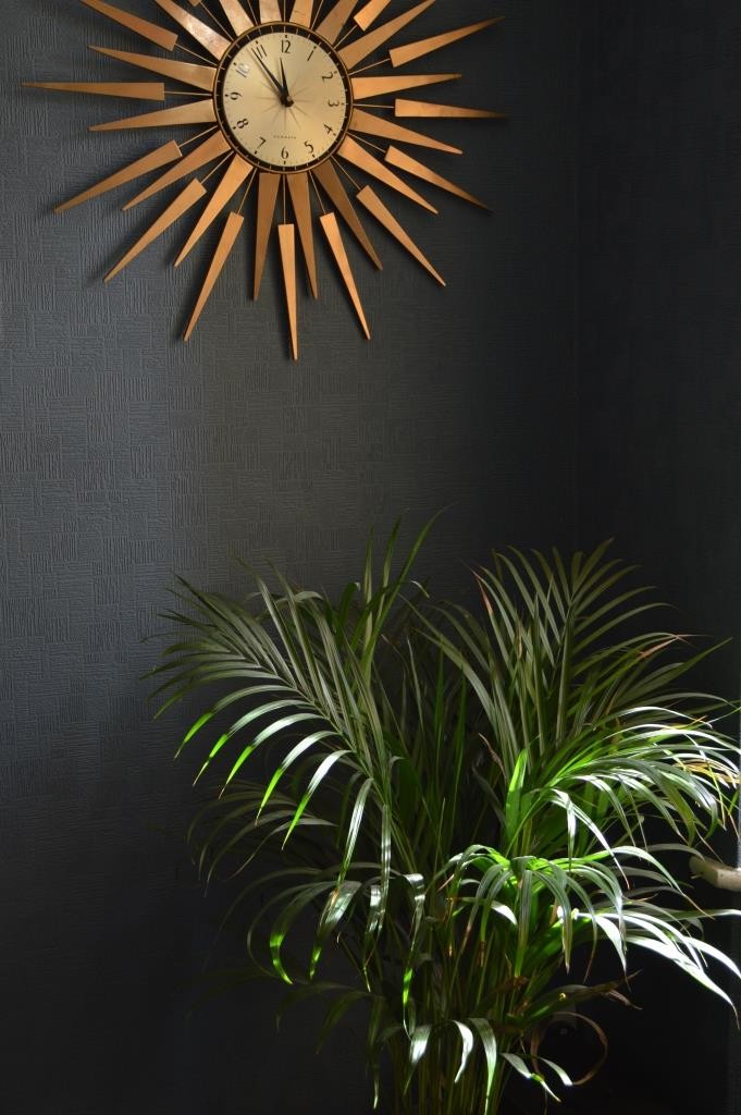
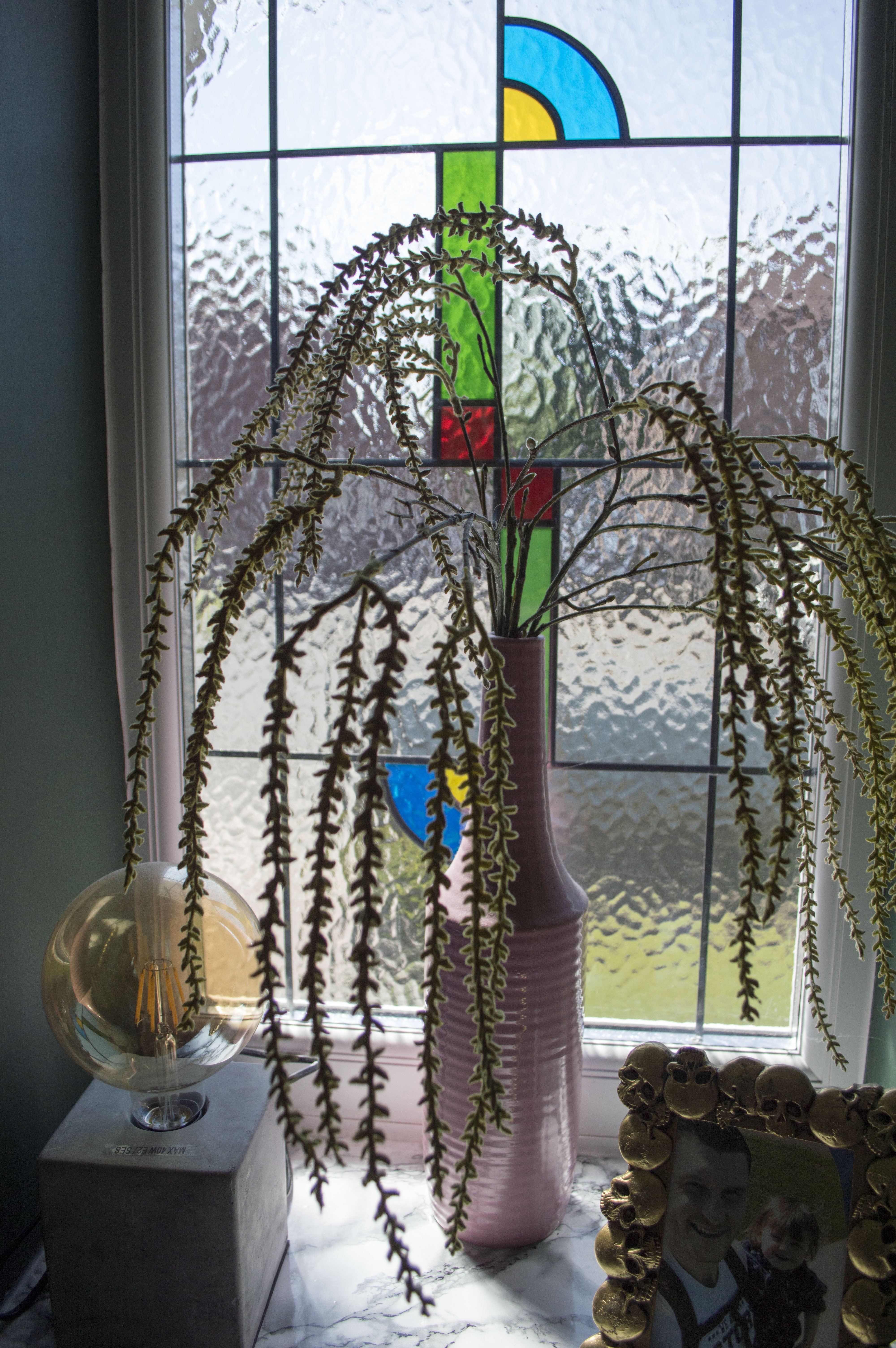
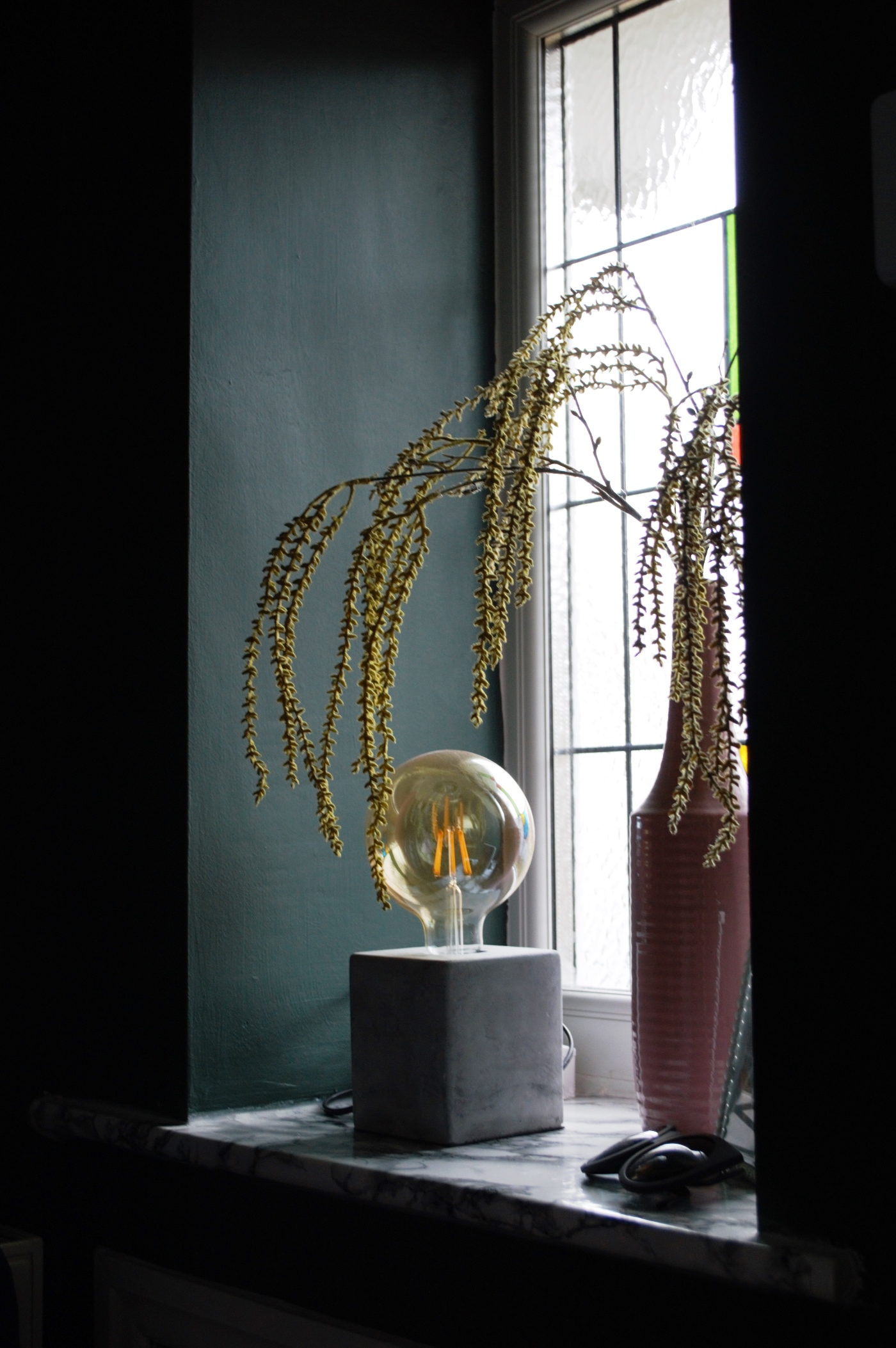
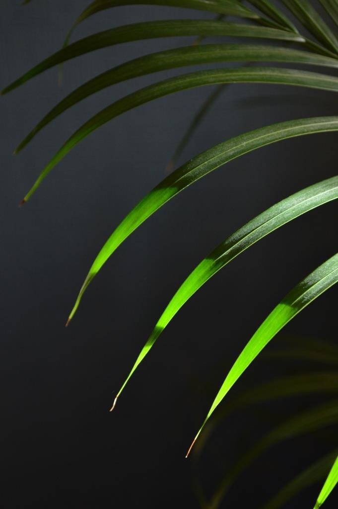
This clock was given to us in a wooden finish (in fact, it’s still available in John Lewis) but we spray painted it gold. I’ve tried to add more plants to the entire house and this Butterfly Palm sits beautifully next to our window. I love the way the light comes in through the leaves.
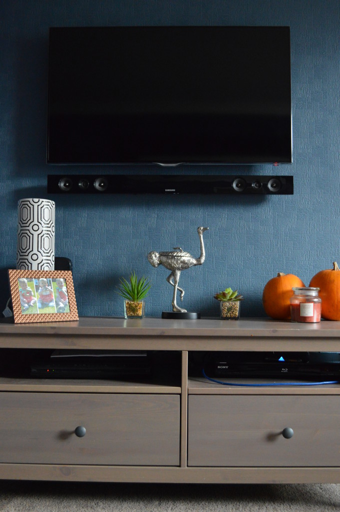
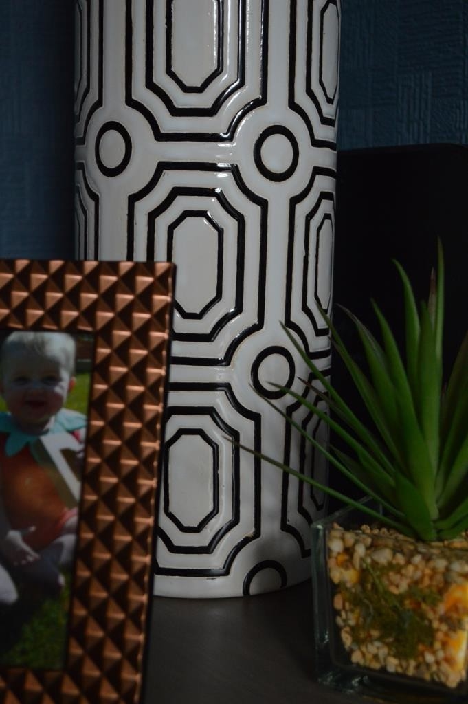
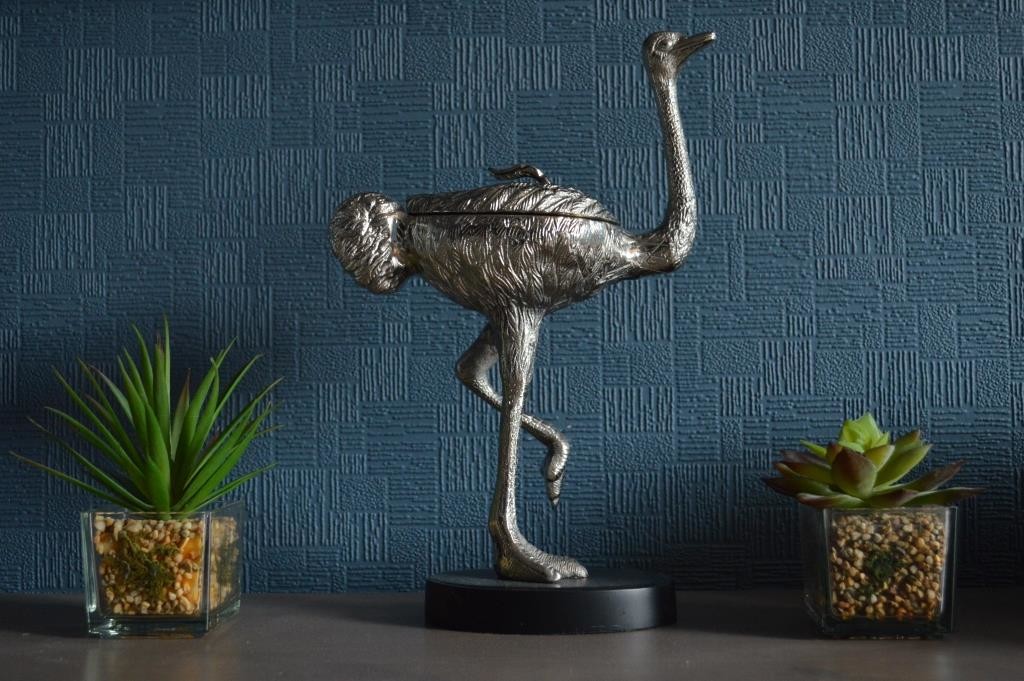
The IKEA cabinet is still holding up well and the grey undertone of the wood sits great next to the blue wall. Thanks to a few birthdays, we’ve finally got some ornaments in this room. Sadly, it’s a constant battle to try and make sure Luna doesn’t mistake them for her toys! You can see most of these purchases in my latest Homeware haul, but if you’re wondering, that ace geometric oversized vase is from Dwell.
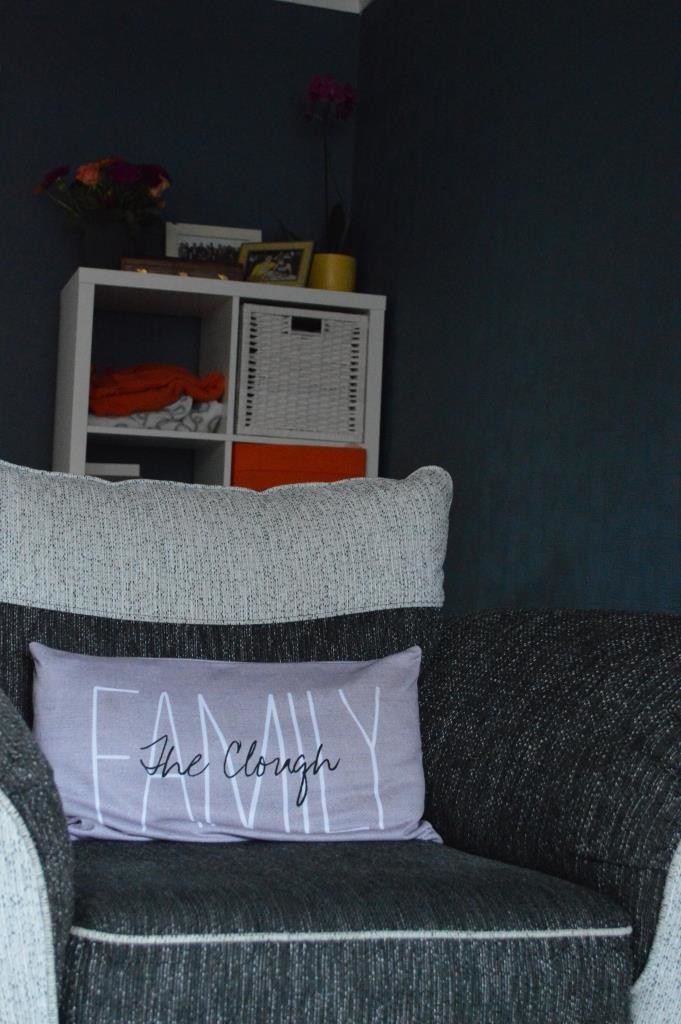
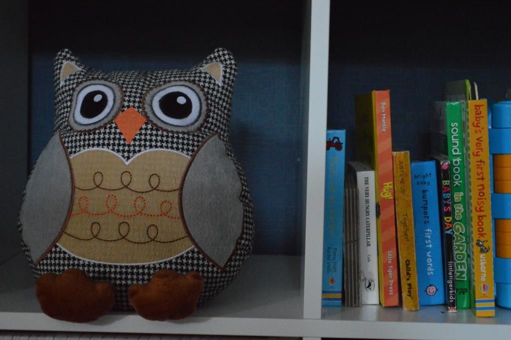
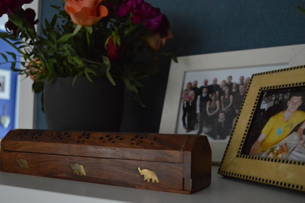
Over behind our single seat which matches the rest of the suite is the classic Ikea Kallax. We tend to keep toys stashed away in there, as well as loads of Luna’s books. We’re turning this corner into a reading nook for her birthday so it’ll likely be updated in the near future. In the meantime though, it’s nice to have another surface for photo frames, flowers and our incense burner.
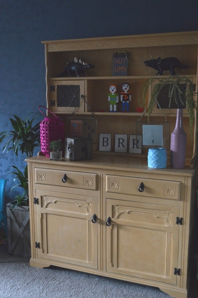
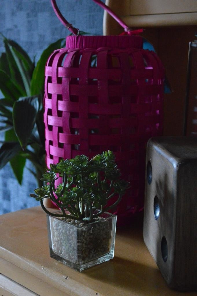
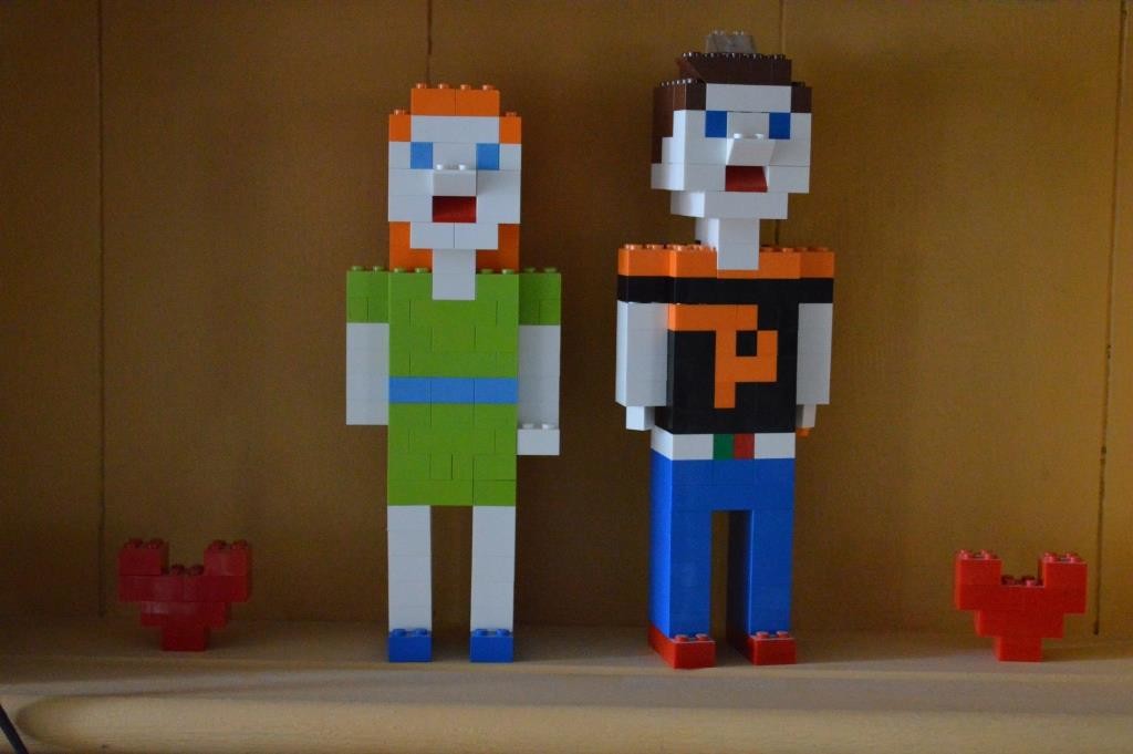
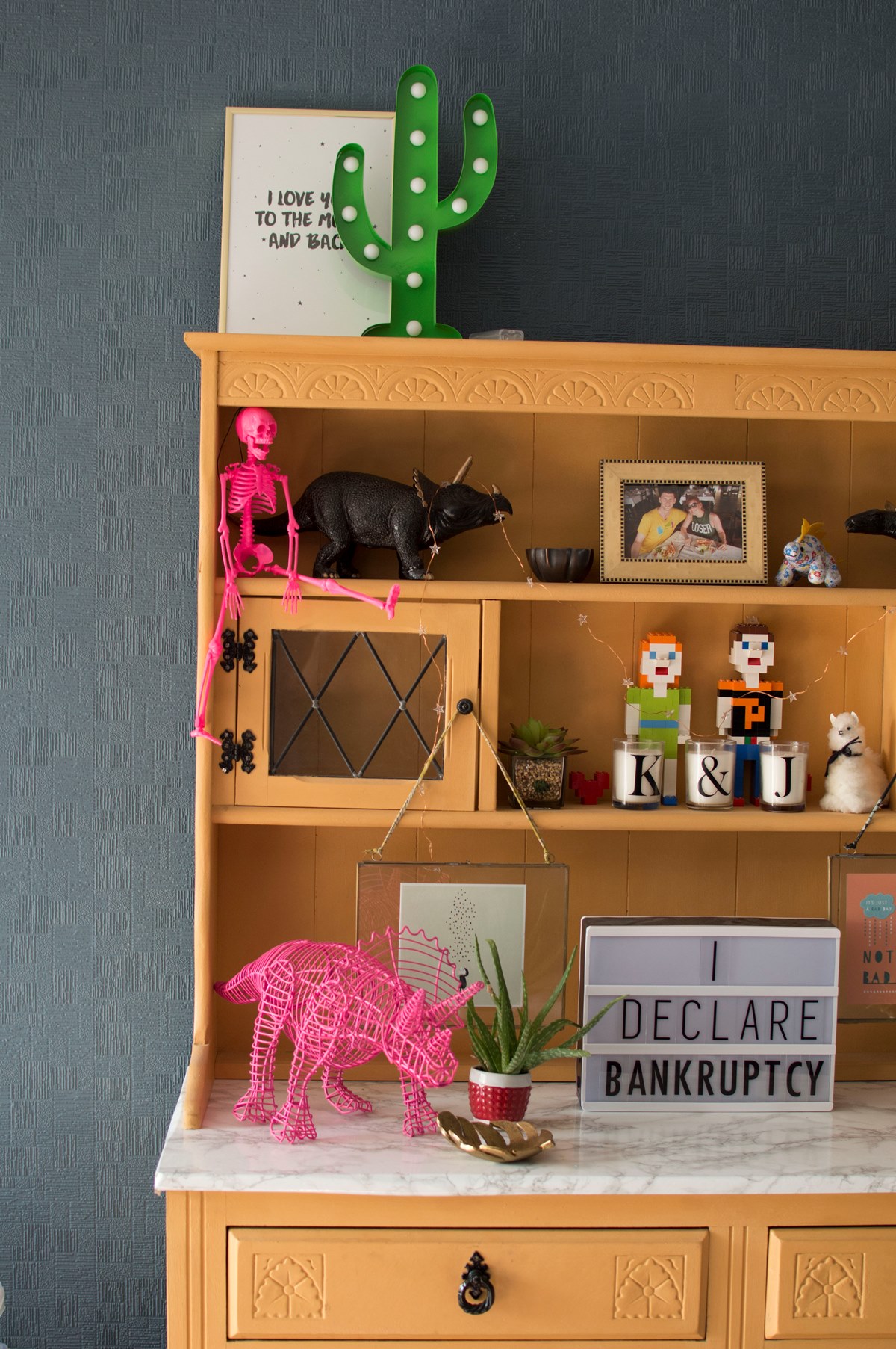
Ah, my dresser! I love it so much. Can you see the shadows of the room in these pictures? I told you the lighting was a bit funny in here. But I don’t mind a bit of darkness. The inner goth in me and everything… And yes this is a family lounge so it wouldn’t quite be complete without an enormous pile of toys. We’re making efforts to get everything more organised, but trust me when I say that this is a huge work in progress for us.
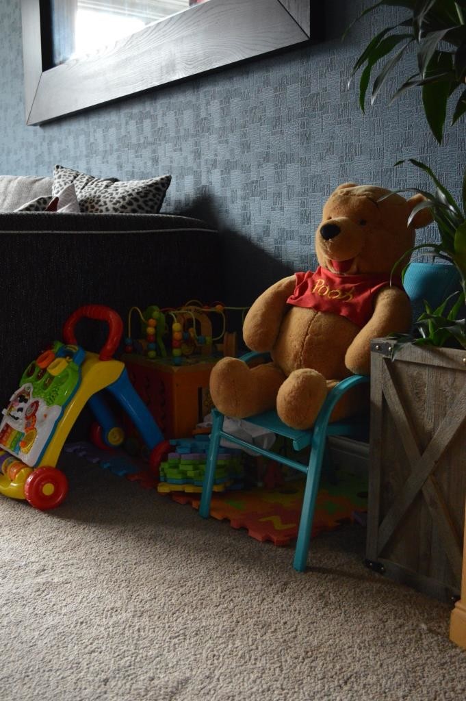
So what do you think? It’s a HUGE improvement on what it looked like when painted white in my opinion. The next step is to get some more sources of light in here, shift around some of the toys, and then add a few more bits to the walls. And if you needed reminding how truly blank it looked before, feast your eyes on the below….

