If you’d have asked me a few years ago what colour I’d paint my bedroom if I could choose any shade at all from the spectrum of the entire colour wheel, I would have picked…black.
Yup. Dark as the night, plain old black walls. Not to everyone’s taste, granted. But they say it never goes out of style and goes with everything, so why not?
The fact remains though, that I’ve never quite managed to persuade Joe to go so dark, and if I’m being really truthful to myself – and it pains me to say it – I don’t think our bedroom is quite big enough to pull it off. Sigh.
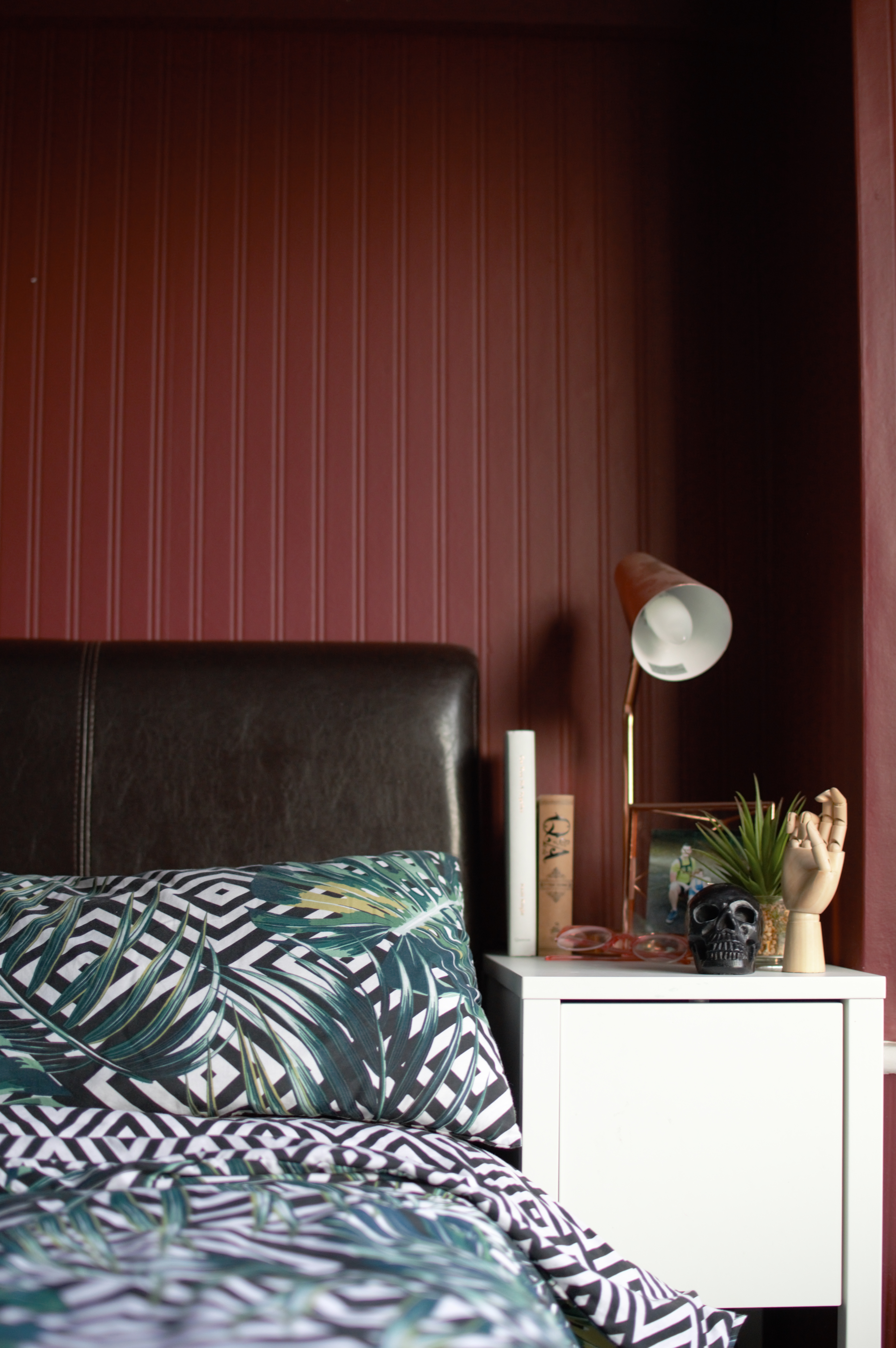
HOWEVER, we talked about other options that would give the room a more grown up feel and we agreed on red. Not a ‘red room of pain’ Christian Grey style of red; a much more innocent burgundy. A deep wine colour with a hint of purple running undercurrent.
With a colour chosen, it was time to spend another day working on the bedroom.
CATCH UP WITH MY PREVIOUS BEDROOM UPDATE HERE
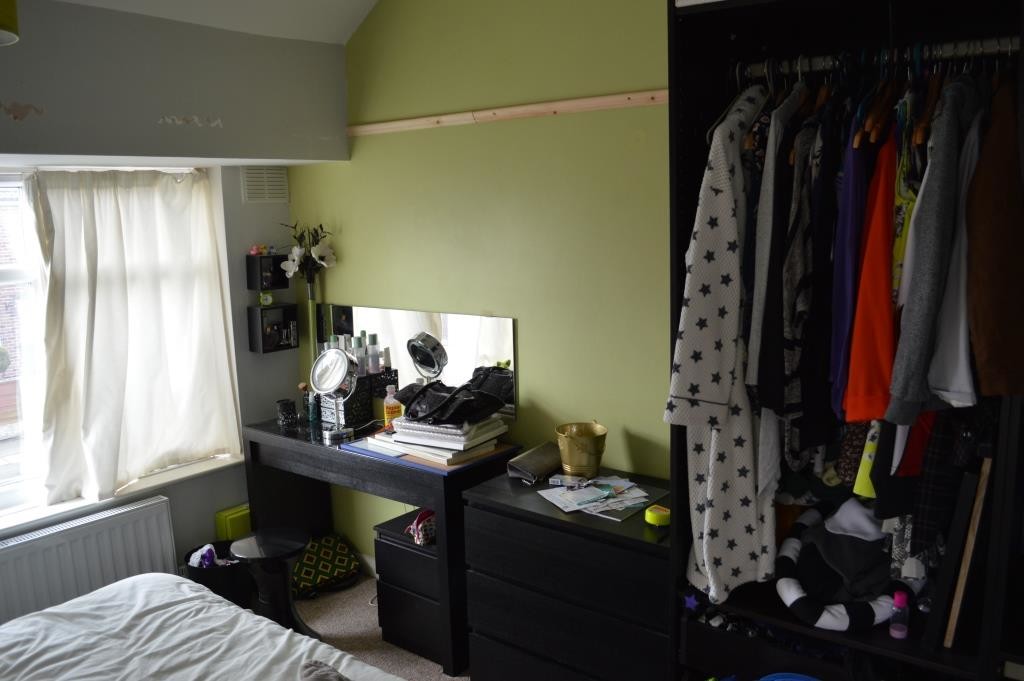
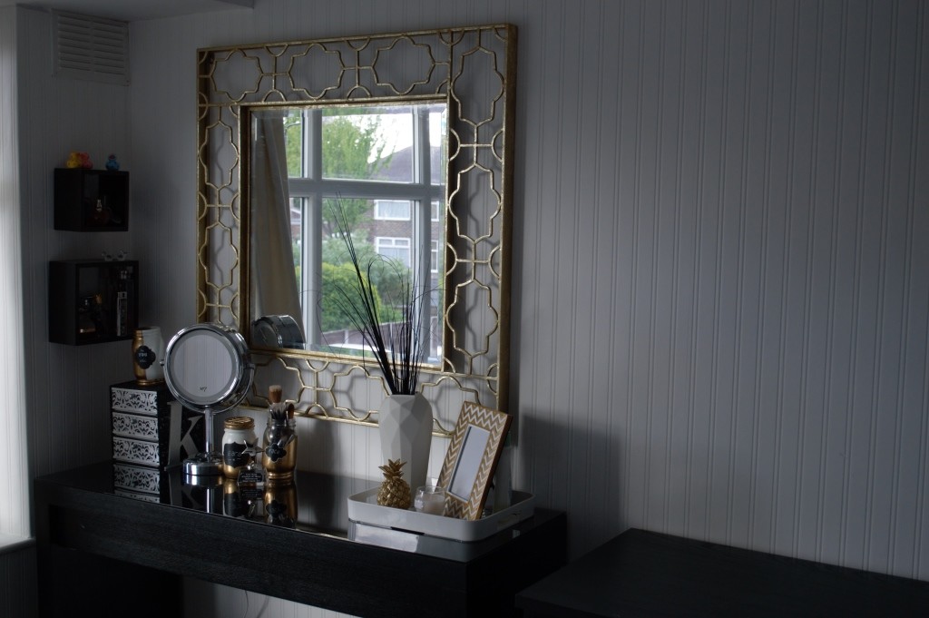
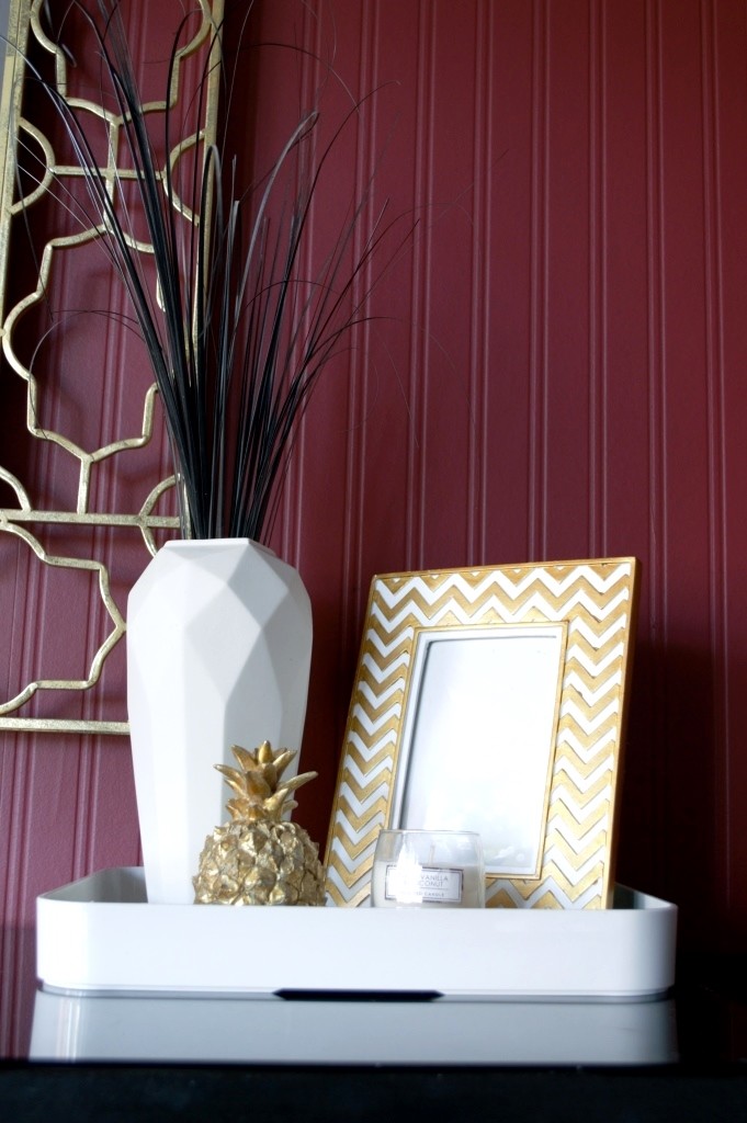
So let’s see how it’s changed by taking a look at my favourite bit of the room; my dressing table.
Winter 2014
Spring 2015
Summer 2015
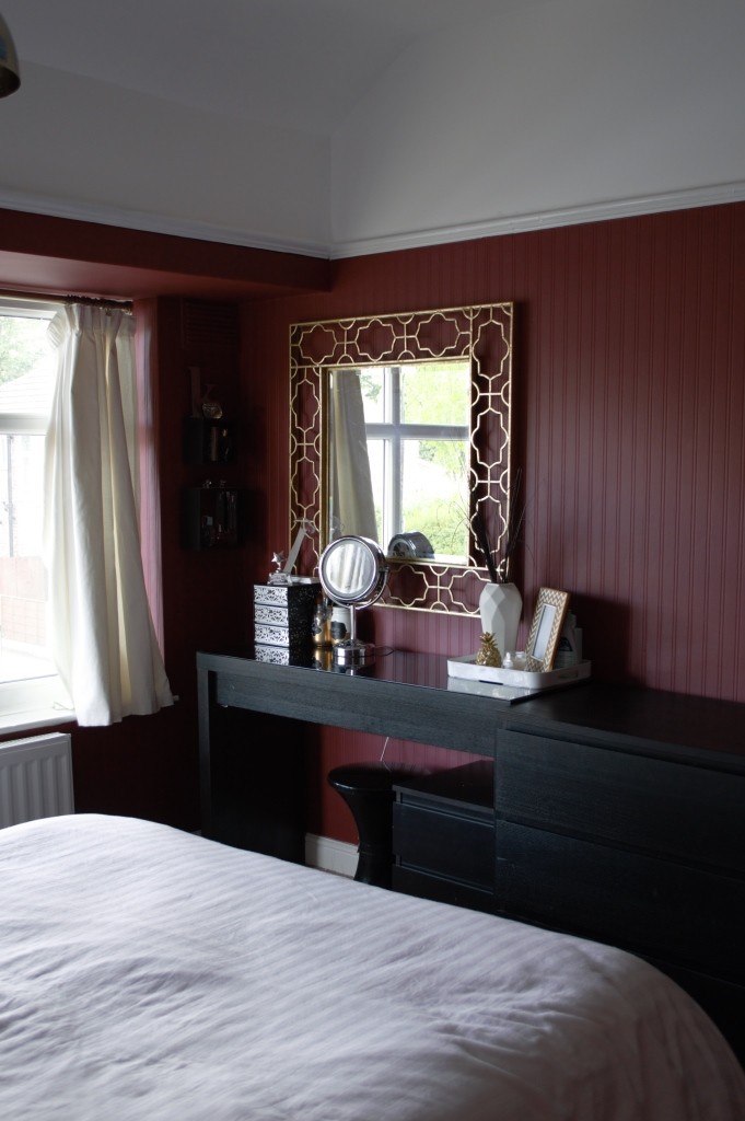
Looks better, am I right?
I’m so glad I picked a colour that’s bold and really would have been out of my comfort zone a few short months ago. When Valspar got in touch to see if I’d want to get involved with their #Valspar3DChallenge I decided to just take the plunge. Nothing beige and neutral – it’s not really to my taste. I think so often I’ve been afraid of what people might think of our room choices, or worry about how our décor decisions might affect selling the property – should we decide to in a few years. But I’ve made a decision to not give a rat’s ass.
Pardon the French.
But it’s true. It’s our bedroom. Joe and I are the ones who have it as a backdrop every single day. It should be somewhere we really love to be. And it’s definitely one step closer.
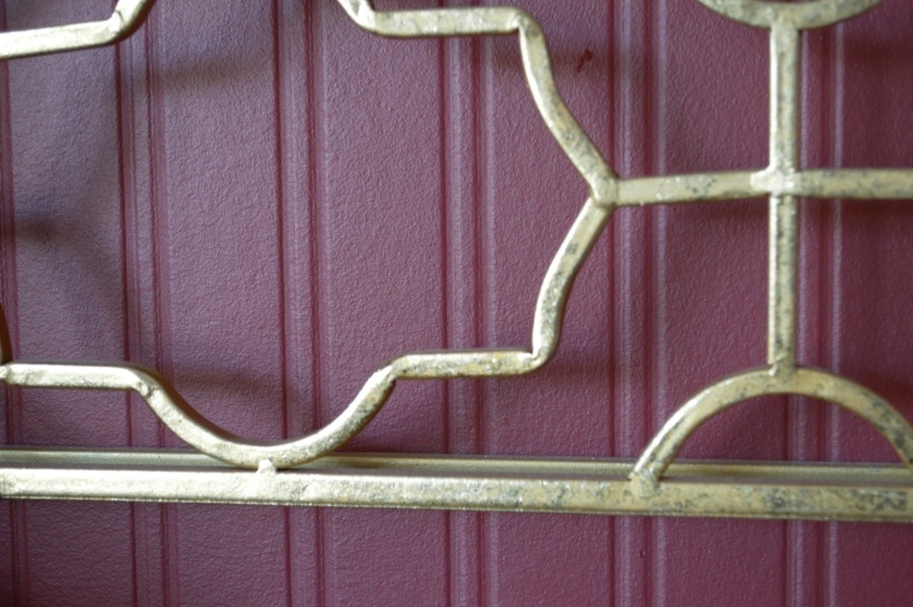
The paint in question is Valspar’s Ruby Begonia.
If you follow me on Instagram, you probably got a sneaky peak!
I’ve used Valspar in our hallway and lounge, both rooms only needing one coat to make totally opaque, with a second just to touch up a few patches. The bedroom took a tad longer though, as the thick wallpaper we chose to use – in order to cover up the visible and unavoidable cracks – was foam based, meaning the first 2 coats were mostly absorbed into the paper. However, 5 coats later (seriously, I’m never using foam paper again. EVER) and we’d still only used about three quarters of a 5 litre tin, so it goes far.
I do love though that it looks not far removed from real panels when painted red, something I wanted to use on this room but couldn’t find the budget for.
So what else have we updated? Here’s a look at the rest of the room.
Joe has a new fan. We always sleep with one on, and Joe got this lovely copper one as part of his Father’s Day present bundle. £35 from Dunelm Mill if I remember correctly.

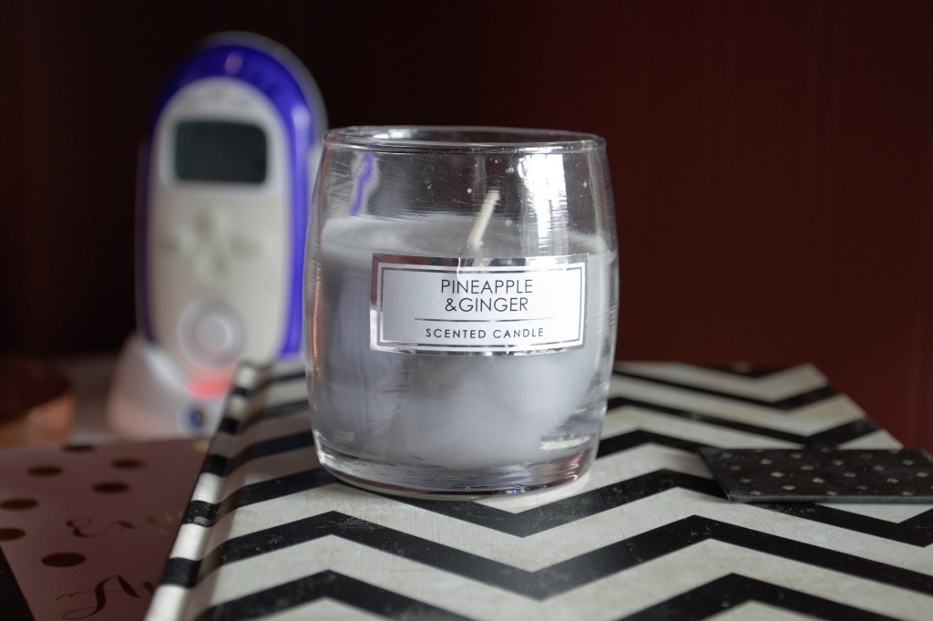
Our bedside tables are in place (Ikea’s Nordli range) and for my side we have our new copper lamps (Pixar style from Homebase), the baby monitor, a stack of cute notebooks (don’t you find you always get the best ideas when you’re about to nod off?) and a candle.
Thankfully we already had some thick cream curtains which fit our bay window. Rather than buy new ones, I deep-cleaned them and treated the fabric with a pre-dye solution to really whiten them.
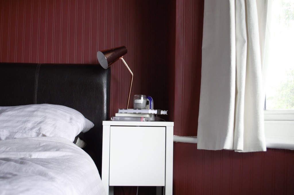
Some people are snobby about candles and I can’t quite understand it. This one was 80p from Primark and it smells absolutely lush.
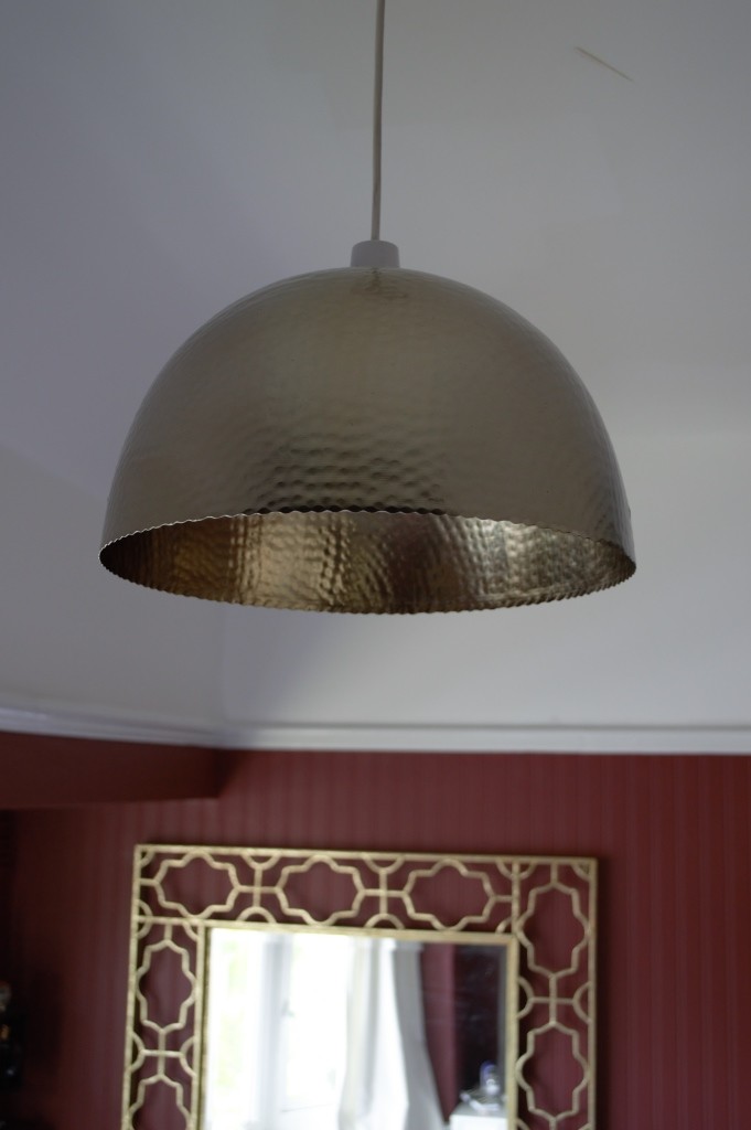
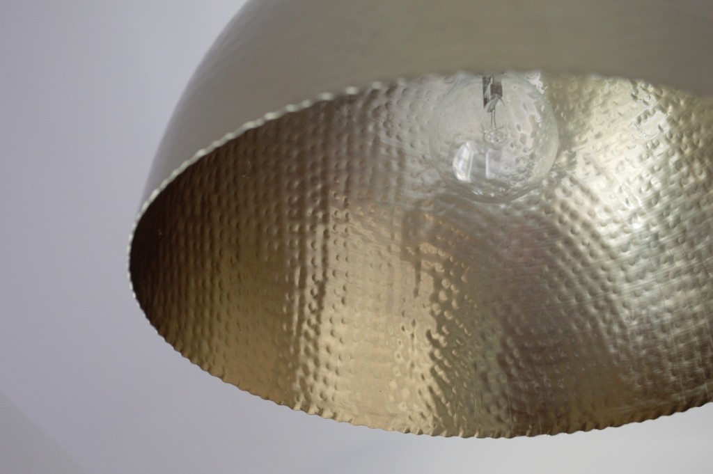
We finally replaced our tatty old lampshade with this battered-metal effect pendant light from Dunelm Mill. I’d seen a similar –albeit larger – version from Habitat which was seriously stunning, but at £150 was out of our budget. This was £15 and, in my opinion, looks more expensive than it costs and makes a great dupe for the Habitat alternative.
On my dresser, I’ve finally found somewhere to display my gorgeous little trophy for winning Affordable DIY Blogger from Bathrooms.com. Can I get a woop woop!
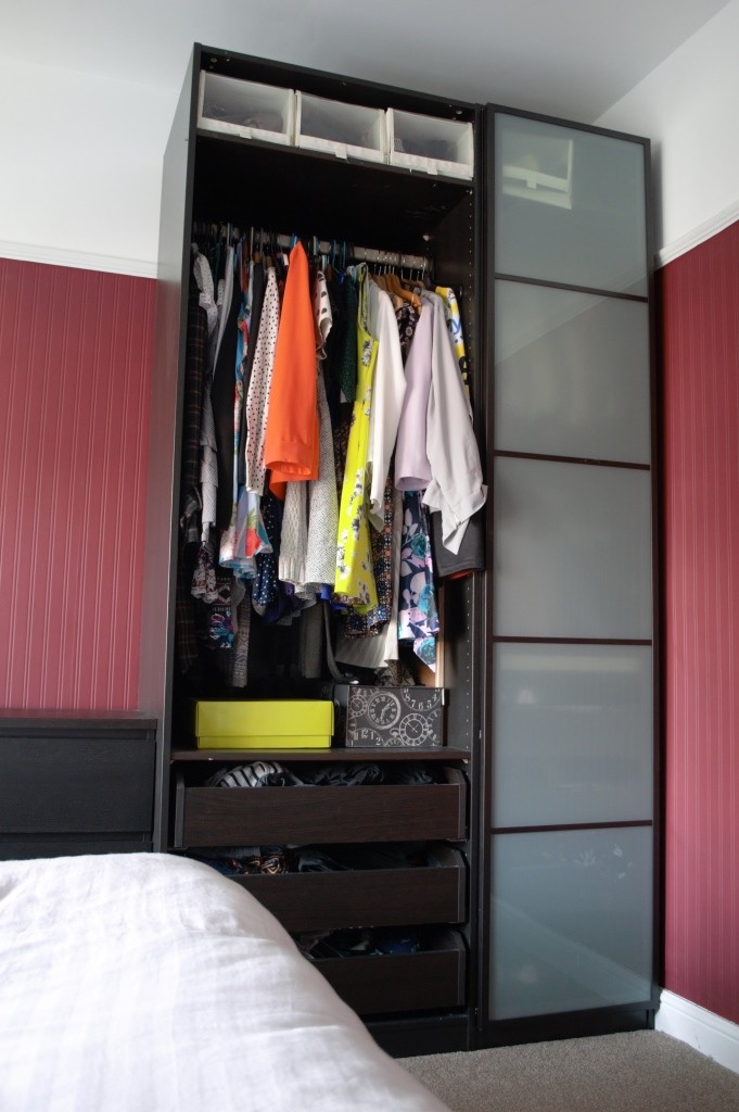
We’ve also added a wardrobe door! I know how bonkers it still looks, but trust me, it’s an improvement. We used to have one huge wardrobe with a sliding door. But now we’ve split the units between the two large bedrooms, meaning we needed to start from scratch with the doors. It’s taking us a while to get them sorted but doors are expensive! This is really the only bit of furniture we’ve altered on this makeover. We’d love one day to replace our bedframe as it took a bit of a beating from the move, but our Sealy mattress is staying put. It’s just so comfortable. And, if it’s not broke, why fix it? We’ve got more doors to buy after all…
So there you have it! I’m really starting to feel like it’s a room that we’ve stamped a bit of personality on.
Over the next few months we’re hoping to:
- Add some plants
- Add some art!
- Sort out the wardrobe door
- Add some feature cushions and a bed runner
- Customise some of the existing furniture – it’s getting quite Ikea-heavy!
In a nutshell, some additional finishing touches should do the trick. Come back for a Winter update to see – hopefully – a final reveal.
Like what you see? Keep up to date by liking my Facebook page.
*Disclosure: The paint for this room was kindly provided by Valspar, a brand I already support independently because I just love the consistency of their paint. As always, all words and opinions are 100% my own. Thanks for supporting brands that support Well I Guess This Is Growing Up.

