I love our house.
I feel that this is an obvious statement since I’ve spent almost 4 years blogging about what we’ve been doing to it. But there are also days where I’m envious of others. You see, I have a real love for period properties. And don’t we all deep down? They’re just bursting with personality, and quirky little features which ooze of history.
(I know some of my blogger friends will feel the same, as so many of them live in these exact homes! You lucky devils.)
Last weekend, with the weather beautiful and a date day planned with my best friend, we took a wander to Tatton Park – a huge estate in Cheshire centered around a neo-classical mansion. I visited so many times when I was young with it being so local to me, but there was something about walking around the property with the head of a homeowner, that made me leave there feeling both inspired and yet insanely jealous.
I’m happy with our home. Really, I am. But there is something lacking with modern homes which found me leaving Tatton muttering… “They just don’t make ’em like they used to!”
If you’ve never been before, the grounds really are beautiful and I’d recommend spending a day there. Go for a walk. Take a picnic. Visit the farm. Wander the gardens. Whichever it is, just go! For now though, I thought I’d share some snaps I took of the day. I couldn’t hel myself. Consider this my short photo diary of Tatton.
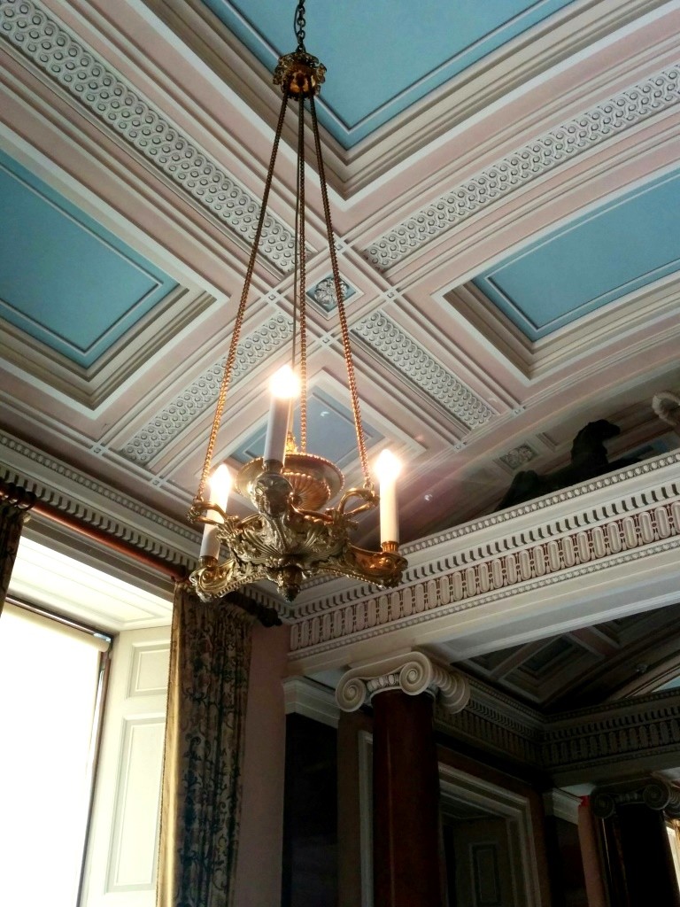
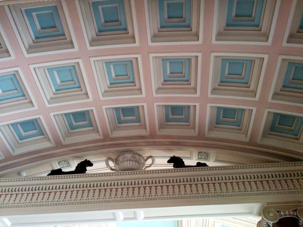
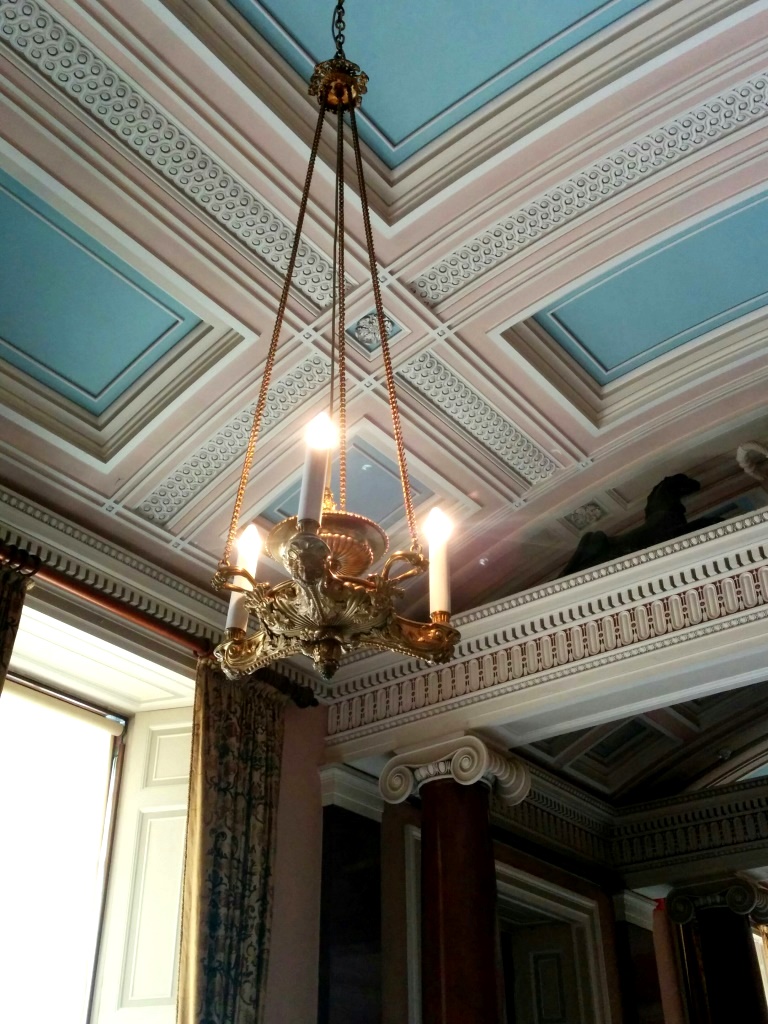
#CeilingGoals am I right? Those pinks. Those pastel blues. The detail! *swoon*
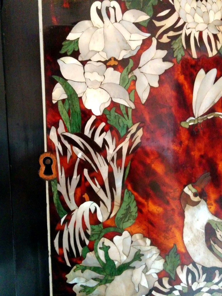
Hand carved black furniture adorned with ivory setting. (I don’t agree with ivory FYI, but understand that it was a thing of the era. The skill involved however, for what they accomplished with it is really quite impressive.)
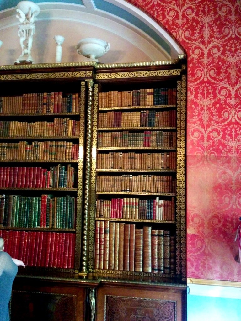
Absolutely enormous books on an even BIGGER bookshelf? Where do I sign up? Why aren’t these standard in normal homes anymore?
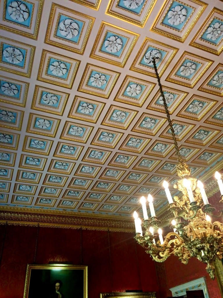
Another incredible ceiling. How did people of this era get anything done? I’d be bumping into everyone left, right and centre from staring upwards all the time. Seriously though, how beautiful is the colouring here?
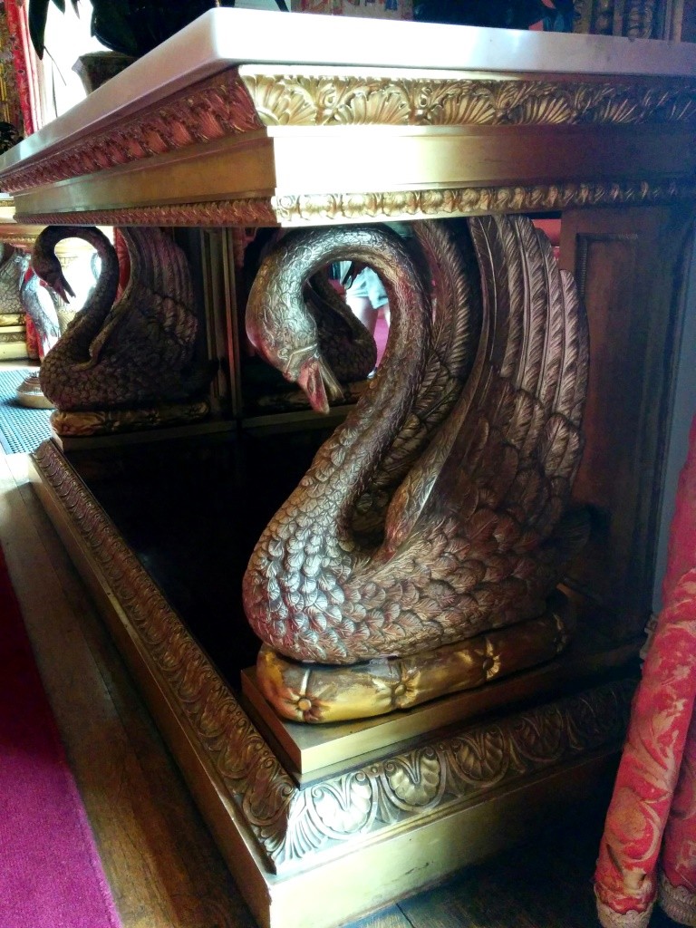
Why have a boring side table when you can have THIS? Marble. Gold. Swans.
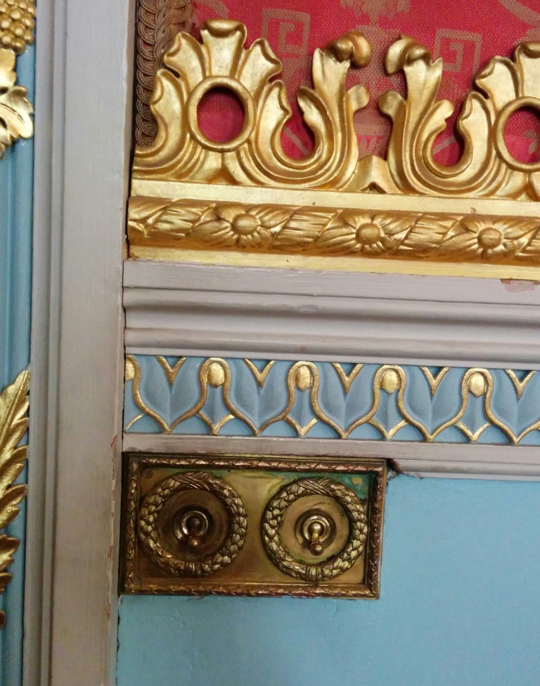
The attention to detail on this wall is insane. Not only do the light switches put ours to shame, but the wallpaper is a beautiful red fabric with a greek-key inspired pattern, next to hand painted woodwork, and gold trims. You just couldn’t have any old piece of MDF architrave back then. No way.
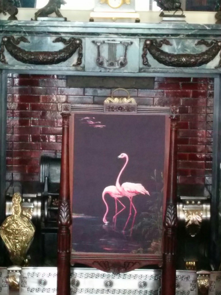
This fireplace I particularly loved. Not only was it rocking the flamingo trend since waybackwhen, but it was in a room that was completely symmetrical, meaning that there was an identical one on the other side. In fact, this room went to such lengths to make it completely symmetrical that it was covered floor to ceiling in books, with the entrance doorway given a false bookshelf to complete the look. Who doesn’t dream of a secret doorway behind a bookshelf? It’s genius.
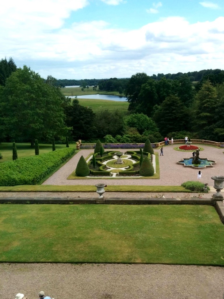
Not a bad view to wake up to, eh?
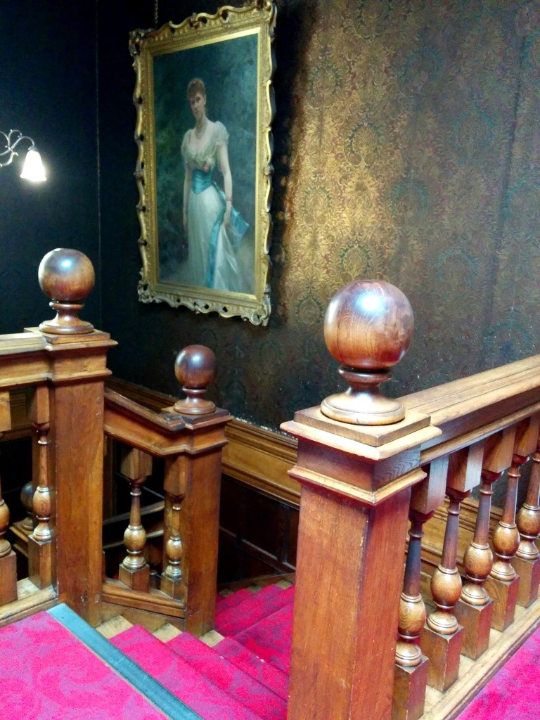
Absolute staircase envy.
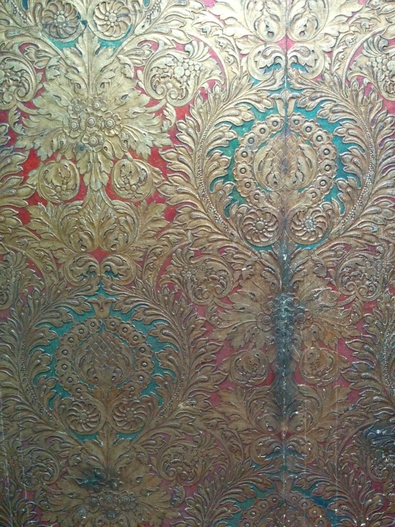
C’mon you guys. How stunning are these walls?
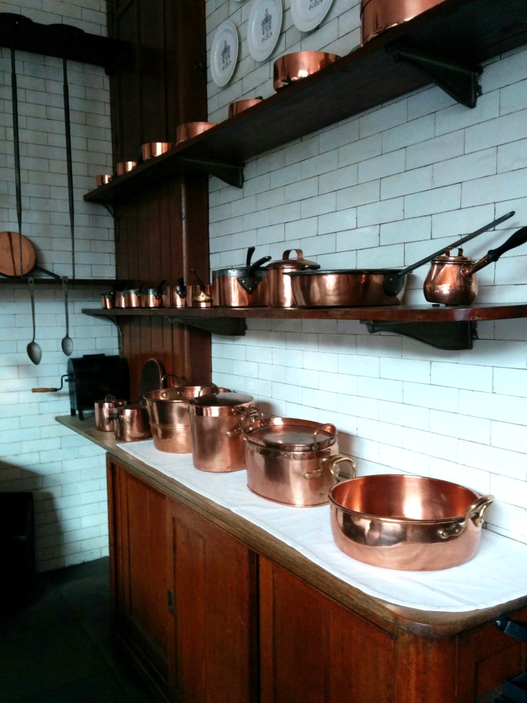
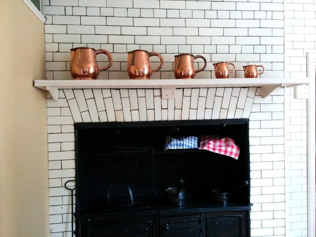
Tatton Mansion; rocking the copper and metro tiles trend since before it was a thing.
What do you think? Don’t you think it’s fab? Have you ever been to Tatton Mansion? Hit me up in the comments if you have anywhere similar you think I should visit!
