I’ve been working on our kitchen feature wall for a while now, but only this month have we started to piece everything together.
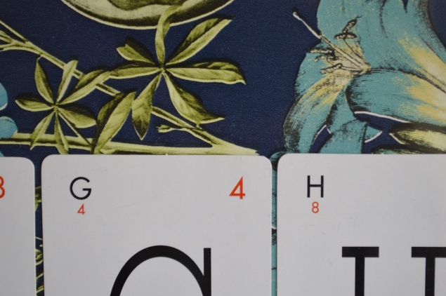
If you follow me on Instagram, you may remember a while back after a not-so-interesting trip to B&Q that I set my eyes on the Ideco Home Flaura & Fauna wallpaper with its rich blues that match our kitchen walls, but with a tropical plant pattern that I just loved.
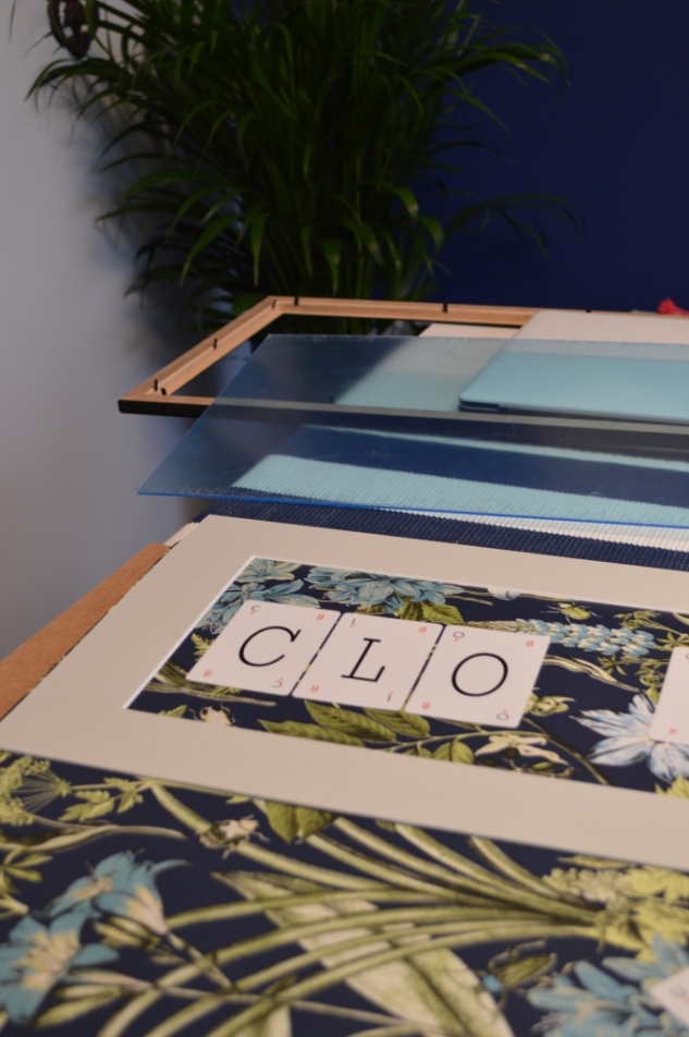
Since then, I’ve decided to use it in the kitchen, firstly on some shelves (blog coming soon – sneaky peak below) and secondly on a piece of art for the feature wall.
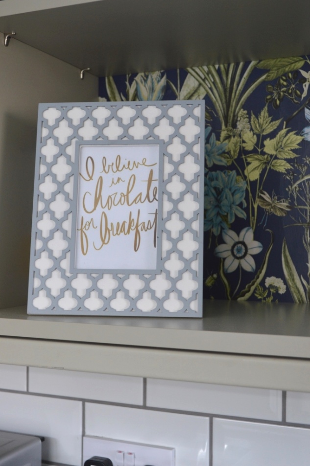
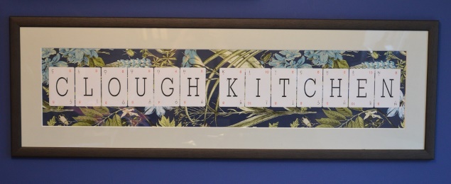
The wall art that I chose for this wallpaper I am really pleased with, not only because it looks awesome if I do say so myself, but it was also really easy to do.
I wanted a sign somewhere in the kitchen with our name on it. Not that we are likely to forget our own surname in a hurry of course, but I just really like that family feel personalised items have. Besides, even if one day we move on to another property, this kitchen will always be ours. We designed it and had it built from scratch after all so it only feels right to stamp our name on it in some capacity.
I know there are personalised boards and wall stickers that you can buy for this kind of thing but it wasn’t the style I’m looking for.
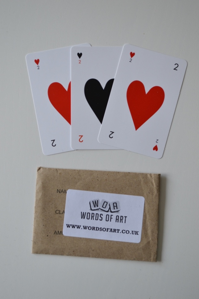
Instead, I decided I wanted it to be simple and say “Clough kitchen”. I bought the letters in a playing card style from eBay and only cost me around £6 to spell this out, and we got a few bonus cards with hearts on.
(I figure I’ll either use the leftover hearts for another frame around the house or it might make a nice pressie for someone. In fact, with changed wording, I think this could be a really lovely idea for Mother’s Day which is coming up!)
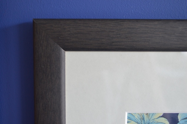
As the phrase we picked would make for quite a wide but short piece of art, I knew we’d need something custom made so I ordered a grey/black wooden frame with a cloud (off-white grey colour) mount from eFrame. The customer service was fab because the original sizing I put on the order would apparently not make for a very strong frame so they rang me and advised to make it a few centimetres taller, which I agreed on.
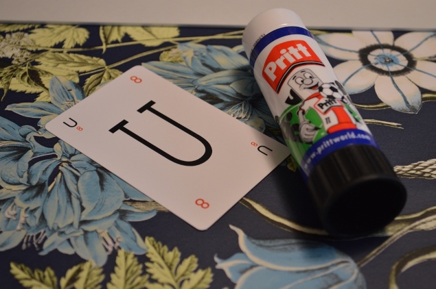
I used the mount to measure up where the wallpaper pattern would fit best, and then I stuck down the cards using good old Pritt Stick. Nothing fancy needed here folks.
And voila! There you have it.
I love this simple project. The wallpaper just goes so well with our Smalt blue kitchen wall, and the leaved pattern goes perfectly with all the flower and plants we’ve made an effort to add to the kitchen lately.
If you’re thinking about trying this yourself and want to keep the budget down, you could use a smaller frame or a standard size frame. The eFrame version we used cost around £45 due to its custom size, which is really reasonable considering it was made to order and it’s a massive frame – a great service if you have an awkward space that needs filling. Also, if you don’t want to buy an entire roll of wallpaper, buy samples insteaad or even look at gift wrap paper next time you’re out and about – paperchase and Waterstones are really upping their game for printed sheets. Picking a detailed pattern in the background will also make it look far more expensive than it was to make.
So what so you think? I hope you like it! Let me know if you’ll be doing something similar.
I’ll be revealing the rest of our feature wall next week, yippee.
*Disclaimer. The frame was gifted to us from eFrame for the purpose of review. However, the words and opinions are always 100% my own and we think this rocked.

