The skirting and coving have been added and replaced – respectively – and the next stage in this living room makeover includes wallpaper.
(Read all about those additions in my Living Room Update: Part 1)
Normally, I think I would have opted for paint, with one bold feature wall and my neutral of choice – grey – elsewhere. That’s how I always envisaged our lounge anyway. One problem we had with this plan is that it’s a long and narrow room with no clear wall as to what would constitute as a feature wall. Secondly, cracks in the walls made paint less desirable. Don’t worry, structurally it’s all gravy! In fact, we had it plastered only in 2011, but we’ve learned that some houses will just always get hairline cracks with the subtle movement of the building. No biggy. But when you know they’re there, it’s all you see and it’s just plain annoying.
In fact, here are some of the ‘touch-ups’ in the lounge which paint just wasn’t going to cover…
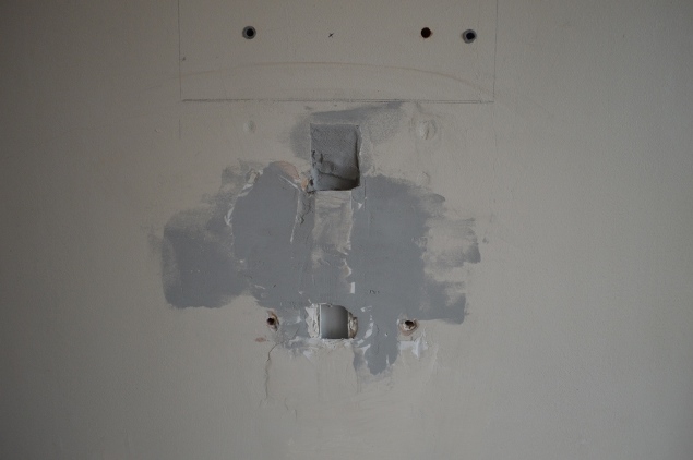
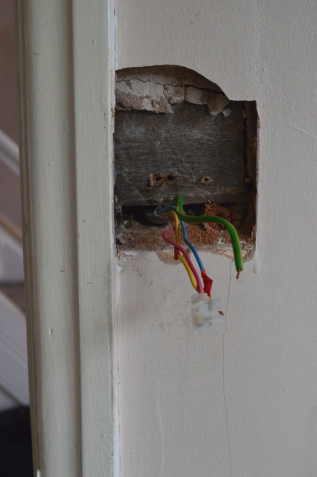
Yup. That’s what you get when you have a husband who LOVES technology and resorts to burying wires in the walls.
These imperfections have been bugging me for a long time now, so we instead decided to make features out of the furniture at a later date instead of the walls, and go completely neutral on the walls – covering up the cracks, and any future cracks that will inevitably appear, with a textured wallpaper.
Being a little on the *ahem* wobbly side these days being a bit pregnant and everything, and Joe not having wallpapered himself in the past, we were given the really generous offer of having it done for us by Joe’s auntie as a birthday present. How wicked is that?
So step 1 was choosing wallpaper. These are the 3 we narrowed it down to.
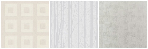
Option 1 – Superfresco. I really loved this pattern. I love geometric shapes and I think it looks really modern where a lot of textured wallpapers can look dated. Sadly, we quickly realised that with a long room, any pattern that required a straight horizontal line would look wonky very quickly as the walls in this house are truly not straight.
Option 2 – Craig & Rose. Also loved this when I saw it online. It’s paintable too with the tree pattern shimmers grey on top of the frosty white background colour. Upon looking at samples though, on a large scale it looked like a wallpaper of cracked walls, the very look we were trying to avoid. Dammit!
Option 3 – Superfresco. It’s a much thicker paper than the other two so would easily cover our cracks, and although a pattern this busy would not normally be to my taste, on a larger scale it adds just the right amount of texture to cover any imperfections underneath whilst also remaining neutral, but with a glimmer of those geometrics I really love. This was our winner. To the checkout!
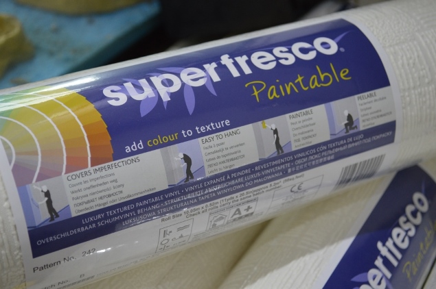
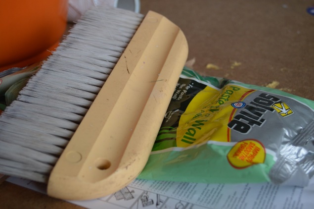
We bought 8 rolls, to cover the lounge which is approximately 22 feet long, 11 foot wide, has 2 doors and one ginormous window. If you’re buying wallpaper and trying to work out how much you’ll need, don’t forget to account for your pattern. The more complicated it is or the longer the pattern is on the roll, the more wastage you’ll have, so bear this in mind.
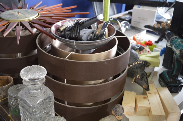
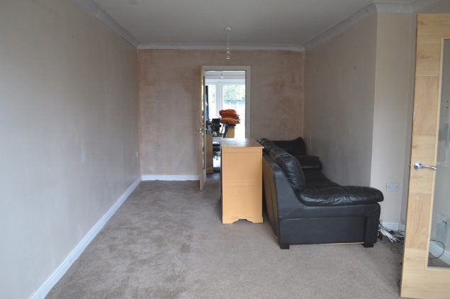
Next on the list was something we’re all too familiar with in this household – shoving as much as possible from one room into another! We piled the contents of the lounge (things like lampshades, dinosaurs, whiskey…) into the kitchen, and emptied the living room as much as we could.
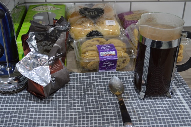
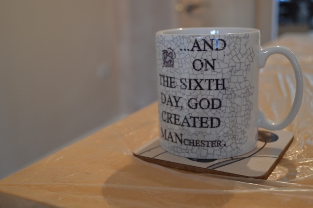
Next step, preparing the daily supplies. You can’t have a decorating day without treats!
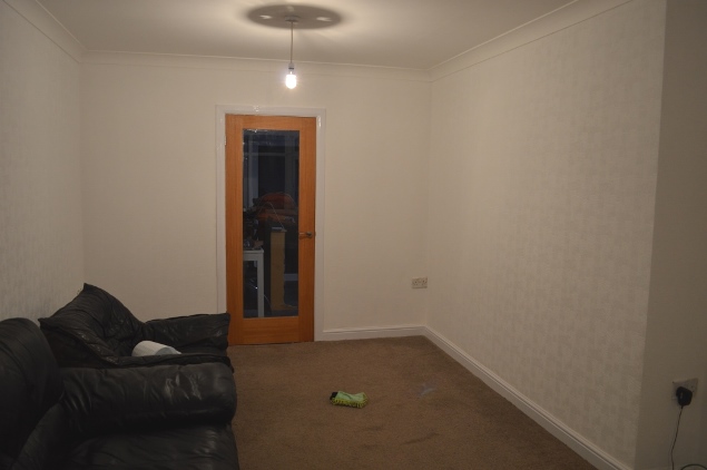
Okay okay, so now let’s get to the wallpapering. Be gone, horrible brown-peach-plaster-colour walls!
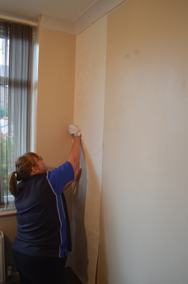
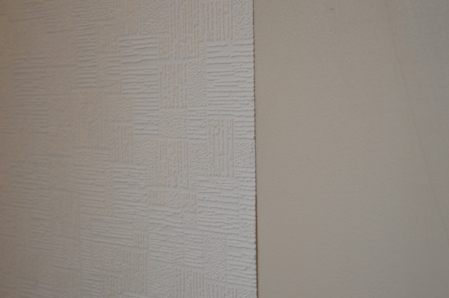
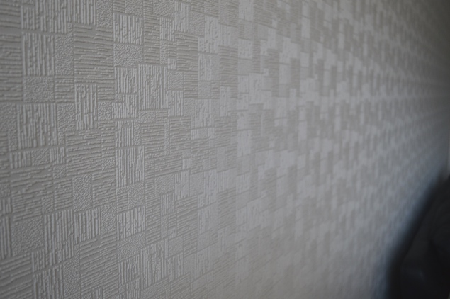
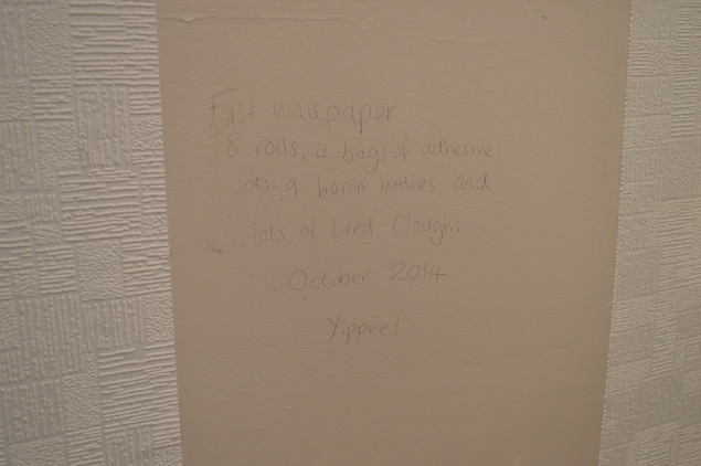
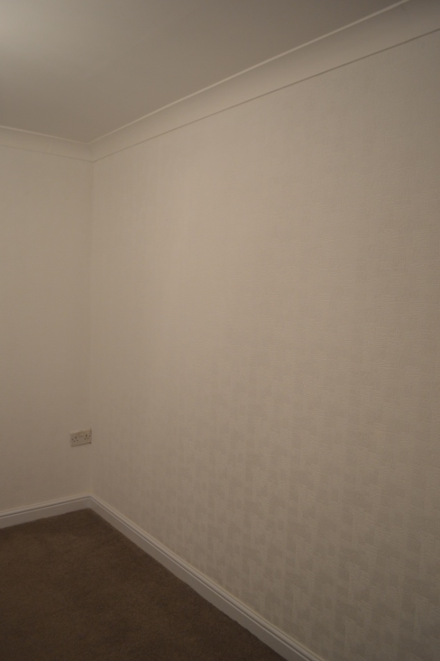
I actually really like how the textures of the pattern appear a different shade of white as you look down the room. Also, we left a little note on the wall, underneath the final strip of paper to be pasted. We did the same when we bricked up the fireplace in 2011 for a bit of fun.
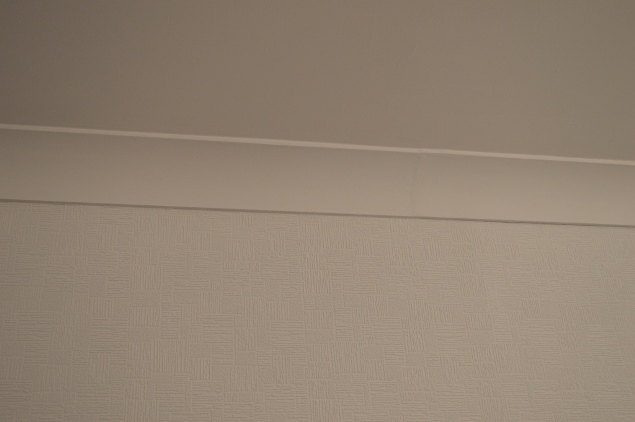
And then, we painted.
The coving was painted. The skirting was painted. The ceiling was re-painted. The wallpaper was painted.
It was all given a treatment of white. And what a difference it makes.
I actually, as a rule, thorougly dislike white walls. To me, they just look a little…unfinished. And we’ve lived in a state of ‘unfinished’ for so long now that I want to move on from that. However, the texture makes me actually like the neutrality of the white in here and it is 100% the fresh start that the room so desperately needed. To look brighter, and most of all, cleaner.
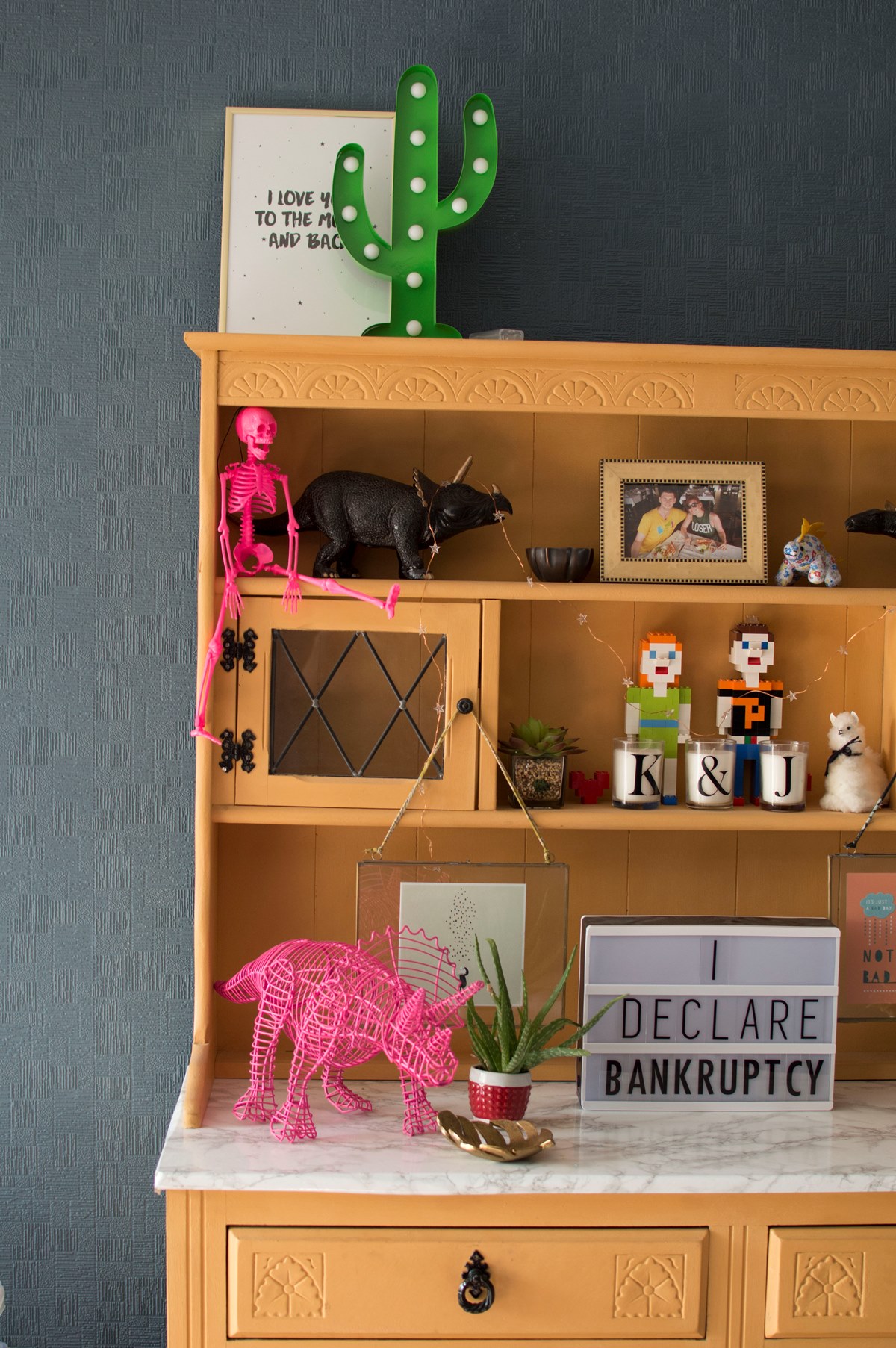
When our furniture is added in, with our bright orange dresser, hot orange lighting, cmixed coloured cushions, grey sofa and colourful flowers in front of the TV, you’d never notice that the walls were what could be considered to be plain. But the beautiful thing here, is that the wallpaper is paintable so if in the future we choose to add that feature wall with paint, we can!
For the time being, the room has been given a well-needed refresh just in time for the baby’s arrival, making it a much more welcoming place for all those lovely guests we’ll probably have. Take a look at the finished walls and let me know what you think!
Wait until you see how much cosier it looks now that we’ve got furniture back in there. Come back for my next living room update to take a look.
